Saturday, 6 December 2014

The Lupine Book Club Sunday Afternoon Reader -- Part 2

More Sunday Afternoon reading! Let's get into it. See the Part 1 for an explanation of what I mean by Sunday Afternoon reading, should you require one.


Messages – Stan Romanek (2009)

Pic from Amazon.com
A few months ago, my dad leant my sister this book. She’s currently undertaking her PhD in psychology, so my dad was interested to hear what she thought about it from a psychological perspective. So I decided I’d have a read as well.

One of the main points which distinguish the book from the hundreds of others like it is that author Stan Romanek seems to have accrued a number of photos, as well as some video footage, of his abductors. Unfortunately, many of them do not seem to have made it into the book. I can appreciate that there are space considerations, but it does his story no favours when he talks about amazing photos he’s taken, then doesn’t include them. And to put it rather bluntly, regardless of where you sit on the sceptic/believer spectrum, the included photos are not going to impress. The same applies to his footage of “Boo” (one of a number of named aliens in the book) which you can view here.

Still, Messages is an entertaining, enjoyable read, and – whether true or not – a good introduction to the main tropes of UFO abduction phenomena. One of my sister's thoughts, incidentally, was that whether or not anything real had happened, he probably needed some counselling for stress.


Lego Batman – The Visual Dictionary

Pic from Amazon.com
I bought this while overseas in 2013 – I figured 5 pounds was pretty good for a Lego-related book and Batman minifigure. The book was definitely worthwhile -- covering the Batman and (DC) Super Heroes Lego from 2006 through to 2012, it naturally inspires a great deal of regret that I wasn’t paying more attention to Lego around this time (not that I could have afforded it back then anyway). Though a lot of licensed Lego is a mixed bag, the Batman theme in particular generated some really cool sets. Additionally, there are curiosities such as a prototype of Wonder Woman’s invisible plane – which will be showing up in 2015, albeit it different form.

Unfortunately, the minifigure was pretty disappointing in comparison to the book. Based on the Electro Suit from the 2008 Lego Batman video game, they’ve used the flimsy plastic that sometimes turns up in the Minifigures theme, the helmet doesn’t fit properly and he's missing the backpack that he has in the game. Nonetheless, when considered as a package, it’s definitely money well spent. No regrets about this one.  

Mysteries of the Unknown: The UFO Phenomenon (1987)

Pic from Amazon.com

I mentioned this book in the previous instalment of the Sunday Afternoon Reader. Of the two, I think it is the better, with more impressive illustrations, and an overall more unsettling tone. But of course, ideally you’d own both, even if they do cover some very similar territory.

A classy looking faux-leather cover, lots of metallic ink printing and many entertaining stories add up to make this one a winning combination. 

The only downside is that now I feel like I need to track down a copy of Mysterious Creatures, which was another excellent one from the series. It's still available reasonably easily, so it may be one to track down in the new year.

Ninja: 1,000 Years of the Shadow Warrior -- John Man (2013)

Pic from Amazon.com
As we get older, there are certain beliefs we held as children that need to be challenged. One of them is the idea that ninjas were black-clad badasses who pretty much went around chopping people's heads off and then disappearing in clouds of smoke, leaving any survivors in awe of their near-supernatural abilities.

Sadly, this wasn't the case, and it's a shock I think most men struggle to come to terms with. It's way worse than finding out Santa isn't real. I don't think I've quite dealt with it yet, and so I cling to characters from my past like Storm Shadow and Raphael -- ninjas who do live up to my exceedingly high expectations.

Ninja dispels a lot of legends surrounding the titular warrior-clan, but it also contains enough sensationalism to keep the interest inflamed throughout the course of the book. Importantly, it shows that for everything we do know about the ninjas, there's a buttload more that we don't know -- after all, what we do know seems to indicate that they were deliberately secretive...in the meantime, I'll probably continue to use outrageous pop culture interpretations to fill in the blanks.

That wraps it up for another installment of Sunday Afternoon Reading -- Part 3 will hopefully not take as long to arrive as Part 2 has!

If there's a particular book you'd like me to look at in the future, post in the comments and I'll do my best. You can also visit the Lupine Book Club on Facebook. Click here!

Friday, 5 December 2014

Funko POP Universal Monsters: The Mummy


Boris Karloff – a horror legend if ever there was one. Almost 50 years after his death, the image of him as Frankenstein’s Monster continues to dominate popular culture. Universal must be making more on merchandise than they ever did on the movie itself, going off the sheer amount of stuff that’s been produced in the decades that have followed.

But Frankenstein’s Monster wasn’t the only role Karloff was famous for – another was Imhotep, the titular character of the Mummy. Released in 1932 to cash in on the craze for all things Egyptian following the 1922 discovery of King Tutankhamen’s tomb, The Mummy was an immediate hit. Imhotep never achieved quite the same iconic status as Frankenstein’s Monster, but he remains an important part of the movie monster pantheon. The character also got a revival of sorts in 1999, when a remake (or re-envisioning or reboot, whatever you’d prefer to call it) of The Mummy was released, and became a tremendous hit.  

The original is not a perfect film, but it evokes a dark mood that still manages to unsettle to this day. I first saw it when I was maybe 10 or 11, and found "old" things laughable as opposed to frightening. How did anyone ever find such things scary? Hokey and melodramatic in parts it may be, but The Mummy quickly disabused me of the idea of old stuff not being frightening . And even now, more than 80s years on, Boris Karloff’s makeup as the titular character in his coffin still holds up quite well – just look at a real mummy here and compare with the image below.   

Yet despite my fandom of The Mummy, I was a little dubious about the execution of this POP – the initial illustrations and then the promo photos made him look quite boring, with far too much grey, all seemingly of the same shade. While the finished product is not perfect, it’s certainly better than the initially released images appeared. While he’s still almost entirely grey (his sole flash of colour is his gold/bronze scarab ring), giving almost a black and white effect, it looks much better in person than in photos. Still, I think a darker wash over the bandages (and possibly the hair) would bring out some of those sculpted details nicely. Aside from this, my only complaint is that the paint on the tip of his nose was a little chipped in the box. Still, given that he's fairly monochrome, it doesn't really stand out. 

Imhotep has a mouth, which is unusual among POPs. The Creature and Dracula both have one, which makes sense for their respective designs, but I’m not sure it was necessary for Imhotep. I also feel like the addition of more wrinkles would have been a good idea, though that might have made the overall figure a little too detailed.   

Though I don’t know how likely it is, they could definitely do another series of Universal Monsters POPs. The Invisible Man and the Wolfman in human form are just two potential options, and one could be Imhotep in his more “human”, Ardeth Bay form, which is how he spends most of the movie. He’s still heavily wrinkled, looking like a walking desiccated corpse, but although the makeup is not as extreme, the effect is at times even more disconcerting than when he’s wrapped in bandages. 

This depiction of the Mummy is a pleasant surprise. He’s not my favourite Funko POP, and he pales in comparison with the Creature from the Black Lagoon, but he’s nonetheless a lot of fun and turned out much better than anticipated. Highly recommended for vintage horror fans. 

Snoopy -- Hot Wheels


I don’t often think about it these days, but Snoopy and the rest of the Peanuts gang were some of my great loves of childhood. I owned a huge amount of merchandise – t-shirts, books, stuffed toys. I was even bought an exceptionally nice Snoopy watch from America around the age of 8. His arms were the hands of the clock, and it was far too expensive a watch for a kid to wear during day-to-day life – so much so that I think I only wore it two or three times before the battery eventually conked out, years later. It was one of the great treasures of my childhood.  

When I've read Peanuts in more recent years, it tends to make me sad, more than anything else. This is at least in part to do with Charles Schulz’s passing in 2000. It was a big moment for me; I have not had many relatives or friends die, and this though a beloved member of the family was now gone. 2000 was not a good year for many reasons, and in hindsight this was pretty close to the top of the list of those reasons.  

But there’s more to it than that. I remember reading Charles Schulz saying that he had never intended Peanuts to be for children; it was for adults who remembered what childhood was like. I dismissed this when I was a child myself. Surely he could see the joy that Charlie Brown and the gang brought to millions of children all around the world? I’m sure he did. But filled as it is with surprisingly adult themes – religion, unrequited love, absent parents, inadequacy, disappointment, just to name a few of them – the strip has taken on a new poignancy for me as I too have grown older. There was very little "closure" in Peanuts, and I think nowadays it pushes some buttons that I didn’t even know I had. Schulz was a deep thinker -- this strip from Saturday Morning Breakfast Cereal may not have been too far off the mark.  

But we have digressed – we were here today look at a car based on Snoopy. Hot Wheels, in fact. I don’t really “do” toy cars anymore, unless it’s a Transformer, a Batmobile or otherwise DC-related. But when I came across this guy, I felt a stir of the old fondness and decided that I’d plonk down $2.25 (AUD) to own it. How does he come across?

Well, I wouldn’t have opened him had it not been for the fact that his packaging was already a little torn. It’s pretty standard stuff Hot Wheels – a CG-rendering of the “car” with Snoopy sitting atop the doghouse. It’s kind of a shame they didn’t deviate a little more from the traditional packaging style; I think a proper Peanuts illustration would have been a much better option. Maybe they’re testing the waters for a deluxe series in future? I could get behind that.

The doghouse portion of the car is a little weird, but what we’ve/I’ve come to expect from Hot Wheels. A red doghouse that looks like it’s straight out of the strip sits atop a thin green chassis, presumably representing grass. Some of the red paint of mine was chipped in the packet, so keep an eye out for that.

We now move into more stereotypical Hot Wheels territory with a massively oversized hotrod engine with funnels that are surely too big to be practical. Massive rear wheels, and small front wheels. I don’t know enough about cars to offer more thoughts than that, save to say that I don’t think this would be road legal if it were a real car. 
   
Onto Snoopy himself! Cast in softer plastic, and attached to the doghouse roof by a small post, he is the main drawcard of the toy for me. Even in the box I could see this was going to be questionable though; he’s got paint apps for his eyes, ears and nose but none for his mouth or collar. He looks a little half-finished, and this is worsened by the mould flash that’s left on the crown of his head. He also sits a couple of mm above the roof of the doghouse, rather than flush, so that’s a mark against it too.  

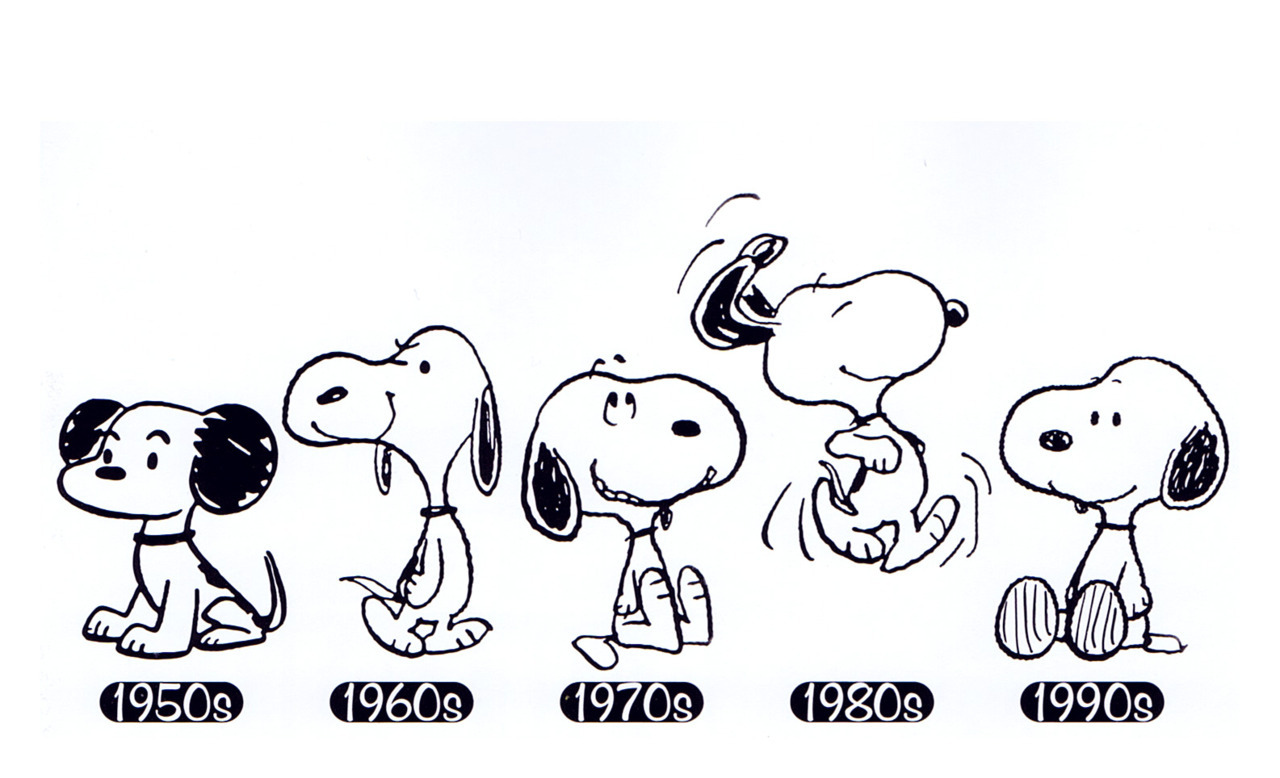
Speaking of paint apps, Snoopy’s ears tend to be a problem for merchandisers. Ostensibly, Snoopy is a beagle, but his markings don’t match up all that well with a real Beagle. Schulz tended to draw Snoopy with partially coloured ears, even across his different appearances over the decades. Merch manufacturers tend to give him solid black ears (which is technically wrong) or partially colour the ears black and leave the rest white, which usually looks worse in 3 dimensions. This one tries to split the difference and colours the exterior of his ears black while leaving the interiors white. It’s not great, and I think they should have just made them all-black.  


This car is a great concept, but lacking in execution. While the doghouse portion is well-executed, Snoopy himself is definitely lacking. I’d much prefer to see Peanuts deluxe releases, with nicer card art and “real” cars, to make for a nice desk display. Perhaps with the movie on its way next year, we’ll get that.  

Thursday, 4 December 2014

Wonder Woman #36 (The New 52)


Image copyright DC Comics 2014

The New 52, eh? It’s something I have mixed feelings about – I was quite fond of the post-Crisis on Infinite Earths DC Universe, flawed though it was, and I wasn’t thrilled to see it go. But like any other business, comics is a money game and I’m lead to believe that The New 52 relaunch back in 2011 did some pretty good business – so it looks like we’re keeping it for the foreseeable future.

All of this, of course, is a very long-winded way of essentially saying that I’ve read very little of the New 52, outside of the Justice League, so I’m not up to speed with all the current continuity. So please forgive any errors I may make as I write about this issue.  


This issue has been out for a couple of weeks now, so I’m hardly first cab off the ranks in reviewing it – think of this a catch-up before issue #37 arrives. 

First things first – the art. It may be shallow, but I do often find it difficult to read a comic when I don’t particularly like an art style, and that’s one of the main reasons I never picked up any of Cliff Chiang’s run on this series over the last few years.* But now that David Finch is on pencilling duties, I’m planning to be all over it. Even my perennial favourites Jim Lee and Jose Luis Garcia-Lopez have disappointed me from time to time, but I’m yet to see comic art by David Finch that I don’t like.

While I wouldn’t say this is his all-time best work, it’s still pretty darn good. Sensation Comics have thrown us a myriad of interpretations of Diana over the last few months, some of them better than others -- this issue, on art at least, blows all of them away. 

And with that we move on to part 2 – the story. Written by Meredith Finch (David's wife) it does an adequate job. As might be expected, there’s not a whole lot in the way of plot advancement; a lot of the issue seems designed around easing in the new creative team, and introducing (or perhaps re-introducing) characters who we can assume will be important in the upcoming story arc. There’s also something of a recap for readers such as myself, who haven’t been reading the last few years of the book; The Amazons are annoyed at Diana for her liberal views, and allowing men onto Themyscira, which is bound to cause trouble in future issues.

Image copyright DC Comics 2014

In terms of the larger plot arc, there’s someone or something who’s controlling the weather, causing natural disasters. The JLA cameo, which is to be expected, as does Swamp Thing. I really appreciated this, as he’s long been one of my favourite DC characters and often doesn't get the love he deserves.

Image copyright DC Comics 2014

The issue finishes with a fairly abrupt cliffhanger, which I won’t reveal here. How the consequences unfold over issues to come remains to be seen, but I'm certainly intrigued.  

Wonder Woman #36 comes recommended for WW and David Finch fans alike. It’s not groundbreaking, but it shows promise for strong future issues from this particular creative team – here’s hoping it delivers to expectations!   


Visit the Lupine Book Club on Facebook. Click here!

  
*Cliff Chiang is not a bad artist, btw. His style for WW just hasn't really clicked with me. 

Wednesday, 3 December 2014

Fairytale Princess (Lego Minifigures Series 12)


Well, it’s been a little while between drinks here at the Lupine Book Club. My residence, Wolf Manor, recently had the bedroom cupboards renovated, which means most of the stuff I’d normally be writing about has been stored away. Couple this with the general business of the impending holiday season and I’m sure you’ll understand.

But with the impending release of Series 13 of Minifigures, it’s time to take a look at the last couple of figures I bought from series 12 – today, the Fairytale Princess.

This minifigure is very much the archetypal fairytale princess; she’s wearing a lavender medieval-style dress and is wearing a large conical hat, complete with a tassel and long braid of hair at the back. I guess you could use her as a stand-in for Rapunzel too, should you feel so inclined, or for the Princess from the Princess and the Pea. For me, I think she’ll end up in a Castle set somewhere.

Her sole accessory is the frog (or toad, if you prefer). This is exactly the same frog that has popped up in a number of other sets, including the Treehouse. It’s a cool little piece; I wouldn’t mind it having painted eyes, but I suppose I could always do that myself if I felt so inclined.

But although she’s kind of light in the accessories department, she does have a cool feature – her default expression is just a very happy face, which is nice in a generic way, but her secondary face is of her puckering up to kiss the frog. It’s a great expression that I haven’t previously seen on a minifigure, and I think it will be great for customisers. 


The main downside is that her headpiece (which I assume is a new mould) doesn’t stay on terribly well. This is not such a problem if she’s only going to be on display, but if she’s going to be used for play, I would suggest maybe using a small amount of blu-tack to keep it on.


I class her as a success. Not likely to be a hit with young boys, I imagine, but I think she’s another example of Series 12 being an overall return to form for the theme. Now roll on Series 13!