Showing posts with label 2010. Show all posts

Saturday, 14 February 2015

Lego Minifigures – Forestman (Series 1)

Back in 2010, Lego released the first of their now ubiquitous series of Minifigures. The blind-bagged concept isn’t particularly new or inventive, but it was the first time Lego had done it. Much more importantly, it was a cool way of bringing out characters that either hadn’t been seen before, or as in the case of the Forestman here, hadn’t been seen in decades.

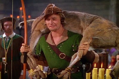
The Forestman, as his name suggests, is based on the Forestmen faction from Castle. They were released in the late 1980s, heavily inspired by the stories of Robin Hood and his Merry Men. Indeed, this guy looks to be the famous outlaw himself. He's got a very Errol Flynn look to him -- it's not  perfect representation but it covers all the important details like his beige collar. The belt in particular is spot-on! I love Lego's pop-culture tribute, and it's cool to look back and see that they've pretty much been doing it since day one of the Minifigures.   

The Forestman comes with three accessories -- a bow, a quiver full of arrows and a feathered cap. The only other thing I think it should have (realistically) included is a sword, though I've got enough of them lying about the place that sourcing one shouldn't be a problem. However, in an ideal world it would have also included a dead deer, to replicate this iconic scene

My main disappointment with this minifigure is that it didn't spark off a re-invention of the Forestmen. Castle has been a little bit all over the place in the last few years; the 2013-14 had some great sets, but the Kingdoms theme that had been running for a few years prior didn't really grab me. It seems 2015 will leave us without a medieval-oriented theme, which is a real shame.  

Perhaps even more sadly, Minifigures series 1 & 2 don’t seem to have been released in Australia. You can still track down most of Series 2 at a (somewhat) reasonable price, but even the crappiest characters from Series 1 are now outrageously expensive. I’ve seen Forestman here go for around $50AUD – but the Zombie is the worst, now usually selling for about $60AUD. It’s a bit of a shame that Series 1 was such a limited run, because it had a lot of cool characters who are now priced out of many people’s budgets. Still, the Forestman is a great minifigure, and worth adding to your collection if you spot him for a reasonable price.  


Wednesday, 24 September 2014

DC Universe Classics: POWER STRUGGLE 2-pack -- SUPERMAN VS PARASITE (Part 2 of 2)


LINE: DC Universe Classics

YEAR: 2010
COMPANY: Mattel

THE BACKGROUND
In my review of the other figure in this set, Superman, I explain in more detail how I ended up buying this 2-pack, so I won’t repeat them here. Suffice to say, I bought it for Supes and Parasite was a nice bonus.

Parasite is a villain I’m not terribly familiar with, beyond his appearance in Kingdom Come. Even there he’s not around for long, but his actions have some pretty serious repercussions for the rest of the story. However, Wikipedia tells me that Parasite has been plaguing Superman since the 1960s, and there have been a few different Parasites over the years. This particular figure, as you might guess from its 1990s/2000s stylings, is based on one of the more modern incarnations.
Parasite is dangerous because he can absorb energy from people – including superheroes – and use it as his own. While pretty handy in and of itself, it’s since been expanded on to include abilities like shapeshifting, absorbing memories from victims and other related paraphernalia. For a while he even posed as Lois Lane, and learned Superman's identity was Clark Kent.  

While normal people tend to die when Parasite drains their life force, Superman is turned into a regular, powerless human. The effects are temporary, but it means Parasite now has the powers of one of Earth's most powerful heroes -- you can see how that might be a problem.
SCULPT AND ARTICULATION

This figure was originally released as part of the DC Superheroes line, a precursor line to DC Universe Classics. Like a few other DCSH figures, it got re-released as part of a multi-pack. The reasons for this are likely two-fold – one, to allow people that missed DCSH to get a Parasite, and two, to get some more use out of his moulds. I daresay there was an awful lot of unique (and therefore expensive) tooling that went into Parasite – about the only thing that looks reused from other figures is his crotch piece and possibly the “T” sections of his hips.   
Given that he was designed by the legendary Four Horsemen, it was pretty much a given that Parasite was going to have a fantastic sculpt. OAFE’s review specifically points to Ed McGuinness’ art as the jumping-off point, and I don’t know enough about the character to disagree. But it certainly makes sense; when this figure was first released c. 2006, McGuinness’ artwork was quite prominent, in part thanks to his work on the Superman/Batman series that was out at the time (which is well worth a read, I might add. It struck a good balance between the more serious and camp elements of both characters).

However, while McGuinness’ work is quite cool, it’s also quite cartoony. Some of that has been smoothed out in the transition to action figure form, making something that’s inherently silly (a purple monster in a white leotard) and giving it a convincing real-world look, while not losing its comic-y qualities. This is something that has been seen a lot in the Four Horsemen’s Masters of the Universe Classics -- a series I certainly can't afford to collect, but can certainly admire from afar.
His face reminds me of Flukeman from The X-Files, though Parasite is a bit toothier. Flukeman was also a parasitical creature, so this may not be accidental. Other touches have been added to increase his inhuman appearance too -- obviously there's the inhumanly muscular physique, but there's also his three-fingered, grasping hands, and his Ninja Turtles-looking feet. Then there's all the little notches carved all over his body -- these seem to be muscle detailing, but could just as easily be scars. There's some great attention to detail on this figure -- I love it!
Parasite's "correct" pose is slightly hunched over via the ab crunch and bent knees; stand him straight up and his head is looking directly to the sky. The only real downside about this is that it makes him a lot shorter than Superman -- I'm not sure whether this is comic accurate, but it does kind of feel like he should be bigger than Supes.

Articulation is more or less standard for the DCUC line, but it has been slightly modified due to his monstrous physique.

*cut neck
*ball-jointed shoulders

*swivel biceps
*hinged elbows

*cut wrists
*ab crunch

*cut waist
*t-hinged hips

*cut thighs
*hinged knees

*rocker ankles
His shoulders are a little loose, but not so much that they won't hold poses. Additionally, be careful when you're moving them around. I'm not sure if it happened in-box or after I'd opened it, but I noticed that a small chunk of plastic on the shoulder had actually been gouged out, presumably by the shoulder socket and the shoulder ball meeting at an angle they weren't meant to. You can make it out in this pic.


ACCESSORIES
Parasite (and the two-pack as a whole) comes with no accessories, but I don’t think he’s known for any in particular.

PAINT
Parasite is cast in purple plastic, with the appropriate details coloured in as necessary. They’re all very clean, with little to no slop. His eyes are yellow, and his teeth are actually painted with two different colours. The back row looks to be orange and yellow, with white on the top row -- then the whole thing's been given a glossy finish, as have his lips. It looks great!     

There’s also lots of black shadowing. For the most part this is well-done, and makes what could have been a purple lump of plastic look much less “toy-ish” than it otherwise might. There are a few areas where it’s a bit uneven, but no major issues. 
His white harness-style outfit has a couple of chips in the paint, and overall I think it has the problem that most white-over-dark-colour paints have – the brushstrokes show and as a result the colour isn’t quite flat and even. This is accentuated by there apparently being a black wash over the top in certain places too. But though it doesn’t exactly match with the box art, I still think it works for the most part. Having it all perfectly painted stark white would probably look a little odd in contrast to the more “realistic” paint detail that’s on him elsewhere.

OVERALL
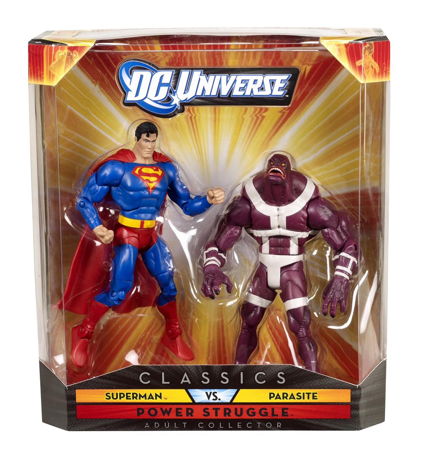
The main issue I have with this set is that the two figures don’t gel with one another terribly well. Obviously the characters have a long history together, but there are some clear stylistic differences. The Superman in this set is elegant in his simplicity; the toy evokes the image of what most people think of when you say the word "Superman", irrespective of the era you originally knew him from.   
Parasite, by contrast, is covered in lots of little details which look awesome but also make him look like he’s from a completely different toyline. Add in the drastic difference in height and things are definitely accentuated. But I think a better pairing would have been 1990s long-haired Superman, as long as the Big Blue Boy Scout was painted with some heavier shadows.

But this doesn’t change that Parasite is a great figure on his own. Though the 1990s-esque vibe will switch some off and of course date it to a particular era, but it’s just a whole lot of fun, and a great monster toy in its own right. As something that I expected to get as an extra with Superman and simply sell on eBay, I’ve been thrilled with the outcome. The two figures in the Power Struggle 2-pack come highly recommended – maybe just not together.
 

Sunday, 21 September 2014

DC Universe Classics: POWER STRUGGLE 2-pack -- SUPERMAN VS PARASITE (Part 1 of 2)

Pic from Amazon.com
LINE: DC Universe Classics
YEAR: 2010
COMPANY: Mattel
Earlier this year, Mattel announced that it was re-releasing several of its DC figures in Super Powers- themed colours and packaging – a tribute to Kenner’s seminal 1980s toyline.  Though I didn’t have the Super Powers line as a kid, the announcement pushed my nostalgia button firmly – especially with the Jose Luis Garcia-Lopez-inspired artwork! If it looks familiar, that’s not surprising – DC is currently using his work on quite a lot of merchandise.
I wasn’t interested in the Riddler, Gold Superman, Mr Mxyzptlk or the Collect-and-Connect Kalibak, but the core trio of Superman, Batman and Wonder Woman rapidly became must-have items. It’s not hard to find figures of these core three, but it’s hard to find three that look cohesive together – well, ones that aren’t based on the New 52, anyway. But as the release date started to grow closer approach I began to wonder whether I could justify the not inconsiderable price tag.
“Hmm…the packaging does look nice, but it’s going in the bin anyway…this kind of blue Batman isn’t really my favourite style of Batman…Wonder Woman isn’t going to include her axe and shield…”
Deliberations such as these went on for a few weeks, but I eventually decided I’d be better off looking up earlier releases of these figures, and comparing costs. If older versions were cheaper, I’d go with them instead. Superman was surprisingly easy to find, and this 2-pack was the most cost-effective method for getting him – and as far as I can see, this is identical to the figure that’s been re-released for the Super Powers tribute, bar the colouring. And he came with Parasite, too – SCORE!

SCULPT AND ARTICULATION
If I am not very much mistaken, I don’t think there was ever really a proper “Classic” Superman in the main series of DCUC. Not long before the debut of DCUC, Mattel had done a series called DC Superheroes, a line that focused almost exclusively on Superman, Batman and their respective allies and rogue’s galleries. For the most part, the two lines gel with one another, and have a similar aesthetic. But part of what killed that initial line was endless variations of Superman and Batman – they’re both awesome characters, but most people are not interested in owning 32903750923 different versions of them.
Hence, when DCUC came around, there was no Superman until wave 6 – and that was 1990s Superman, complete with long hair. It was a cool look, but it instantly marked it out as a Superman of a specific era. So a more “iconic” Superman never got a release in the main line, but there were a couple that showed up in a related 2-pack and 5-pack – and then there was this one, cobbled together from the existing “large male” DCUC body and the Eradicator’s head.
The DCUC line tended to try and replicate how a character looked on the page, rather than worrying too much about “realism”. That yielded some mixed results from time to time – some costumes work better in print than in 3D – but it’s the right call on this occasion. Superman has always been a big guy, and this figure maintains an appropriately exaggerated physique.

Somewhat curiously, he’s been sculpted without a smile. Without it, it’s actually a bit difficult to tell which artist’s work this is based on – there’s arguably a little of Jose Luis Garcia Lopes in there, but that still doesn’t seem quite right. In fact, the head is a little on the odd side in general. Front on, it looks great – maybe a little too thin at the sides, but definitely workable. From an angle, it tends to look a bit odd as the face is actually quite flat. This isn’t restricted to this figure – Wonder Woman has the same thing, and looking at one of the recent Masters of the Universe Classics toys, I noticed the same thing there too. So presumably it’s a Mattel house style thing, or possible a Four Horseman sculptural quirk.
The cape is also a little odd. The material is soft but sturdy, so I don’t really have any concerns about it rotting away, but it sticks out at the back quite a bit. Secured by a hole in his back, it’s fine from the front but looks odd side-on. From the back it works okay, though the lines are cut a little too deeply.

Articulation is standard for the DCUC line:
*ball-jointed neck

*ball-jointed shoulders

*swivel biceps

*hinged elbows

*cut wrists

*ab crunch
*cut waist

*t-hinged hips

*cut thighs
*hinged knees

*hinged ankles
The neck is technically a balljoint, but it's not super manoeuvrable. The shoulders are a bit restricted due to the cape, and the swivel biceps feel a little tight. However, these are pretty minor issues and none of the other joints gave me any problems at all. It was a welcome contrast to Hawkman. I've grown to like that figure a little more since I wrote that review, but he was extraordinarily disappointing and I was worried I've have a repeat issue.

Curiously, it’s kind of hard to get him into a good flying pose. I think this is partially down to facial sculpt, both hands being fists and the way the neck moves. It doesn’t bother me a lot, but I can definitely see it upsetting some fans.   

ACCESSORIES
Superman (and the two-pack as a whole) comes with no accessories. Some Kryptonite, Fortress of Solitude Crystal or a miniature Bottle City of Kandor would have been nice, but really he doesn’t need anything.

PAINT
Most of Supes is just cast in dark blue, and then paint is applied accordingly. There are no major issues with slop, but it does seem odd that – his hands also seem to be cast in blue, and painted in skintone. I’m not really sure why they went with this option rather than just casting them in skin colour, but I assume it’s a costing thing.  

As a nice little touch, his hair features little light blue highlights, just like in the comics.

The entire DCUC range relied heavily on parts re-use, with a great deal of the main characters just reusing one body or another. The upside of this was that the line was able to pump out a number of B-, C- and D-list characters that were unlikely to get an appearance elsewhere.  The downside is that reusing bodies tend to give certain characters odd quirks. In Superman’s case, there’s no sculpted line where his neck gives way to the suit – it’s just painted on. I might complain about this elsewhere, but the paint line is neat, so it works well enough.   

A few tampographs are used. The back of the cape has a yellow “S” symbol tampoed on – as all Superman capes should – and the chest logo is tampoed too. Additionally, the eyes have been tampoed on. They’re pretty much even, which is great. Too many action figures have an awkward or cross-overed look.  
 

AVAILABILITY
I bought this two-pack brand new from a third-party seller, for what I assume was just above retail price. eBay and Amazon seem to indicate you’re in for a difficult and/or expensive time if you want any of the other DCUC Supes figures. However, at time of writing the Super Powers figures were still in stock at MattyCollector.com

OVERALL
My very first action figure was a Superman one. Working from an approximate timeline, I don’t think it was a Super Powers figure – I’m a little young for that – but rather from ToyBiz’s DC Superheroes series. It followed only a few short years after the end of Super Powers, reused many of the same moulds and had a very similar design aesthetic, but was never quite of the same standard. Sadly, he lasted only a few months before one of the knee joints gave way, and for whatever reason he was never replaced. It’s easy to remember how much we enjoyed a toy; it’s more difficult to remember how poorly some of them were made (and I have to say, I don’t remember the Kryptonite ring at all)!

So from a nostalgic perspective, this Superman had quite a bit to live up to. He’s not quite everything I’d like from a figure of Superman, but for this price point, he’s still pretty darn good. I don’t have Hot Toys kind of money at this point, so this guy will do nicely.

Part two coming soon – we take a look at Superman’s boxmate, Parasite!

Saturday, 20 September 2014

Minifigure Week! Day 7: Pharaoh (Series 2, 2010)


Minifigures are one of my favourite things about Lego – and series 12 is on the way (possibly even out in your country by the time you read this). So to celebrate this upcoming release, every day this week, we’ll be looking at a different minifigure from the series that have come before. This is by no means a comprehensive overview – nor even necessarily a look at my favourites – but it’s an example of some of the unusual figures the line has produced since it debuted back in 2010. So on the final day of Minifigure Week, we take a look at the Pharaoh all the way back from Series 2. 
“That spot looks just right for a pyramid!”

This Pharaoh of ancient Egypt woke up in a museum one day, and he’s been a little confused ever since. He doesn’t know how or why he’s in the modern world, but it’s definitely taking some getting used to! He’s not used to taxi cabs and supermarkets yet, and he can’t figure out where all the sphinxes and crocodiles have gone, but he’s trying to make the best of things in his strange new circumstances.

First off, the place is definitely going to need some pyramids…so with the help of his friends at the museum, the Pharaoh is taking matters into his own hands and using all the bricks he can find to build his own. Now he has a little piece of home to share with everyone!

Back in 2011, when I was in a full-fledged stage of Minifigure obsession, I bought a complete set of Series 2. It was expensive, but nowhere near what you’d pay for a full set these days. And somewhat foolishly, I also passed up the opportunity to own a complete set off Series 1 for around $150AUD. Again, expensive then, but ridiculously cheap now…sigh. As David Sedaris has said, it's the things you don't buy that stick with you the longest. But enough of past regrets and onto the present.  

I love Ancient Egypt, so the Pharaoh was a must-have figure as soon as I found out about him. I always wished Lego would do something Egyptian-themed when I was a kid, but I missed the late 1990s sets, and I'd have to wait until much later for my wish to come true -- but I'll expand on that in a forthcoming review.  
The paintwork on series 1 and 2 was good, but viewing the sets in comparison to series 3 onwards, it's clear that the designs were a little more basic back then. In the case of the Pharaoh, this isn't really to his detriment, as he's wearing relatively little and doesn't need a whole lot of detail. He's been given elaborate eyebrows to simulate kohl eye makeup, which was very common in ancient Egypt -- even the gods wore it. His cheekbones are also unusually pronounced -- is he meant to be one Pharaoh in particular?
Aside from this, the only detail I would have added is feathers in the wings on his scarab beetle chestpiece. 

He comes with two accessories: a golden Nemes headdress, reminiscent of Tutankhamen and a golden staff with a cobra-esque snake moulded around the top. A crook and flail would have been better, but it works well as a possible cheeky reference to the story of Moses and Pharaoh's magicians too. 
The Pharaoh is an excellent minifigure -- one of my favourites from the entire Minifigures range line. It's just a bummer that he's relatively expensive for new collectors to track down. There were some really cool figures in the first 2 series of minifigures, and it's unfortunate that they never made it all the way to Australia. Also, he makes a nice companion for the Classic Alien. Since they built the pyramids together, after all.  


As Minifigure Week comes to an end, I would be remiss if I did not thank Brickipedia. One of the best Lego sites on the web, this place has a tremendous amount of content on Lego both new and old. Writing some of this week's installments without it would have been near imposible!