Showing posts with label 2012. Show all posts

Wednesday, 7 January 2015

Masked City Hunter Predator (1/4 Scale)


Company: NECA
Year: 2012
Series: Reel Toys/Predator 1:4 scale

THE BACKGROUND

Predator 2 is much maligned, and there are some good reasons for that. While it has some good points (Danny Glover, Bill Paxton, the Predator’s design), it feels a lot cheaper than the original, even though they spent waaaay more on it. But nonetheless, I’ve got a soft spot for it – probably because I watched it before the original.   

Since 2013 I’ve bought a few NECA Predators, so naturally I wanted a City Hunter too. But it has been an exceedingly difficult thing to achieve. NECA has been pumping out Predators for some years now, covering a whoooole buttload of them. Unfortunately, distribution has not been equal across the board. The City Hunter – namely, the masked version of him – has been particularly difficult to find, in spite of having two separate releases. And if you can find him, you’ll be paying far more than you should. So it was actually easier and more cost-effective to get this ¼ scale version – thanks must go to my wife for getting it for me for Christmas!   

THE PACKAGING

This guy came in a giant window box, which echoes the colour scheme of some of the smaller figure blisters. In terms of colour scheme and design, it’s also fairly similar to some of the Predator 2 posters. It’s a great-looking box, and it’s a bit of a shame it’s not really collector-friendly – it would be great for storage!

Unfortunately though, the plastic window cracked quite easily, and removing him from the box means destroying a lot of the elements that hold him in. There’s not really any space wastage but there are a whole bunch of twist-ties that need to be removed when you take him out. I would strongly suggest that you have a pair of wire cutters handy. Ordinary scissors may not be enough to get it done and you don’t want to damage anything via twisting and pulling.    

SCULPT AND ARTICULATION

First things first – the City Hunter is massive. I'm never going to pretend I'm the world's best toy photographer, but this guy was particularly difficult to get a good, well-lit shot of, just because he's so big! Time for me to get a proper (large) lightbox.

That size translates into weight. He’s got a good amount of heft behind him, too. The sculpt is by Kyle Windrix, who’s done a huge amount of great stuff for NECA. It’s top-notch, capturing all of the essential details – at least to my eye. I can’t find a clear photo of the costume from the movie, so I can’t vouch that it’s 100% screen accurate, but NECA tend to be quite good with these sorts of things.  

Instead of going with the painted netting that features on the 8” figures (which can be pretty mixed in its execution) this figure uses plastic netting. It’s somewhat similar to the netting you sometimes see on bags of fruit, though thinner and with smaller gaps. It’s a good alternative, though I wonder if fabric – like on the Hot Toys version of the City Hunter – might have been better still. You’ll want to be careful with it. I’ve seen a spot on the right arm where it looks to be weakening, but I’m not sure whether it was already like this before opening or not. No breaks yet, but I’m expecting some, which is annoying for a figure that cost $140AUD.

As for articulation, here’s what he’s got:

*Ball-jointed neck? (It only moves like a swivel though)
*Swivel-hinged shoulders
*Swivel-hinged elbows
*Ball-jointed wrists
*Ball-jointed hips
*Double-hinged knees
*Ball-jointed ankles

The motion of the hips is pretty restricted, due to the loincloth and associated leg armour, though you can figure out workarounds. As always with NECA toys, be careful when you first move the elbows and knees – some joints will be tighter than others. Also, it seems like there’s no motion in the waist, though it’s clearly a separate piece to the hips. If it does loosen up, I’ll update this review later.  
I was recently reading a review of the NECA ¼ scale Batman, and it mentioned the figure (and indeed, pretty much all recent NECA ¼ scale figures) were very top-heavy – so much so that it was very difficult to get it to stand. Though I was able to get him standing relatively easily, I was always a bit hesitant in letting him stand on his own, as I wasn’t sure if he’d stay balanced. He’s pretty heavy, so a fall means he’ll hit the ground hard. Investing in a stand seems like a good idea if you plan to keep him displayed full time. 

One thing to note: the figure comes with no instructions – there’s nothing terribly complex that you shouldn’t be able to work out, though. My main concern was in relation to the Plasma Caster, which I mention in the accessories section below. 

PAINT

Broadly speaking, paint is off a similar high quality to the smaller 8”-scale figures, but the downside is that the minor errors you wouldn’t notice on the smaller figures are greatly amplified and much more noticeable. For example, where the left wrist meets the left hand is a little wishy-washy – there are a few similar spots dotted about the figure; incorrectly painted dreadlocks, slightly sloppy gloves on the hands etc. With so much sculpted detail, it’s not really surprising that there’s the odd mistake or two. This isn’t Hot Toys quality, but granted, you’re not paying Hot Toys prices. Overall, it’s impressive and well-executed, with some room for improvement.   

ACCESSORIES

City Hunter comes with three accessories – an extra left hand (to hold the Combi-Stick), a Smartdisc and a Combi-stick. His plasma caster is also a separate piece in the box, but it clips straight into the rail on his left shoulder – just be careful when you slot it in; the rubber of the rail will stretch and hold, but the plasma-caster stand is a little more fragile.

Out of the box, the hand designed to hold the combi-stick is a little too tight. You’ll need to ease it in gently, adjusting the fingers one by one as you go. Don’t force it, as you don’t want to break the hand or the combi-stick. Speaking of which, the real star accessory is the combi-stick – almost as tall as the Predator himself, it’s fully extendable.

The smart disc is really cool to have – particularly since it plays a fairly important role in the movie itself – but it doesn’t actually stick into the holder on his leg properly, and it’s tricky to make stick on his (right) hand.  

Three accessories is a lot for a NECA figure (even one as big as this) but I think it would have been good if you got a right hand that could hold the combi-stick, as well as the skull and spinal cord that the Predator takes from Bill Paxton’s character. That would have let people really re-enact this scene.
   
AVAILABILITY

I'm lead to believe that the 1:4 Scale Predators are released on a fairly limited basis -- about 5,000 figures worldwide each. Nonetheless, most of them still seem to be reasonably easy to pick up for retail price. You might have to pay a premium for postage, but that should be about it.   

OVERALL

Though wildly impractical in terms of storage around the home, the City Hunter is a great figure. I’m very satisfied with my purchase, and provided I’m careful with it can’t see there being major issues in the future. I don’t see myself venturing any further into NECA’s ¼ scale line at this stage, due to expense and the sheer room they take up – though in about a year’s time I may be dipping my toes in again. Now I just need to find an 8” one at a reasonable price, and for NECA to release a Danny Glover figure too.


Sunday, 28 September 2014

Storm Shadow v44 (Ninja Force)

Company: Hasbro

Year: 2012
THE BACKGROUND

Some of you will remember that back at the beginning of September, I took a look at G.I. Joe’s Ninja Force theme from the 1990s. I mentioned there that I had never owned the Ninja Force iteration of Storm Shadow, and harboured some regrets about that. Well, shortly after writing the article, I came across something online that would plug that gap!

A couple of years ago, Hasbro released a few G.I. Joe figures to Dollar General (and a few other discount retailers) – an American discount chain which, to draw a comparison for Australian readers, seems to be more or less analogous to Kmart. They were seemingly used to get non-movie versions of some core characters (like Cobra Commander and Snake Eyes) into circulation at a cheaper price than normal. They’re a bit of a throwback to older-style Joes, with minimal accessories and retro paint schemes. So in today’s review, we take a look at the Storm Shadow that was released in this line – a modern tribute to the Ninja Force version!

SCULPT AND ARTICULATION
This was the 44th version of Storm Shadow that’s been released over the years, so you’d hope they’d got it right by now! Fortunately, they’ve got a good thing going with this figure.
The toy is more of a paint tribute than a sculpt tribute to the Ninja Force Storm Shadow. He looks like he’s wearing a gi, the traditional martial arts outfit. The original did too, but this time all of the extra details have been discarded – the grenades and other paraphernalia are all gone. They're not really missed; though they were cool on the original figure, it's hard to believe that ninjas would have been rocking around with bright flashy gold objects on their chest.
Most of him is cast in a hard black plastic, but the lower legs and feet are cast in slightly softer white plastic – not quite as soft as the hood, bandolier and belt, though. In a nice touch, he’s wearing tabi, traditional ninjutsu split-toe boots. You can even see the notches from his toes through the “fabric”.         

As for articulation; well, G.I. Joe's articulation was well ahead of its time when it debuted in 1983, and was well ahead of the curve for much of the 1990s too. But how has it held up in 2014?  Well, he’s got the following joints:
*Ball-jointed head

*Swivel-hinged shoulders
*swivel-hinged elbows

*swivel-hinged wrists
*swivel ab crunch

*ball-jointed hips
*double knees

*swivel-hinged ankles
Pic from YoJoe.com
Swivel biceps would have made it easier to get him into a good arrow-shooting pose, and also let him hold the katana with two hands – but whoa! That’s still a buttload of articulation for such a little guy. There are a couple of quirks that are worth pointing out though. Firstly, he doesn’t actually have a waist joint, though the hips and swivel ab crunch compensate for some of this. Also, you’ll find the hips don’t turn outwards in quite the way you expect. Perhaps most strangely, his wrists/hands are articulated differently – on his right hand, the joint cuts through the palm of his hand, which is pretty standard. The left, by contrast, cuts the joint sideways through the hand. These points don’t detract from the figure overall, but just make sure you manage your expectations accordingly if you’re from a more Marvel Legends-style background.    
Though it might have been nice to have a “true” update, it does mean the look is now a little more plausibly Arctic camo-looking, as opposed to OTT 90’s X-Treme styling. This is a positive thing, even though I'm a big fan of the original -- I can once again say without irony that I definitely want to own a real-life version of this outfit.  

ACCESSORIES
Storm Shadow comes with only three “real” accessories – a katana, a compound bow and a Cobra stand. All are cast in matte black plastic. The Cobra stand is a nice addition – but the pegs seem slightly too big for the holes in his feet. It’ll fit, but it’ll also look like he’s levitating slightly above the stand too.

The sword was little warped, possibly from being held in his hand in the display box, but this should be fixable with some hot and then iced water. Neither stays in his hands very well, but it’s nice that they’re there nonetheless. Ideally, what I would have liked to see was the sword and a sickle cast in white like the original figure, but the compound bow (a tribute to his v2 design) is still pretty cool.

The hood, the bandolier and the belt are all removable too, but this doesn’t qualify them as true accessories in my book.   
PAINT

There’s not a lot of paint, but it’s a good standard for the scale. My main gripe is that his hands are noticeably darker than his face. Also, I think the expression should have been made to look a little angrier – the expression works for a Joe-aligned figure, but this is apparently meant to be villainous Storm Shadow, so it seems a little too neutral. Still, he doesn’t sport any Cobra logos, so you can just use him as a Joe if you’d prefer.   

OVERALL
Storm Shadow is the first G.I. Joe I’ve bought since 2004, so I didn’t really know what to expect. The line has gone through many twists, turns and reboots since I was a kid, and I haven’t really kept up to date with what’s going on. But Storm Shadow -- and specifically his Ninja Force version -- remains a perennial favourite, so it was always going to be hard for me to be anything less than "very pleased" with this figure. He’s not perfect, particularly considering the price I paid for him (definitely more than retail), but Storm Shadow is still a very worthy addition to the collection. Perhaps more importantly, as with Raphael, it’s a 20+ year omission on my part rectified. 


    The Lupine Book Club is now on Facebook! Just click here

Thursday, 18 September 2014

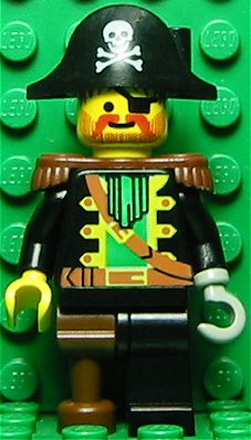
Minifigure Week! Day 6: Pirate Captain (Series 8, 2012)

Minifigures are one of my favourite things about Lego – and series 12 is on the way (possibly even out in your country by the time you read this). So to celebrate this upcoming release, every day this week, we’ll be looking at a different minifigure from the series that have come before. This is by no means a comprehensive overview – nor even necessarily a look at my favourites – but it’s an example of some of the unusual figures the line has produced since it debuted back in 2010.  Today, we look at the Pirate Captain from series 8.

“Yarr! Don’t ye know who I be? And if not, do ye have any suggestions?”

A real pirate is a merciless, rotten son of a sea dog, and that’s exactly what the Pirate Captain aspires to be. He certainly looks the part with his rugged eye-patch, hook-hand and peg-leg, but he has to admit that he’s had a few hiccups along the way.
 
First of all, his ships keep sinking. No matter whether it’s a man o’ war or a dinghy, any vessel capsizes within five minutes of him coming aboard. Also, he gets seasick really easily – sometimes just a picture of the ocean is enough to set him off. Worst of all, he’s having real trouble coming up with a piratey name. All the good ones – from Ironhook to Brickbeard – seem to already be taken. If he can just come up with a name to strike fear into the hearts of landlubbers everywhere, the Pirate Captain figures the rest of his problems will solve themselves!

--LEGO.com biography

Pirates. One of the expansive and popular themes the company has ever released, Pirates dominated a good chunk of my pre- and primary school years. It is still something of a matter of sadness for me that I never owned the incredible Pirate Ship – though I did own two different versions of the pirate hideout, both of which were incredible.  

But since the late 1990s, there’s been precious little Pirates stuff released. There were lots of Pirates of the Caribbean sets in recent years, which some might argue filled that niche, but it just wasn’t the same.  A Brickmaster book, a few sets here and there, a handful of figures and the subject of today’s review, the Pirate Captain has been all that Pirate fans have been able to get their hands on for years now. 
Still, 2015 looks like it will have something exciting happening on the Pirates front, and one can only hope that means we’re going to see more in future too. In the meantime, let’s look at the Pirate Captain from 2012.

Series 8 was one that I almost completely missed. I wasn’t in a very good way at the time of release and Lego was low on my list of priorities. By the time I snapped back a little, series 8 and 9 had all but disappeared from the shelves and the (mostly disappointing) series 10 was about to drop. This doesn’t bother me too much, but I want that Diver! If anyone’s keen to help out, let me know.
The Pirate Captain is just an all-round great figure. He looks something like my mental image of Captain Hook – he’s a gentleman’s pirate, in contrast to the more stubbly Captain Redbeard. His moustache has been neatly waxed, his red coat looks dapper and his neck ruff is impeccable.  He's got a leather belt, and a matching strap slung across his chest -- presuably this could be used to hold a blunderbuss or two, Blackbeard style.

The Pirate Captain with some of my old early 1990s Pirates


Gold is a recurring theme here -- the skull and crossbones on his hat is emblazoned in gold and he even has a little gold tooth in his mouth too. I like to imagine that this is kind of his ceremonial dress, rather than just his everyday getup -- it's for when he needs to intimidate the enemy and inspire his men, pre-batttle, rather than when he's actually fighting.  

The Pirate Captain comes with one accessory – a golden cutlass – but he also features a golden hook hand and a brown peg leg., so that kind of balances the accessory count a little. You don’t really need anything else, but if he was going to have another, one of the old parrots would have been cool. Sadly I couldn't find any of my old ones.
 

Captain Red Beard with Skull
photo from Brickipedia
The old Pirates minifigures had amazing paint work for the time, so even with all the time past, there was still a lot to live up to -- and given my childhood attachment to the Pirates franchise, my expectations were exceptionally high. But he definitely delivers. Though he’s not likely to become as iconic as Captain Redbeard (see left) from ye olden days of the Pirates line, he's fantastic. Roll on 2015 and more Pirates!  

Wednesday, 17 September 2014

Minifigure Week! Day 5: Intergalactic Girl (series 6, 2012)


After a few hitches at my end, Minifigure Week is back on. Sorry for the delay guys!

Minifigures are one of my favourite things about Lego – and series 12 is on the way (possibly even out in your country by the time you read this). So to celebrate this upcoming release, every day this week, we’ll be looking at a different minifigure from the series that have come before. This is by no means a comprehensive overview – nor even necessarily a look at my favourites – but it’s an example of some of the unusual figures the line has produced since it debuted back in 2010.  Today, we look at Intergalactic Girl from series 6.
“No thanks needed. I’m just doing my part to make the spaceways safe!”

The name of the Intergalactic Girl is cheered by life forms on every inhabited planet, moon, space station and asteroid in the cosmos. As an interstellar adventurer, she and her daring outer-space exploits are the stuff of legend throughout the known universe, and even a few of the unknown bits, too.

With nothing but a quasar zapper, a pair of antigravity boots and a can-do attitude, the Intergalactic Girl has single-handedly saved solar systems from black holes, rescued civilizations from cosmic conquerors and captured entire fleets of Blacktron battle cruisers. She never has time to stay for the celebrations afterwards, though, because there’s always another space crisis waiting just around the next nebula!
 
Since the blind-bagged minifigures debuted, there have been quite a few Space Police-esque and Blacktron figures released. Starting with the Spaceman in Series 1, similar characters have popped up every few series, just quietly lurking in the background.
While the Space theme yielded many great sets in the 1980s and 1990s, there hasn't been a lot going on in the last few years – a Space Police theme in 2009 and Galaxy Squad in 2013 seem to have been about it. Galaxy Squad had some cool ideas and some exceptional higher-end sets, but I can’t help but feel that it never quite lived up to its full potential.

Intergalactic Girl wears a pink spacesuit and helmet. I’ve got mixed feelings about this; I probably would have liked her a lot more if she was wearing a more generic colour such as grey or blue, but I can appreciate that realistically this figure is being pushed at little girls more than it is at 29-year old male toy collectors.

Paint is minimal -- she's got all of the standard modern Space trappings, like the logo and little detailings on her suit. Her face has been done with the standard "sassy" expression, with the main difference being that she has silver lipstick rather than the traditional red. Her sleeves are both cast in slightly darker colours than the torso piece, matching the printed detailing on edges of the torso and legs.

Her ray gun ("quasar zapper") is the same as the Classic Alien, but with a blue laser blast instead of a green one. This accessory has been reused multiple times throughout the minifigure sets, and I’m sure we’ll see it again in future series too.
Her main distinguishing feature from other Space figures is her hair – while all of the male figures have removable helmets, she is the only one with an interchangeable hair piece. So I think we can safely conclude that all men in Space Police are bald, or shave their heads. I didn’t plan to turn this into “Jane Fonda week” in addition to “Minifigure Week", but though Intergalactic Girl is sufficiently generic that you could probably point to a few different sources, she becomes a bit of a toned-down Barbarella once her helmet is removed and hair attached.

I probably don't sound all that enthused about this figure, and I think that would be fair -- I’m not really over the moon about Intergalactic Girl (HA!), but she’s not bad by any means. Her value for me is not really as part of the Space theme itself, but as some kind of conscious retro-futuristic throwback to 60s or 70s sci-fi. A fun, if non-essential addition to the collection.


Monday, 8 September 2014

Minifigure Week! Day 1: Classic Alien (Series 6, 2012)


Minifigures are one of my favourite things about Lego – and series 12 is on the way (possibly even out in your country by the time you read this). So to celebrate this upcoming release, every day this week, we’ll be looking at a different minifigure from the series that have come before. This is by no means a comprehensive overview – nor even necessarily a look at my favourites – but it’s an example of some of the unusual figures the line has produced since it debuted back in 2010.  Today, we look at a figure from series 6 -- the Classic Alien.

“The truth is around here somewhere!”

The pyramids? These guys built them. The microwave? They invented it. Elvis? Got him right up there on the mothership. All of those totally out-there conspiracy theories about little gray men from outer space are absolutely 100% true – or at least, that’s what the Classic Alien believes.


You see, he’s been out of communication with the home planet for a while (thanks to that whole Area 51 thing), and all of his recent news has come from what he’s read in supermarket tabloids and seen on the internet. Those reporters and bloggers really seem to know their stuff, so he figures they must have the real scoop. After all, if it’s not all true, then what’s he even doing here?

-- Lego.com biography

The Grey (or "the Gray", for my American readers. Possibly the most ubiquitous image of a possible extra-terrestrial doing the rounds today, thanks in no small part to Whitley Strieber’s Communion.

Fortunately, this particular alien is a little less disturbing, and more on the cutesy end of the spectrum. Considering my youthful (and partially ongoing) obsession with UFOs and the possibility of extra-terrestrial life, it was a given that I’d pick this guy up. Indeed, I would like to pick up several, and build a miniature invading force of them. Also, I need a Lego Pyramid and Lego Stonehenge built, so they’d be helpful for that too. But nowadays they’re a wee bit more expensive than when they were first released (though not much more!), so I’d best restrain myself.  

The figure itself is pretty basic. He's cast in grey, and seems to be wearing a slightly darker grey loincloth -- which is the same grey his hands are cast in, too. He's also got some grey detailing printed on his chest to him that emaciated look that seems to be common in their depction. Presumably he doesn't need to wear clothes, or they just haven't given him any at Area 51. That's not being a good host at all!


The Classic Alien comes with one accessory, which can be split into two – a ray gun with a glowing green “shot”. He’ll overbalance when the shot is inserted into the gun unless he’s on his stand, but I tend to display him without weapons. As with all other minifigures, he also comes with a basic black stand.


Minifigures with non-standard heads are a bit of a mixed bag. Most of The Simpsons series look fine, but the simplicity of the Lego look is something that’s a big draw for me – how much can you do with such a simple aesthetic? A whole buttload, it turns out. I guess Lego fans were all collecting designer toys well before the concept had even been developed. But I digress. In this particular instance, a modified head was the right way to go. One of my co-workers described it as looking “a little bit bootleg”, but I don’t think that diminishes its charm at all.

The Classic Alien is a great addition to the range, and a strong personal favourite. Hopefully we see more UFOlogy-related figures in future series!


Friday, 15 August 2014

April O'Neil (TMNT 2012)


Company: Playmates
Year: 2012
RRP: (See “Availability”)

BACKGROUND

April seems to be far and away the rarest of the TMNT figures out there. She currently resells online for a ridiculous price. She seemed to be pretty readily available when I first bought the four turtles just over a year ago – but while every other character from that first wave still seems readily available, April is nowhere to be found on shelves.  
Why is she so rare?

Well, the smart money is on the “girls don’t sell in a boy’s toyline” theory, and she’s just been produced in smaller numbers than the other characters. In turn, this makes her substantially harder to find. A lot of boys do go through a phase where they shy away from “girl’s things”, but I would strongly debate that “I hate Barbie” does not necessarily equal “I hate April O’Neil.” But here we move into deeper waters, territory that demands an article of its own. Onto the review!
SCULPT AND ARTICULATION

April’s sculpt seems to follow the animation model reasonably closely but this does mean that her proportions end up looking a little odd. Her legs are disproportionately large compared to the rest of her, and her head looks particularly small. Fine on film, not great when rendered in plastic. Given that the turtle toys look little to nothing like they do in the show (at least until the Battle Shell ones came out), I think it would have been fine to go off-model a little.  
Articulation is not great.

*ball-jointed neck
*swivel-hinged shoulders
*cut forearms

*swivel hinged thighs
I think the lack of elbows and knees is particularly disappointing. This alone will be a reason not to buy for many of you reading – and I don’t have much to say to try and dissuade you from that.  

ACCESSORIES

The one really great thing about April is her accessories. She comes with a particularly long bo staff – longer than Donnie’s – as well as a rack of weapons which includes the following:
*2 shuriken
*a bokken (wooden practice sword)
*a shinai (bamboo practice sword)
*a tonfa                                                                                                                                                                     
*2 round objects which I assume are some kind of smoke grenades.
I’ve seen one reviewer speculate that April’s weapons rack was actually meant to come with Splinter, and this is quite possible this is the case. It’s possibly telling that the picture of her on the back of the box depicts her sans accessories.   


PAINT

April doesn’t have a huge amount of paint, but she does have a lot more than most of the characters in the line. Most of it is pretty cleanly executed, though she somehow ended up with some black slop on the back of her head.  

Based on the box art, there’s one app that’s missing on the actual figure – her mouth. The finished toy just leaves it as the sculpted line. This is a minor detail, but I think it’s significant. April is quite cute and endearing on the show, but this lack of painted smile leaves her looking a little odd. I may end up fixing it myself, with an artline pen or something.  

AVAILABILITY
In theory, April should only set you back around $AUD15. But she’s difficult to find in-store, and you’re likely to pay a considerable premium for her if you get her from a third-party reseller. I don’t recommend this, for reasons which I’ll go into in the next section. Buying stuff just because “it’s rare” is often not a wise move when you’re interested in something purely for play value, rather than resale value, and this is a classic example.

It should be noted that I found her in a Hawaiian Wal-Mart while on holiday a few months ago, and have not seen her again since. So if you are still keen, and you’ve got the opportunity to buy her for a reasonable price, take it.

OVERALL
Though I’m pleased to have gotten April for the collection, she’s not actually that great a toy on her own merits. I like the figure and can overlook her shortcomings on the basis of wanting her to complete a set, but taken purely on her own merits she is an easy pass. Hopefully, now that Casey Jones has been released we will soon see a new version of April on the market, with improved articulation. I don’t know that one is on the way, but I would advise waiting anyway. She’s an integral part of the franchise and it’s a shame she hasn’t received better treatment in plastic form.  

Sunday, 13 July 2014

Playmobil Dimetrodon - 5235

Company: Playmobil

Theme: Dinos
Year: 2012

Price: See “Availability”
BACKGROUND
Today we look at a birthday present I received a couple of weeks ago that’s very dear to my heart – a Playmobil dimetrodon.

The dimetrodon is one of my favourite prehistoric animals. Living between 298 and 272 million years ago during the Permian period, it was an early precursor to mammals – though sadly, does not have any direct living ancestors today. As I’ve mentioned elsewhere, the dimetrodon is not actually a dinosaur. You could be forgiven for thinking so, as it does kind of resemble one and it’s often featured in books about dinosaurs, not to mention in amongst dinosaur toys – much like woolly mammoths and sabre-toothed tigers. I didn’t even realise it wasn’t a dinosaur myself until a couple of years ago! But it turns out they lived around 40 million years before the first dinosaurs walked the earth.
One of its most distinct features is the large sail on its back. Theories behind the sail have changed over the years; when I was a kid, one of the most common theories was that dimetrodon was cold-blooded and the sail was for heat regulation. But thought has shifted and it’s now more commonly thought to have been used as a mechanism for sexual display. But until we clone a couple of living specimens, Jurassic Park-style, we’re unlikely to know for sure. That means there won’t be a lot of discussion of “historical accuracy” – which is usually quite silly when it comes to dinosaur toys – though I’ll make sure some gets in there.  

THE PLAYSET


Playmobil playsets are new territory for me. I had a handful of Klickies as a kid, but never any of the playsets, and don’t remember having any great awareness of them either. It’s a shame really, as Playmobil is a great brand and often overlooked.  

This one is pretty simple as they go – it’s a sort of swamp scene – but it’s loaded with accessories with the dimetrodon itself serving as the centrepiece. 
Everything is placed on an irregularly shaped green base, which has a trench cut into it. What’s that for? Well, you have two choices – leave it empty and it can be a dried-up swamp. Or do as the box suggests and click the translucent blue piece into place. Then you’ve got yourself a simple stream flowing in and pooling. It’s so simple, but looks so great!

Then it’s time for the plants – two trees, a patch of leaves/moss/lichen, some reedy-looking things and a flowering bush. I’m no good with modern day botany, and much worse at prehistoric stuff. I couldn’t begin to tell you whether this is an accurate representation of a Permian Age swamp or not, so bear with my ignorance.  
One tree resembles a palm tree with two separate batches of leaves. Both have lots of fronds, which are created by inserting multiple leaf pieces into the top of the two trunks.


The other one looks more like some kind of dead Australian tree – it has two bits of foliage on it, which serve as mounting points for two creatures that we’ll get to shortly. The instructions and the box differ slightly as to how this tree should appear on the display, so I just ended up going with the image on the box – it better facilitates the angle of the vegetation. This tree can also be displayed standing straight up, or lying flat as though it has been knocked over.  
 

The moss is a single piece, nicely textured to break up the single colour. The reeds are cast in a slightly lighter green, in a flexible plastic. Particularly interesting is the flower bush. Each little flower needs to be put onto the bush separately, which was enjoyable for me but will no doubt annoy many children. The end result looks great though! 
 
 
Last but not least is a lilypad, complete with white flower on top. This is an excellent little piece, and you can easily set it “floating” on the river.  


In among the accessories are various fauna to populate the swamp environment – a snake, a scorpion, an enormous dragonfly and a flying lizard. The snake could be a contentious inclusion – evolutionary knowledge surrounding these guys is apparently a bit on the vague side. But consulting with Bob Strauss’ page here seems to suggest that they first showed up in the early Cretaceous, with some arguable precursors well before that. Gasp! POTENTIAL ANACHRONISM!! Scorpions though? A quick bit of Googling seems to suggest that we're in reasonably safe territory.


Now we come to the flying creatures. The first is a large dragonfly-looking creature – probably a Meganeura. Related to the dragonflies of today, they were absolutely massive in comparison to our modern specimens. It’s cast in a translucent plastic, with some slight tampographs. The only thing I don’t like about it is that it doesn’t actually glow in the dark, despite looking like it might. It can be mounted on a couple of different spots on the playset, but the fallen tree is the most logical place for it.
The second flying creature to mount on the tree is a Xianglong – or possibly a Coelurosauravus or Kuehneosaurus. The Coelurosauravus or Kuehneosaurus are probably a little more likely as they was first described in 1926 or 1962, in contrast to the more recently discovered Xianlong, which was first described in 2007.


All of these are species of gliding lizard that you’ll see decorating many a page in dinosaur books. These lizards are almost never the focal point of the images they’re in, but they still look really cool and help set the prehistoric scene. It’s a nice touch, and I don’t think I’ve ever seen a toy of one before. The Xianlong lived in the Cretaceous period, in what is now China, while the Kueheneosaurus lived during the late Triassic – and the Coelurosauravus lived in the Upper Permian, so we may have avoided the dreaded HISTORICAL ANACHRONISM on this occasion. 
Jokes aside, my only real point of criticism of these accessories is that there are so many that I can’t help but wonder whether this set is really intended for kids. Maybe you’d give it to a slightly older kid, 9-10 or older, but any younger than that just seems like a recipe for disaster. It does come with a couple of spare flowers, but you can almost guarantee these will get lost too.  The suggested age of 4-10 seems a little on the low side.

As cool as these elements are, it’s the dimetrodon who is the centrepiece of the set, so it’s important that he turns out well. He’s got movement at 3 points – his jaw, and his two forelimbs. It might be nice if the back legs moved too, but Playmobil has always gone for a pretty simplistic aesthetic, and this design fits that aesthetic nicely. Not to mention that younger kids would probably just get incredibly frustrated if they had to try and balance the thing constantly. 


Most of him is cast out of the usual solid Playmobil plastic, giving him a nice chunky feel. However, his fin is cast in a rubbery plastic, presumably for safety reasons. It’s fine, but I would have preferred the whole thing be cast in the same solid plastic – I don’t want the rubbery plastic cracking and ruining the toy and its paint job as it ages.  Still, I’m very, very pleased with this toy.
With the dimetrodon alone, I feel the (reduced) purchase price is justified – I love dimetrodons and am glad to have an awesome one for display. But the swamp is a great set in its own right, and all the accessories are fantastic. Stripped of its prehistoric beasties, this playset could easily serve as a swamp setting for any Playmobil figures you chose – and if you’re willing to fudge the scale a little, it could work for Lego, too.

PAINT
There’s not a huge amount of paint on any of this set – the vast majority of items are cast in the relevant colours, with the dimetrodon receiving most of the paintwork. Most of the paint has been tampographed. Whether it’s colour-accurate is of course entirely open to speculation, but it’s a good colour scheme that still makes the sail a bit of a spectacle, without being garish. The same goes for the Xianlong’s wings.

The only real dud paint in the set is the snake. Seemingly hand-painted, in contrast to the tampographing elsewhere, it’s a little on the sloppy side. But it’s a tiny accessory, so it can be let slide.  

AVAILABILITY
Though it’s a couple of years old now, this set is still reasonably easy to find at your local Toys R Us – and I saw it at the Australian Museum recently, too. The problem is mainly that it costs an arm and a leg in Australia, usually around $50AUD. I paid about $USD20 – an on-sale price, admittedly – for this guy on Amazon, which seems much more reasonable.

OVERALL
Playmobil is great, but I don’t plan to buy a lot of it. I’m already collecting enough stuff, and there’s only room for so much of this stuff in the house. Add in the relatively high price (not that Lego and NECA figures are cheap, mind you), and it’s just not really feasible. 

But on this occasion, everything was just right – the price, the timing and my mood. So I’m very happy with the Dimetrodon. Dimetrodons rarely seem to get a look-in outside of the lower-end dinosaur toys, so I’m thrilled to see one in a more prominent role. Here’s to more public awareness of the dimetrodon!


For more toy photography, follow me on Instagram – lupinefunclub


Sunday, 6 July 2014

Lego Monster Fighters -- The Mummy (9462)


Theme: Monster Fighters
Pieces: 90

Construction time: 15-20min

Year: 2012

RRP: $14AUD

THE BACKGROUND
Well, I’ve moved on from being fairly unimpressed with the Monster Fighters theme through to owning most of the range. Funny how that works, isn’t it? So today we look at my latest (and likely last) purchase from the range – The Mummy.   

MINIFIGURES
There are two minifigures in this set – the Mummy himself and Ann Lee. Both of them are okay, if not great. The Mummy has printing on the front of his head, chest, back and legs, but the arms are blank. He fits in well with the Pharaoh’s Quest sets, but as a standalone figure, I still prefer the Mummy from Minifigures series 3.  
Ann Lee completes my set of the Monster Fighters themselves. She’s the only female fighter among the gang, and has a similar kind of visual aesthetic – Victorian-era meets combat fatigues. Ann Lee has two printed faces – a stern, determined one, and one with more of a smirk on it. She’s got some cool little details on her, like the garlic and stakes printed on her trousers (though it won’t be much use against a Mummy, of course). But overall, I’m not really sold on her. I think my main problem is with her hair – she reuses the same hair as the Cave Woman from Minifgures series 5, but styled with a crossbow bolt instead of an arrow. It’s a good piece, and it worked fine for that character, but here it looks a little strange. Maybe they should have just given her a ponytail or something.


THE BUILD
There are two vehicles this set – a one-person helicopter and an Egyptian-style chariot.


Like most of the Monster Fighters vehicles, I wasn’t overly impressed with the helicopter on first glance, but it’s grown on me since. It’s got a cobbled-together look that ties in well the overall theme – the Monster Fighters are facing deadly supernatural foes with very little in the way of resources. Of the vehicles I own from the range, but it’s still kind of cool – just a little too specific to be used in other settings too, I think.    

But the real centrepiece is the Mummy’s chariot. It’s got lots of ornate little details – the golden scorpion, the moonstone, the spears put on the side of the harness, the gold horns on the front and the green “lamps” on the chariot itself. There’s a lot going on, but never so much as to overwhelm the eye.    
 
I can’t speak for how “historically accurate” it is – not very, I suspect – but it nonetheless conjures up a great pop culture idea of what an undead Ancient Egyptian chariot should look like.  

AVAILABILITY
I first saw the Monster Fighters theme in stores around Halloween 2012, and apparently they had their American release in May that year. Most of them disappeared pretty quickly from stores; Halloween isn’t that big a deal in Australia, so I suspect that most retailers didn’t order a huge amount. However, since late last year, Kmart stores have had the range popping up in larger quantities than I ever saw them during their “official” release period. I can only assume that they got a good deal with an overseas warehouse or something. Still, they’re thinning out in numbers now – if you’re keen to get this set I would suggest grabbing it ASAP.  

Apparently there are two versions of the set – initially the Mummy and the skeletal horse both glowed, but the later runs of the set have only the horse as a glowing piece. Mine appears to be from the later run, which isn’t surprising that I bought it about two years after initial release! 


OVERALL
I bought this set as a birthday present for a friend earlier this year, but I fence-sat on it for a long time for myself. However, with my recent acquisition of the Rise of the Sphinx and the Scorpion Pyramid sets, I thought the chariot would be a cool supplementary piece. Taken as part of the Monster Fighters range, it’s not my favourite set (which would probably be the Vampire Castle), but it’s a great Egyptian-styled piece and a welcome addition to the collection.   


Saturday, 26 April 2014

Creature from the Black Lagoon -- Diamond Select


Company: Diamond Select

Release: 2010/2012

Price: See below
Scale: 7”

The Background
Diamond Select has been producing action figures based on the Universal Monsters for a number of years now, with largely positive results. Their detailed sculpting is impressive, their paint jobs high-quality and their prices reasonable.

Having recently (finally!) watched the classic Creature from the Black Lagoon earlier this year, I liked the idea of getting my hands on their version of the Creature (aka Gillman).  One of the few classic Universal Monsters not based on a pre-existing folk tale or novel, the Creature burst onto cinema screens in 1954, spawning two sequels, as well as an appearance on The Munsters and in The Monster Squad. Though he’s not as ubiquitous as Dracula or the Wolfman, he’s undeniably left an impact on pop culture, even totally not turning up in Lego form a couple of years ago.

Sculpt and Articulation
I had my first experience with Diamond Select earlier this year, when I picked up their Silver Surfer. He was a pretty cool toy, though he had a couple of minor articulation issues. So I was reasonably confident when I ordered this guy. The box looked great, and I had looked at a few positive reviews some months earlier…but long enough ago that I’d forgotten a few key details.

Namely, articulation. “Action figure” is something of a misnomer here. The entire Universal Monsters range has very minimal articulation. In the Creature’s case, only his shoulders, elbows, wrists and ankles are articulated, and they’re all pretty restricted.

Here’s what he’s got:

*shoulders (balljoint?)

*elbows (hinged)
*wrists (cut)

*ankles (cut)
The shoulders can only really move in a hinged fashion – due to the sculpt of the torso, they can’t really swivel out to the side or anything. In the case of the wrists, they’re quite tight, initially, but they've loosened up now. As for the ankles, this is fairly redundant without accompanying leg and hip articulation, but it can be handy for getting him to stand on the base.

The sculpt gives a good overall impression of the creature, though the face is not quite as inhuman as the original mask – I’ve thought about it for a while, and I think it’s due to the difference in the eyes and giving him a closed mouth. While it now looks more like a “real” creature, these choices have had the (likely unintentional) effect of making him look rather ticked off and irritable – as opposed to being a terrifying prehistoric beast, fighting to defend his home against invaders.  He’s been standing in a queue for too long and is pretty darn annoyed about it!


Aside from this, I can’t pretend I’m an expert on screen accuracy, but it looks more or less right to me. One interesting feature which I saw pointed out in another review is that his shins are untextured – this is accurate to the film’s costume, but something that's apprently often overlooked.
The main problem is that he's probably a little too tall. Gillman is probably bigger than a normal human -- but not as big as a Predator. He's almost big enough to class him in 8" scale, rather than 7". However, though I'd read this online, I didn't really notice it until I lined him up next to the other guys in the photo above.
Just as a side note, going off reviews at ItsAllTrue.net and MWCToys.com, this figure seems to have first been released in 2010, but this particular version is indicated on the box (and stamped on his foot) as ©2012. However, it doesn’t look to have been changed since this original release – maybe the paint has been altered slightly? I can’t spot any differences myself.

Accessories
The creature comes with two accessories – a sandy, rocky diorama base and Kay Lawrence, who was the object of Gillman’s affection in the movie (played by Julie Adams).

The base is a little plain, but the upside is that it’s generic enough that you could use it for almost everything. There are rocks, sure, but it doesn’t look scale-specific. This could be fine for anything from Lego through to 7-8” figures.
 
Actually, calling Kay Lawrence an accessory is doing her something of a disservice. She’s a figure in her own right really, with plenty of attention to detail on the sculpting. She’s not really articulated, which is a shame – but her head is a separate piece, so you can turn it on the neck. She doesn’t sit quite flat on the base, but you don’t really notice most of the time.
I don’t think the likeness to Julie Adams is all that great, though. I agree with MWC's review that the set looks more or less based on this photo (far left) -- the hair isn't quite right and neither is the face. I suspect the likeness rights may have been tricky to get hold of – this was apparently the case with Diamond Select’s Dracula figure, which is a great vampire, but definitely not Bela Lugosi. But that doesn’t mean it’s a bad sculpt. It looks like a very attractive young woman, in somewhat of a pin-up style.


Gillman wasn’t really an accessorised guy, so getting anything at all is a nice bonus. There’s no cause for complaint with what’s included, but it might have been nice to get the fossilised Gillman hand, which is found at the beginning of the film and sets off the whole chain of events that follow.

Paint
The Creature seems to be cast in black, with everything else painted over the top. For the most paint, the paint job is great, with the dominant colour being a metallic green. The finny attachments dotted around his body are a little sloppy, but nothing that distracts from the figure as a whole. However, the paint on his neck is one flat colour, and it seems to be a little thick. I think a subtle dark green wash here would have made it gel better with the rest of the body. Similarly, the pink of his lips contrasts just a little too strongly with his green flesh.   

Aside from these minor quibbles, the only real issue were small patches of unpainted skin on the right and left shoulders. It looks like some of the paint may have scraped off, but given that it’s an area completely concealed when the arm is hanging by his side, it’s not a major issue.  
The paint job on Kay Lawrence is very impressive, too. Apparently cast in skin-coloured plastic, her swimsuit, hair and face have all been picked out incredibly well, with no trace of slop. In a particularly impressive touch, even her fingernails and toenails have been painted with "nail polish".


Availability and pricing
This guy isn’t too hard to track down on eBay and he’s not particularly expensive either. I paid around $AUD25 for him – but I also paid close to that again for him in postage! Such is the case when you ship things from the US to Australia though, and I’m learning to just suck it up.

I understand that most of the Universal Monsters figures have been released in two different versions – typically a Diamond Select version, and a Toys R Us version. The Toys R Us version will have fewer accessories, but it will generally have a different paint job, and/or a slightly different head sculpt.
In Gillman’s case, he has a non-metallic paint job (and no pink lips) and a different, more detailed base. However, going from my eBay searches, the reviewed version looks to be the easiest to track down.  

Overall
This would have been an amazing toy in 2002-2004, alongside the relatively unarticulated toys NECA and McFarlane were offering at the time, but it was a little out of date by 2010 – and more so by 2012, I tend to think. Strange as it may sound, I don’t think this range of Universal Monsters has really been designed for toy collectors as such – rather, I think it’s been designed for movie fans. There can be a lot of overlap, granted, but this figure seems more geared towards being a movie memorabilia display piece, rather than a “proper” toy.

So I’m pleased, but not quite thrilled with this figure. Personally, I will take a good sculpt over articulation, but I was still a little disappointed that the arms were as restricted as they were. Additionally, the combined cost of figure and shipping made this purchase close to $AUD50, which isn’t great value for money – I think if I’d paid between $25-$35 total I would have been more satisfied.

If you’re considering the purchase, I might suggest that you wait for the new Diamond Select version later this year. He looks to be better articulated and has a cooler base – though doesn’t look to include Kay Lawrence. Had I known about it, I might have waited, but I don’t think I’ll double-dip – it’s just too soon.