Showing posts with label action figure. Show all posts

Saturday, 16 June 2018

Braun Strowman (WWE Elite Series 58)

Ah, Mattel. You inspire such mixed feelings in toy fans. You’ve done some great lines (like DC Universe Classics and Masters of the Universe Classics) while also consistently refusing to listen to fans, making questionable management decisions, skimping on accessories and generally conflating “bare minimum” with “great work”.  

But one thing Mattel does do well is wrestling figures. Sure, not all of them are perfect – but they pump them out at a frighteningly fast rate, they consistently improve the quality and the pricepoint has been maintained at a reasonable level. So today, we’ll take a look at their most recent version of WWE’s terrifying heel Braun Strowman.

I’m pretty newly returned to wrestling, so I haven’t really seen Strowman's ascent to stardom. But from a newcomer’s perspective, he’s pretty likeable – and he’s getting a bit of a push at the moment, having recently won the 50-man Royal Rumble. Unlike certain other wrestlers we could name, he seems to have both the charisma and in-ring skills to leverage it successfully.

Strowman has had a couple of Elite figures before – once in Series 44, which depicted him in his Wyatt family garb, and another in Series 52 which came with a wheeled stretcher. Though all share some parts, this one looks to be a virtual re-release of the Series 52 figure; the primary difference at first glance is the head, though a closer examination reveals a few different paint apps on the pants. 

The likeness in the sculpt is quite good, much better than the (okay) paint would suggest. I’m sure there are already customisers out there already working on better paint jobs, but I’m happy enough with what I have. Normally I prefer more neutral faces on action figures, and Mattel certainly has a mixed record for delivering yelling faces. But for Strowman I’ll make an exception; he is a big unit who spends a lot of time yelling at his opponents. 

This makes for a fun figure, but he’s certainly not perfect. Though his articulation is mostly pretty good, his shoulders appear to be on pegs, rather than swivels. His arm movement is considerably more restricted than…well, any other Elite figure I own. This is a problem, because unlike many of his bigger WWE brethren, Strowman can actually wrestle, rather than simply delivering big hits. Additionally, the beard means it’s all but impossible to turn his head.

Paint is solid, especially on the tattoos. It’s a shame he doesn’t have any stubble on the sides of his head, but at this price point I think it’s a forgivable admission.

Accessory-wise, he comes with an ambulance door (not pictured), and a stand with a stylised portrait of Strowman on it (also not pictured). The stand is handy, but I’m so-so about the portrait that it comes with. Personally, I preferred the backstage diorama look from previous series. What would be far better is interchangeable hands. I’m sure I’m not the first person to express this sentiment, but it would really take things to the next level. One open hand and one fist is okay, but it would be good to be able to get a bit more variety -- especially considering the guy's catchphrase is literally "Get these hands". 

Braun Strowman is a solid figure that looks great on the shelf, but the lack of shoulder articulation definitely hurts him. Also, given Strowman's inclusion in this week's Money in the Bank match and his overall popularity, it seems more than likely that we'll see more more Strowman merch in the near future. Recommended for diehard fans, but not strictly necessary if you picked up the Series 52 version. 

Friday, 8 September 2017

Grossery Gang: Trash Head

Trash Head aka Clanky
Trash Head used to be your average filthy trash can until he was splashed by toxic juice and mutated into a pile of trash that’s ready to smash!
Trash Head is choc full of slop and is ready to empty himself on his enemy!
He’ll always throw up a challenge to the Clean Team!
Get ready to fight dirty!


Well, I’ve certainly referred to action figures as garbage in the past, but I think this is the first one where I didn’t mean it as a pejorative.

Last year, I took a look at a couple of Grossery Gang miniatures back when Series 1 was first released last year. We’re now up to series 3 – released under the title of “Grossery Gang vs The Clean Team” – and as something of a supplement to the main series of blind-packaged miniatures, Moose have release a number of Grosseries as fully-fledged action figures.

Trash Head here is (unsurprisingly) a trashcan. He’s leaking slime from his lid and his disgusting gaping mouth, while his limbs also appear to be made of the green stuff. In the mix is all sorts of other stuff, including cockroaches, fish bones and even an apple core. It’s totally disgusting and it is completely AWESOME! It’s the must-have accessory for every crust punk this year.

The overall aesthetic is quite reminiscent of the 1980s/1990s Playmates Teenage Mutant Ninja Turtles line, both in packaging and sculpt. Others have been pretty swift to point out the similarities to the long-defunct Food Fighters, who were originally released by Mattel in 1989. You’ll also find that the price point is reasonably retro, too – this figure retails for $11, which is impressively cheap in this day and age.  

As befits the figure’s pseudo-retro look, articulation is not amazing – but it’s slightly better than you would expect. I was expecting cut arms and legs, similar to a 5POA figure, but they’ve actually included swivel joints on all four limbs, which gives it an adequate range of movement.

Trash Head also comes with two accessories – a large set of fish bones which serves as his weapon in his war against cleanliness, and a Grossery of himself*. I believe the Grossery (or at least the paint scheme) is unique to this particular set, which will make it worth the price of purchase alone for some obsessive fans.

The Grossery Gang action figures are collectively great, and I hope we see more of them in the future. They’re incredible designs, a reasonable price point and they have a fantastic throwback feel overall. Highly recommended, even if you haven't been collecting the line. 

With that said, while these figures have been out in the US and Canada for a few months now, they’ve only just shown up in Sydney. The Grossery Gang brand seems to be going gangbusters overseas, while apparently having a bit of a mixed time here in Australia. Series 2 never really seemed to get much distribution, and Series 1 is also still hanging round in quite a few places too. Hopefully with the arrival of series 3 we’ll see a bit of a resurgence the public’s awareness of the brand.  


*What a narcissist  

Sunday, 5 March 2017

Creatureplica Louisiana Rougarou

So way back at the end of 2014, I interviewed legendary action figure sculptor Jean St Jean about his then-upcoming Creatureplica range of action figures. Centred around various cryptids, I knew this would be a must-buy. Flash forward more than 2 years, and my Louisiana Rougarou has finally arrived!

Despite having read books on the “unexplained” fairly extensively over the years, I have to say I’d never heard of the Rougarou specifically. Presumably a corruption of the French word loup-garou, there are all manner of Cajun and Native American folk tales about the beast. Most of them are simple morality stories, as folklore and fairy tales often tend to be, but it’s an interesting and oft-overlooked piece of werewolf mythology in our era, which tends to be dominated by a more Twilight or Underworld-esque view.

And this boy is magnificent. More Dog Soldiers than Wolfman, this is a HUGE figure; not just because of its height, but also in chunkiness. Designed to fit in with a 7” scale, he’d also work with plenty of 6” lines too. The detailed sculpting on the fur is incredible; it’s obvious that this project is a real labour of love for Jean St Jean, and it’s an excellent showcase of the skills he’s picked up during his decades in the industry.  

Jean St Jean has worked for pretty much everyone, but these days he’s probably best known for his work with Diamond Select. Additionally, this series is distributed by Diamond Select over in the US, so it’s not altogether surprising that the figure adopts a very Universal Monsters Select articulation scheme – fortunately of the more modern variety, rather than the old limited articulation. Here’s the breakdown, from head to toe:

*swivel ears
*hinged jaw
*double barbell head/neck, providing a balljoint-like effect
*balljointed shoulders
*swivel biceps
*hinged elbows
*cut forearms
*hinged wrists
*cut abs
*cut waist
*swivel-hinged hips
*cut thighs
*ratcheted knees
*ratcheted calf
*ratcheted rocker ankles

The ratcheted joints are a particularly good inclusion, given that this guy is big, and would probably topple over without them. The sculpted fur restricts movement a little around the shoulders, but not excessively, and the only joint I actually had a problem with was the right wrist which appears to be a little bit stuck. Though there are other articulation schemes on the market which might have blended with the sculpt slightly better, it’s overall a good compromise and of a much higher standard than many mass-produced figures that I have bought.

Similarly, paint is of a very high standard. No doubt customisers can and will do a lot with it, but as a factory-painted figure it looks excellent on the shelf and also blends nicely with similarly sized lines such as the aforementioned Universal Monsters. The green eyes with white highlights/pupils are also an excellent touch.

"Do you even swamp bro?"
Louie here comes with four accessories – three shirt scraps and a display base. I didn’t think much of the shirt scraps on initial purchase; they’re held on by friction and fall off pretty easily, but now that I have it on display I quite like the look of them. They add a nice little bit of detail, and break up the grey-brown colour scheme without distracting the eye too much.

The display base is particularly good, and will definitely remain part of my display. It’s a swampy, bayou-esque mix of plant life and mud, with three foot pegs to support the Rougarou. Topping it off are a skull and ribcage with shredded shirt; these have excellent detailing, but they do seem a little large, even allowing for the 7” scale. Nonetheless, they evoke eerie and sinister voodoo connotations, which seems entirely appropriate for the figure.

Creatureplica’s figures are somewhat more expensive than their more mainstream Diamond Select counterparts, which is understandable given the lower production runs and (generally) greater articulation. I did have a few difficulties tracking one down; while US and Canadian purchases can apparently be made direct from the site, overseas orders need to be placed via email. I won’t go into all the details, but suffice to say that I’d suggest contacting them via their Facebook page instead.

Nonetheless, now that I have it in hand I’m thrilled with the final product. To be quite honest. I've been a little burnt out on action figures of late. I don't buy many these days; I'm trying to be a little more discerning, and with the sheer number of releases coming out across licenses I like it can be a little fatiguing. It's a first-world complaint if ever there was one, don't get me wrong, but this is the first figure in a long time that I've come across which has made me truly excited about the hobby, rather than "merely" pleased. 

The Louisiana Rougarou is an essential purchase for any werewolf or horror fan, and a shining example of how licenses don’t need to drive a high standard of product in the action figure market. Here’s hoping to getting a series 2 in the near future!

Monday, 30 January 2017

Predators Series 16: Ghost Predator

Company: NECA
Year: 2016

NB: This review was written BEFORE the Spiked Tail Predator that was published in December

Well, it’s been quite a while since I reviewed any NECA Predators here at the LBC. The last one I bought was the Elder Predator v2, which was released back as part of series 12. Cool as he was, I don’t think I ever got to reviewing him on here – which means the last one I looked at was the ¼-scale City Hunter, all the way back in early 2015!

Series 13-15 weren’t bad, by any means, but I didn’t buy any of them. Series 13 continued the Kenner-style Predators, while 14 and 15 focused on the first Aliens vs Predator film. The toys looked good (if a little too similar to one another) but my aversion to the movie itself really kind of put me off. I’m hanging out for an updated Wolf Predator from AvP: Requiem; nothing has been confirmed, but I think it’s a reasonably safe bet to show up sometime next year.  

So today we look at the Ghost Predator, who seems to be based on the Renegade Predator from the old Kenner series. Back then, he was probably the truest to the “real” look of the Predator from the movies in comparison to his gaudier companions. NECA has retained this comparative realism, which I enjoy, but they’ve really played up his pale look, giving him a nice semi-albino look.

Now, NECA’s Predator line has been built on the back of reuse. While that’s brought us some very creative action figures, it has also been a source of frustration for some – in series 16, Ghost Predator is clearly the one who’s had the least spent on him in terms of new tooling. But with the AvP Predators came newly sculpted base bodies for NECA to use, as well as increased articulation. Ghost Predator benefits from this immensely, with swivel biceps and double elbows now being incorporated into the design, as well as a balljointish thing in the chest – a proper ab-crunch would be good, but it would probably also ruin the aesthetics of the figure.

My main criticism of the design is that Ghost is a victim NECA’s current trick of simply not painting the netting to indicate that a character is not wearing netting – the sculpting is still present, but the paint is not. I feel somewhat churlish complaining about it, given the other positive features of the toy, but I think it should be noted nonetheless. The only bare body NECA seems to have for Predators is the old Super Predator body, which was pretty mediocre; perhaps we’ll see one eventually though.
Still, enough about the bad and onto the good. Netting aside, the paintwork is excellent. Check your sample in-store, but they look to have had a good run on this figure. The tiger-stripe lines and cheetah spots contrast nicely with the pale skin – they seem to have shifted back to a moulding process similar to the one they used to give Dutch his distinctive skin tones. This is very welcome, as it gives a more naturalistic look to the figure, in contrast to the heavily painted AvP figures which looked much more overtly toyish.  

Unlike his original figure, Ghost doesn’t get a gun. But he’s got some very cool accessories; a smart disc, a machete, a spear and a removeable mask. All accessories we’ve seen before, but rarely together. The spear won’t quite fit into the left, gripping hand, but it can be balanced in the more open right hand if you’re careful. 

The mask is very well sculpted, and could easily pass for something out of the films. It’s slightly too big in proportion to the head; for a long time NECA shied away from making removable masks for their Predator figures, and this is exactly why. But he still looks fantastic with the mask on or off anyway; it does tie in with the reality that a Predator is a mask in a mask, and there heads have always looked slightly large on-screen.  


Series 16 was heavily delayed. It was originally meant to come out around July, but it hit stores shelves in Sydney in December 2016 – a few weeks behind the US. Nonetheless, it looks to have been worth the wait. Ghost Predator is an excellent design, Spiked Tail Predator was flawed but still looks great….and the glow-in-the-dark Stalker Predator has now arrived too. So overall, I'd say it's been a very successful series.

Wednesday, 14 December 2016

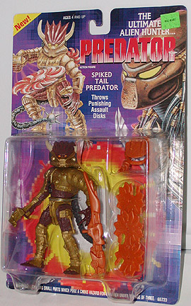
Predators Series 16 – Spiked Tail Predator

Company: NECA
Year: 2016

In the 1990s, Kenner was a ubiquitous brand in the world of action figures. Though they’re probably best remembered for their Star Wars and Super Powers toys, they also produced figures based on delightfully child-friendly movies such as Aliens, RoboCop and Robin Hood: Prince of Thieves.
I had quite a few Kenner figures as a youth in the 1990s (mostly Star Wars: The Power of the Force), and though many were pretty ordinary but today’s standards, they were fantastic at the time. Sadly, Kenner is no more – bought out by Hasbro some years ago, the brand has long since been absorbed into its parent company, the licenses it once held divvied up among other companies. But its legacy still lives on today, in some small part, every time an adult movie like The Dark Knight Rises or Van Helsing gets a toyline intended for children. But it’s rarely as off the wall as it was back then…I don’t think so many people see ultra-violent movies as potential kid’s cartoons, and that’s probably for the best.

So, why mention Kenner in a NECA review? Well, series 16 of NECA’s Predator line is yet another tribute to those often wild and wacky days of toy manufacturing – specifically, a modern update of some more of Kenner’s Predator range. So today we look at the Spiked Tail Predator; we’ll be looking at his two series-mates very soon.

I guess if you had to sum up Spiked Tail’s aesthetic very briefly, you’d say “Steampunk Predator”. Fortunately this is not as terrible as it sounds. The original Kenner toy was very heavily armoured and cyborg-esque, but also kind of plain, with the unusual helmet/facemask combo and odd colour the main selling points. In a line that seemed to have two ugly toys for every good one, Spiked Tail stands out as being almost aggressively unmemorable.

But NECA have outdone themselves with this update. It’s clear that the bulk of this series’ tooling budget went on this guy; though not all of his accoutrements are new tooling, most of them are. As a result, he has a nice, chunky feel to him – though I’m definitely putting him on a stand, as that gigantic dreadlock ponytail thing does leave him a little unbalanced.

Once the mask is on and the gun is mounted (either on his back or on his left arm) he looks fantastic, a wonderfully futuristic take on the hunter. In spite of him shifting well away from the more traditional Predator look, he still manages to feel somewhat plausible once the mask goes on. Maybe not so much as his seriesmate Ghost, but you could see a more muted version of this design making it into a future Predator movie.  

Now lest you fear that I gush too much, there are some problems:
  • The armour really hinders the articulation all over the body – given some time you can work with it, but straight out of the box you’re probably going to keep him in fairly vanilla poses.
  • The gun falls off the backmount quite easily
  • The mask doesn’t quite stay on his face as it should
  • His left forearm popped off when I tried to plug the gun in (though could be popped back on)
  • Paint is a little thick on his armour and bionic hand
  • The “pistons” on his left leg weren’t glued on properly when he came out of the box, and thus don’t sit quite correctly.
None of these are dealbreakers in and of themselves…but when you consider that these figures are now selling for $49.95AUD a pop it does leave a bit of a bitter taste in the mouth.
  
Interestingly, the copy on the back also gives us a bit of a taste of some potential future Preds, with mention of the Lasershot and R’Zor Predators. Lasershot was a previously released Kenner design that looked a bit like a modified Scarab/Nightstorm Predator. It sounds okay…but the mention of R’Zor is particularly intriguing. Information online is scarce, but it seems that he was a cancelled figure that was actually a human marine disguised as a Predator. Some sample figures did make it out into the wild, but they’re definitely few and far between. NECA already has a lot of tooling from the Marines in the Aliens range, so I’m hoping we do eventually get this figure in some kind of official form.  

When I reviewed Nightstorm Predator almost three years ago, I noted that I probably would have hated it back as a kid, and noted that the Kenner Aliens and Predator lines typified some of the worst trends in 1990s action figures – namely, a thin basis in source material, garish colours, little to no resemblance to the “real” character/s and ultimately quite gimmicky. But now, as then, sometimes something will grab me. I was going to pass on this guy when I first saw the promo images, but in person he really popped off the shelf. And so I decided I had to own the whole series, instead of just going for the glow-in-the-dark Stalker Predator.  

So overall? Cool update of a pretty bland design, but it’s somewhat flawed in execution. I’m still glad I made the purchase, but if this was my first experience of the line I’d be less than impressed.

Sunday, 17 May 2015

Spider-Woman (Marvel Legends Infinite: Thanos Wave)

Series: Marvel Legends 
Year: 2015
Company: Hasbro

BACKGROUND

So, here are with Spider-Woman, another Marvel Legend. As with Captain Marvel, I’m pretty sure I’ve read virtually none of the comics that Spider-Woman appears in. Maybe an Avengers comic or two; that would be about it. But I’ve always thought her costume design was great – so simple, yet so striking. In fact, until this year it’s been essentially unchanged since it debuted in the 1970s (and the original is substantially better than the new one, too). 

Jessica Drew has had both a Marvel Legend and Marvel Select figure in the past. While both were adequate (and even pretty good on some points) at their time, they’re both showing distinct signs of age. So now we get a very welcome update.  

SCULPT AND ARTICULATION
Spider-Woman has the following articulation:
*Ball-jointed neck
*Swivel-hinged shoulders
*Swivel biceps
*Swivel-hinged elbows
*Pegged wrists
*ball-jointed torso
*cut thighs
*double-hinged knees
*rocker ankles

All of it works well; some of it was a little tight straight out of the box but not unworkable. Best of all, she actually stands up properly! Not nearly as much fussing around as Captain Marvel or Scarlet Witch.

Spider-Woman uses the same base body as Captain Marvel – which I suppose makes sense seeing as they’re apparently besties in the comics. While this is good for the most part, I think it would have actually made more sense to use the “leotard”-style body that Scarlet Witch had (and swap figure Hellcat uses). It would have given her just that little bit more room for posing her legs. It wouldn’t make much of a difference on some characters, but on someone who’s meant to be as agile as Spider-Man, it seems like a bit of an oversight. It’s a little more irritating as she actually does have Scarlet Witch’s hands too. With that said, Hasbro and ToyBiz have both have a mixed history when it comes to depicting the female form so I think this is an overall good compromise.

The only new feature is her head, which captures the look of the costume quite well. Her hair is quite hard plastic, so you’re locked in to a few specific poses, but this is a common thing with female action figures in general.    

ACCESSORIES

Jessica has two different sets of arm webbing – one spread wide for a gliding look, and another set that is folded, for when she’s doing things like keeping her hands by her side. I’m not sure if it’s a perfect solution to the webbing problem, though. The old figure had cel-style plastic stuck to the arms, which seems to crack and rot over the years. This is better than that but I think softer, more flexible plastic should probably have been used.  

Some kind of energy blast would have been nice, like with Captain Marvel, but I can live without it.
Additionally, she comes with two Build-A-Figure parts – Thanos’ head and one of his arms. I’ve seen the completed figure and I’m not overly impressed (he doesn’t look big enough to me, for one thing) so I think these will just go on eBay.    

PAINT

For the most part, the paint is of a very high standard. Some of the thick black lines are a little wonky around the edges, but there’s nothing so major that it can’t be overlooked. Though there are some minor flaws (like the yellow on the belly being a little thin) everything looks pretty good from a distance and there aren’t any major problems. The only thing I think is missing is some blue highlights on the hair; currently, it’s all solid black.

Interestingly, there are a number of orange highlights on some of the yellow areas of the figure, though they don't really show up in the picture. They’re quite subtle and help break up what could otherwise appear as very flat surfaces.    

OVERALL


I’m still quite new to the Marvel Legends range, owning 4 at this point. But so far I like the series and could see myself continuing with it in the future. All that I’ve bought so far have been of roughly equal quality, and Spider-Woman continues that high standard. She may not be especially innovative in her approach, but she’s consistently well-executed and probably my favourite Marvel Legend in my limited experience so far.   
Saturday, 28 March 2015

Sunday Afternoon Reader: Each Sold Separately/Action Figures Not Included

Each Sold Separately

and

Action Figures Not Included

by Phil Reed

Phil Reed is the CEO of Steve Jackson Games and the driving force behind Battlegrip.com, one of my favourite toy-related sites. In his spare time (and honestly, I don’t know where he finds it – with his day job and the sheer number of posts he puts up on Battlegrip the man must only sleep about 2 hours a night) he finds time to publish books centred around his interests.  

Today, we look at two of those books – Each Sold Separately and Action Figures Not Included. I’ve chosen to review them together, as they really should be read in conjunction with one another. During the initial Kickstarter for Each Sold Separately, Phil announced that he had put together some extra pages beyond the original book – and suddenly, one book became two. I contributed to the initial campaign, and Phil was kind enough to also send me a .pdf of Action Figures Not Included when the two books were finalised earlier this year.      

Ostensibly based around the 1980s but self-admittedly touching on plenty of the 1970s and 1990s too, these books are great reading for anyone who remembers the childhood toys of this era fondly. Rather than being a comprehensive assessment of the toys of the era, it’s more of a look at the unusual and creative ways they were marketed. The usual suspects, such as TV shows and comics, are encompassed, while light is also shed on more obscure promotions such as cereal and “Book & Record” sets.

While the two books may not delve terribly deeply into most of the toy lines covered, that’s not really their purpose – we tend to remember the toys fondly, while often forgetting the huge amount of ephemera that were used to promote them in the first place. It’s great to see some of them rescued from total obscurity, as many of them had a great deal of time and creativity put into them, belying their blatant cash-in origins. As someone who works as an advertising copywriter by day, it’s an interesting insight into the way marketing has evolved – and also how much modern-day marketers could learn from these early-80s mavericks!

My big find was that there used to be G.I. Joe-based Find your Fate books – at least one of which was written by R.L. Stine of Goosebumps fame! How I missed this as a kid is something I may never understand. I may have to investigate further on eBay...  

Transformers and Star Wars get a lot of coverage, which is appropriate given both the enormous marketing success of the two properties at the time, Phil’s personal fandom and the sheer fact that both brands are still going strong today. However, plenty of others get a look-in too. Famous names like He-Man and The Masters of the Universe and G.I. Joe: A Real American Hero sit comfortably alongside comparatively obscure names like Power Lords, Crystar and ROM. A few names pop up that I’d never even heard of, which is always exciting for an 80s buff like myself. The main name which stands out as curiously absent is Thundercats.       

These books serve as a great jumping-off point for people who are interested in learning more about toys or marketing, and a bibliography is provided for those who are looking to broaden their own reading on either subject. Overall, it’s a fun coffee table book for toy and broader 1980s fans.  

You can also purchase the books reviewed here today on Amazon, as well as Phil’s other currently available books, which look at the world of third-party Transformers. Phil is currently working on a book based on the late-1990s Star Wars Expanded Universe action figure series. It’s being funded via Kickstarter, and looks like it will be another great read – I’d strongly suggest backing it if you get the chance.  

Saturday, 26 April 2014

Creature from the Black Lagoon -- Diamond Select


Company: Diamond Select

Release: 2010/2012

Price: See below
Scale: 7”

The Background
Diamond Select has been producing action figures based on the Universal Monsters for a number of years now, with largely positive results. Their detailed sculpting is impressive, their paint jobs high-quality and their prices reasonable.

Having recently (finally!) watched the classic Creature from the Black Lagoon earlier this year, I liked the idea of getting my hands on their version of the Creature (aka Gillman).  One of the few classic Universal Monsters not based on a pre-existing folk tale or novel, the Creature burst onto cinema screens in 1954, spawning two sequels, as well as an appearance on The Munsters and in The Monster Squad. Though he’s not as ubiquitous as Dracula or the Wolfman, he’s undeniably left an impact on pop culture, even totally not turning up in Lego form a couple of years ago.

Sculpt and Articulation
I had my first experience with Diamond Select earlier this year, when I picked up their Silver Surfer. He was a pretty cool toy, though he had a couple of minor articulation issues. So I was reasonably confident when I ordered this guy. The box looked great, and I had looked at a few positive reviews some months earlier…but long enough ago that I’d forgotten a few key details.

Namely, articulation. “Action figure” is something of a misnomer here. The entire Universal Monsters range has very minimal articulation. In the Creature’s case, only his shoulders, elbows, wrists and ankles are articulated, and they’re all pretty restricted.

Here’s what he’s got:

*shoulders (balljoint?)

*elbows (hinged)
*wrists (cut)

*ankles (cut)
The shoulders can only really move in a hinged fashion – due to the sculpt of the torso, they can’t really swivel out to the side or anything. In the case of the wrists, they’re quite tight, initially, but they've loosened up now. As for the ankles, this is fairly redundant without accompanying leg and hip articulation, but it can be handy for getting him to stand on the base.

The sculpt gives a good overall impression of the creature, though the face is not quite as inhuman as the original mask – I’ve thought about it for a while, and I think it’s due to the difference in the eyes and giving him a closed mouth. While it now looks more like a “real” creature, these choices have had the (likely unintentional) effect of making him look rather ticked off and irritable – as opposed to being a terrifying prehistoric beast, fighting to defend his home against invaders.  He’s been standing in a queue for too long and is pretty darn annoyed about it!


Aside from this, I can’t pretend I’m an expert on screen accuracy, but it looks more or less right to me. One interesting feature which I saw pointed out in another review is that his shins are untextured – this is accurate to the film’s costume, but something that's apprently often overlooked.
The main problem is that he's probably a little too tall. Gillman is probably bigger than a normal human -- but not as big as a Predator. He's almost big enough to class him in 8" scale, rather than 7". However, though I'd read this online, I didn't really notice it until I lined him up next to the other guys in the photo above.
Just as a side note, going off reviews at ItsAllTrue.net and MWCToys.com, this figure seems to have first been released in 2010, but this particular version is indicated on the box (and stamped on his foot) as ©2012. However, it doesn’t look to have been changed since this original release – maybe the paint has been altered slightly? I can’t spot any differences myself.

Accessories
The creature comes with two accessories – a sandy, rocky diorama base and Kay Lawrence, who was the object of Gillman’s affection in the movie (played by Julie Adams).

The base is a little plain, but the upside is that it’s generic enough that you could use it for almost everything. There are rocks, sure, but it doesn’t look scale-specific. This could be fine for anything from Lego through to 7-8” figures.
 
Actually, calling Kay Lawrence an accessory is doing her something of a disservice. She’s a figure in her own right really, with plenty of attention to detail on the sculpting. She’s not really articulated, which is a shame – but her head is a separate piece, so you can turn it on the neck. She doesn’t sit quite flat on the base, but you don’t really notice most of the time.
I don’t think the likeness to Julie Adams is all that great, though. I agree with MWC's review that the set looks more or less based on this photo (far left) -- the hair isn't quite right and neither is the face. I suspect the likeness rights may have been tricky to get hold of – this was apparently the case with Diamond Select’s Dracula figure, which is a great vampire, but definitely not Bela Lugosi. But that doesn’t mean it’s a bad sculpt. It looks like a very attractive young woman, in somewhat of a pin-up style.


Gillman wasn’t really an accessorised guy, so getting anything at all is a nice bonus. There’s no cause for complaint with what’s included, but it might have been nice to get the fossilised Gillman hand, which is found at the beginning of the film and sets off the whole chain of events that follow.

Paint
The Creature seems to be cast in black, with everything else painted over the top. For the most paint, the paint job is great, with the dominant colour being a metallic green. The finny attachments dotted around his body are a little sloppy, but nothing that distracts from the figure as a whole. However, the paint on his neck is one flat colour, and it seems to be a little thick. I think a subtle dark green wash here would have made it gel better with the rest of the body. Similarly, the pink of his lips contrasts just a little too strongly with his green flesh.   

Aside from these minor quibbles, the only real issue were small patches of unpainted skin on the right and left shoulders. It looks like some of the paint may have scraped off, but given that it’s an area completely concealed when the arm is hanging by his side, it’s not a major issue.  
The paint job on Kay Lawrence is very impressive, too. Apparently cast in skin-coloured plastic, her swimsuit, hair and face have all been picked out incredibly well, with no trace of slop. In a particularly impressive touch, even her fingernails and toenails have been painted with "nail polish".


Availability and pricing
This guy isn’t too hard to track down on eBay and he’s not particularly expensive either. I paid around $AUD25 for him – but I also paid close to that again for him in postage! Such is the case when you ship things from the US to Australia though, and I’m learning to just suck it up.

I understand that most of the Universal Monsters figures have been released in two different versions – typically a Diamond Select version, and a Toys R Us version. The Toys R Us version will have fewer accessories, but it will generally have a different paint job, and/or a slightly different head sculpt.
In Gillman’s case, he has a non-metallic paint job (and no pink lips) and a different, more detailed base. However, going from my eBay searches, the reviewed version looks to be the easiest to track down.  

Overall
This would have been an amazing toy in 2002-2004, alongside the relatively unarticulated toys NECA and McFarlane were offering at the time, but it was a little out of date by 2010 – and more so by 2012, I tend to think. Strange as it may sound, I don’t think this range of Universal Monsters has really been designed for toy collectors as such – rather, I think it’s been designed for movie fans. There can be a lot of overlap, granted, but this figure seems more geared towards being a movie memorabilia display piece, rather than a “proper” toy.

So I’m pleased, but not quite thrilled with this figure. Personally, I will take a good sculpt over articulation, but I was still a little disappointed that the arms were as restricted as they were. Additionally, the combined cost of figure and shipping made this purchase close to $AUD50, which isn’t great value for money – I think if I’d paid between $25-$35 total I would have been more satisfied.

If you’re considering the purchase, I might suggest that you wait for the new Diamond Select version later this year. He looks to be better articulated and has a cooler base – though doesn’t look to include Kay Lawrence. Had I known about it, I might have waited, but I don’t think I’ll double-dip – it’s just too soon.    

Thursday, 30 January 2014

Arkham Origins Batman


Series: Arkham Origins
Company: DC Collectibles

Scale: 7”

Year: 2013

The Background
Batman: Arkham Origins was probably my most anticipated game of 2013. When it finally landed, I had a lot of fun playing it, but I was very disappointed with the storyline, and I traded it in right after I finished the main game.

Still, in anticipation of the game – and having admired, but never picked up any of the Arkham Asylum or Arkham City figures – I requested this figure several months ago as a Christmas present. After my disappointment with the game, I was a little more concerned. This was heightened after I ran across all of the figures except Batman in London’s Forbidden Planet store. They had good sculpts, but their articulation didn’t look great. That’s not such an issue with characters like Black Mask, but it’s a big problem for Batman. Combined with my disappointment with DC Unlimited Hawkman, I had some real reservations about going ahead with this figure. But he was already in the mail, so it was too late to cancel. Were my concerns justified?  

PACKAGING
The new packaging for Arkham Origins deviates significantly from the cowl-shaped clamshell that marked Asylum and City.  Now it’s more like a rectangular NECA clamshell, but with the Arkham Origins logo flaring out at the top. But clamshell haters need not panic – some of the back has been pre-perforated, allowing you to tear it open with relative ease (just keep a pair of scissors handy).  

The fairly plain insert unfolds into a flyer for both the Arkham Origins and City ranges, both of which seem to have been reappearing at retail lately – a clever touch.
Overall, I don’t dislike the packaging, but I think it’s a little bland in colouring and will probably present storage problems for MOCers, just because of the unusual shape.  

SCULPLT AND ARTICULATION


I was never quite satisfied with the sculpts on the Asylum or City figures of Batman. Though mostly great, his head always looked just slightly too small for his body, giving a weird effect. In fact, the whole series was a real mix of fantastic (Harley Quinn) and ordinary (Poison Ivy), which I think may be why I never actually pulled the trigger on buying any of them.

This Batman resolves those issues, and presents us with one of the best Batman toys I think I have yet come across. The sculpting is by Gentle Giant studios, who I understand generally base their work from digital scans of the character model.
I couldn’t say for certain whether it’s 100% screen accurate, but it definitely looks right – the armour plating is all there, the belt’s present and the head is the correct size. The biggest issue that I noticed was that his left bat-ear was slightly larger than his right one, and some of the spikes on his glove are slightly warped. Fussier folk than I may choose to break out the customising tools, but I’m happy to leave him be – I don’t really notice unless I’m looking for it.    

The cape is really cool. It’s made out a soft rubber which manages the delicate balancing act of being neither too stiff nor too soft. It restricts his shoulder movement slightly, but not massively. My only real concern is that it feels quite oily, and I’m hoping it doesn’t fall to pieces quickly.
As for his articulation, he features:

*ball-jointed neck
*swivel-hinge shoulders

*swivel-hinge forearms

*ball-jointed wrists
*ab crunch

*swivel waist
*hinged hips

*swivel thighs
*double-hinged knees

*ball-jointed ankles


"This isn't what I had in mind when I was thinking about 'Predator Encounters'."
One of his ankles was at a bit of a funny angle in the box, but I was able to twist it back into its correct shape easily enough – no boiling required.
All of the joints work well and move smoothly – of all of my “collector” figures, Batman is far and away the most mobile, particularly compared to say, my NECA Predators. There are no complaints here, which is possibly a first for one of my reviews!

PAINT
In the comics Batman typically has a very plain colour scheme – black (or blue) and grey. Accordingly, the figure reflects this, and the accompanying paint job is pretty basic, though it doesn’t need to be any more complex. The exposed half of his face is painted a flesh tone (slightly darker for the lip) then given a black wash for stubble. Up close he just looks kind of dirty, but it’s pretty effective from a distance – and it still works either way.

I could see DC Collectibles giving us a “Battle-damage” repaint at some point – those of you who have played any of the Arkham games know that the Batsuit takes quite a beating over the course of the game, and a banged-up version could look pretty good. If it doesn’t get a release, of course, all it would take is a steady hand and some Citadel paints… 
The only real issue I have is that the paint is already showing some wear marks at a couple of points. Both the cape and cowl appear to have been cast in grey, and then painted black. As a result, there’s already a wear mark on his cape (possibly from the packaging) and the tips of his ears are starting to wear too.

ACCESSORIES
Batman comes with no accessories. I was hoping he’d come with a batarang, but no such luck. Considering his hands are balled into fists, ideally I think the best way to go would have been to would have liked some interchangeable hands, a batarang and/or a weapon – along the lines of the old SOTA Street Fighter II toys.  

If the range goes for more than two waves, I won’t be surprised if we end up with a variety of different Batmans – perhaps unmasked as Bruce Wayne, Batman in a slightly different costume, or Batman incorporating more accessories. But I hope that they avoid this, as there have already been far too many Batman lines already that simply consist of variants of Batman.
Instead, I think it would be better to incorporate more accessories into a base figure – interchangeable hands, maybe a head and some accessories. It might cost a little more at retail, but I suspect that you’d probably sell more figures too – rather than annoying fans by releasing a bunch of largely unwanted variants. 

OVERALL


"Rookie mistake, Jason."
Despite Batman being my favourite superhero from a very young age, I’ve never really owned a good figure of him. I had an Animated Series Bruce Wayne-to-Batman figure in the 1990s – which was okay – and a Batman Begins basic Batman when the movie was out – which was also okay. But I’ve never really seen one that grabbed me and was within my budget (I’m looking at you, Hot Toys DX 12 Dark Knight Rises Batman). 
The lack of accessories is disappointing, but Arkham Origins Batman is definitely one of my favourite figures that I’ve bought this year, despite my disappointment with the game. The sculpt looks good, the articulation is great and he looks good fighting Lava Planet Predator – I would recommend him thoroughly to any Batman fan. He’s a great addition to the collection. 

Side note: At this stage, the only other figure I’m planning to pick up is Deathstroke, assuming he has similar articulation and a good paint job – he’s scheduled for release in April. However, future waves beyond wave 2 may well hold more characters that I’m interested in. The other figures look fine, but they’re just not up my alley.

 
"I don't use guns," said Batman, loudly and pointedly.
"Well, how about you shut up let the real cops do their job?" said RoboCop.
The bust that followed was a success, but it was awkward for everyone.


Friday, 8 November 2013

Ninjas in Training – Leonardo and Donatello (Playmates Teenage Mutant Ninja Turtles)

Ninjas in Training - Leonardo and Donatello

Series: Teenage Mutant Ninja Turtles

Company: Playmates
 
RRP: $15

STOP THE PRESS!
Right before I was going to publish this review, I picked up Raphael and Michelangelo as well. They won’t get a review on their own, as everything I have said (good and bad) about Donnie and Leo below applies more or less equally across all four turtles. Just substitute the words “Raph” or “Mikey” at the appropriate juncture. The main difference for myself was that Raph and Mikey are my favourite turtles, and their weapons (sais and nunchaku) are smaller, so they're less likely to warp. If you’ve got any specific questions about them, please feel free to comment below.


The Background
I had many, many toys as a kid, but the first toyline I really “collected” was the 2003 Playmates TMNT series, when I was finishing up high school. I didn’t buy every figure, but there were only a handful from the first few waves that I didn’t get – one of which was the “Toddler Turtles” 4-pack. I think it was just too difficult to find, or by the time I did come across it, I either didn’t have the money or had simply moved on in my interests.

Flash forward to earlier this year, and I discovered that there was a new TMNT series (released late 2012), as well an accompanying toyline. What I’ve since watched of the new TV series is excellent, with my main criticism being that it’s a little too “monster-of-the-week” heavy.
The new TMNT toyline, on the other hand, is a bit of a mixed bag. The turtles themselves are excellent, but the supporting cast have been all over the place, with questionable scale being a particular issue. It’s been some time since I’ve gone back and looked at the ’03 figures closely, but these ones feel a little “cheaper” overall, in quality of plastic and paint.

I can’t speak for the rest of the world, but availability is also a problem over here in Australia, which adds to the difficulty of collecting. The turtles and Shredder (original) are easy to find, but there are some – like Cockroach Terminator – that I’ve never seen in the wild and a number of others that I’ve encountered only once or twice. But the line does have a lot of potential, and I hope that its various issues do get resolved eventually. 
But I recently came across word that “Ninjas in training” 2-packs were beginning to hit the stores in America. Never having been able to get the Toddler Turtles 4-pack, I was definitely keen to add these new versions to my small collection of TMNT figures. The next day, a search of my local Kmart uncovered a solitary Donnie and Leo, but no sign of Raph and Mikey.

The Packaging

Keeping in style with previous releases, the backing card is purple and green. I’ve got mixed feelings about this colour scheme, but it’s certainly eye-catching. As always with blister packs, the box is not collector friendly and will need to be chucked if you open it. MOC collectors shouldn’t have any complaints – the figures are nicely displayed, and you can see all of their accessories.

The Figures Themselves


It would have been pretty easy for Playmates to use the exact same mould for all four turtles, simply painting their bandannas a different colour. Fortunately, they haven’t taken this approach – each turtle is unique, even if their poses are quite similar. Looking closely, you’ll notice that all their chest shell pieces are unique too, just as they are on their older counterparts. It’s a subtle touch, but a nice one. 
Articulation is very minimal – the shoulders are swivel hinges, and the neck is cut. The legs on both figures are in locked poses. It’s somewhat reminiscent of the Marvel Superhero Squad figurines that were doing the rounds a few years ago, though these are cast in a harder plastic. There’s a cut across their bellies, but this seems to be the result of the figure being produced in a few different pieces and then stuck together. It’s not an ideal spot for the cut to be placed, but at least it’s in line with their shell plating.

Paint apps are very minimal – the turtle’s bandannas are actually moulded from separate plastic, not just painted on, as far as I can tell. Only their shells and eyes seem to really be painted, and these counts they’re both fine. A couple of highlights on the skin might have been nice, but I think Playmates is probably keeping the costs pretty low on this one.   

Accessories
Donatello comes with a miniature version of his bo staff, and Leonardo comes with two toy swords, all of which are cast in beige plastic to look like wood. Some paint on the bandaged areas would have been nice, but it may have looked out of place -- I don't think any other characters in the range have paint apps on their weapons.

Issues

The weapons aren’t cast in super-soft plastic, but don’t be surprised if one or both of Leo’s swords are a little warped. I don’t think Donnie’s staff should give you any problems – it’s rounded and a little thicker, so it shouldn’t “wilt” in the same way.
I can see a lot of broken arms happening on these toys, as they’re quite thin and fragile. Be careful about who you give these to. And maybe have a replacement handy.

My last issue is a small one – a very small one, in fact. Donnie’s mouth is partially open, and you can see his distinctive gap tooth. However, they’ve decided not to put paint on it, which is slightly disappointing. Of course, if they had painted it I’d probably be complaining about paint slop… perhaps a closed mouth would have been preferable.   
Overall

These figures are okay. They’ve got a cute design, and they do look spiffy on your desk. They also look cool when paired up with their teenage counterparts. I was able to pick Leo and Donnie up for $10 (Edit: and as mentioned above, Raph and Mikey too) rather than the usual $15, and I was satisfied with them for that price – but $15 seems a little overpriced for these figures, even if there are two of them in the box. Put all four together (as Playmates previously did) and I think we would have had a more acceptable package, if not a total winner.