Showing posts with label 2013. Show all posts

Friday, 18 September 2015

Funko POP! DC Comics – Darkseid

Series: POP! DC Comics
Year: 2013
RRP: $18

Originally debuting in the pages of Superman’s Pal Jimmy Olsen back in 1970, few would have predicted that Darkseid would one day ascend to the position of BIG BAD in the DC Universe. He’s survived being thrown into the Source Wall by Superman, having some of his thunder stolen by (acknowledged) knock-off Thanos – and perhaps worst of all, a terrible leotard costume!     
I can’t pretend to be an expert on Darkseid. My familiarity stems with him mostly from the mid-00s Superman/Batman series and the first story arc of the New 52 Justice League. I wasn’t terribly aware of him as a child…I think he mostly kind of inhabited the New Gods/Fourth World stories until the 1980s, when he and the other characters from the series were enfolded into the wider DC Universe, largely through the seminal Super Powers toy line.

Fortunately Funko have gone with his tunic look, as opposed to the leotard. I didn’t really like his sculpt when he was first released, as he was pretty distinct from the usual Funko style – a little too distinct. But a couple of years on, Funko have released such a diverse group of sculpts that it doesn’t look so out of place any more. It’s much more detailed than you might expect; though the helmet and tunic are smooth and undetailed, the face and limbs are all sculpted with the cracked rock look that has been one of his signatures since early days.  


Now let’s get to paint – the traditional weak point when it comes to POPs. Well, paint is actually quite good! Especially considering that this guy was first released back in about 2013, when Funko was just starting to move beyond the fuzziness that plagues so many of its older (and some of its current) figures. The grey and blue colour scheme, combined with the red eyes, really pops on the shelf.

There are two versions of Darkseid available – this one and a glow in the dark version. The GitD version looks near identical. It sells for considerably more, going off eBay, but it’s not as outrageously extravagant as some of the GitD POPs out there. Had I known there was a glow version available previously, I might have tried to track it down – but to be honest, this is a really great POP whichever version you get. It’s really sold me on a character I’ve never been terribly familiar with and made me want to read more.   
Darkseid looms large among Superman's villainous foes.

Thursday, 3 September 2015

POP! Marvel – Beast

Year: 2013
Company: Funko
Series: POP! Marvel

At its core, X-Men is really a (very extended) story about people who feel like they don’t fit in. All of us can relate to this at some level – especially during our teenage years. And while pretty much every character who’s passed through the X-Men fits this archetype in one form another, few typify it better than Beast, aka Hank McCoy.

Beast started life in the comics as a guy who seemed to have the mutant ability of just looking a bit weird and monkey-esque. Honestly, if you read those first few issues of the 1960s X-Men comic, you probably wouldn’t even notice that Beast was a mutant. He was freakishly athletic and strong, which actually sounds pretty awesome. To give this a little more visual pizzazz, the First Class movie gave him ape-like feet.  

In his filmic incarnation, for some reason he decided that his incredibly helpful abilities were excluding him from everyday life, and so he developed a “cure” to neutralise his mutant gene. Unfortunately, it didn’t work, and actually turned him furry and blue. It was incredibly depressing for someone who just wanted to “fit in”. There’s a moral here – namely, don’t worry too much if you’re out of step with the mainstream, because people will appreciate you for you are anway. And people who don’t are not the sort of people you want to try to impress. You’ll only make yourself unhappy in the process.

The comics story isn’t quite as depressing. Beast developed a serum that allowed anyone to become a mutant for a short period of time. He used it to disguise his appearance, but left it too long and was permanently transformed as a result – initially with grey fur, but later blue.      

This Beast POP was first released in 2013, but now seems to be showing up all over the place in Sydney again, as do his wavemates Silver Surfer and Deadpool. Ghost Rider, Phoenix/Dark Phoenix and Dr Doom don’t seem to be turning up with the same regularity though. Maybe it’s a Sony and Marvel not getting along thing – who knows? Funko’s distribution/re-release schedule is frequently mysterious.

Beast is sculpted with his classic blue Wolverine hair look, complete with massive sideburns. I’m sure someone has already used this head for an unmasked Wolverine custom – Wolverine does get drawn with slight fangs from time to time. Beast is also a brilliant scientist, often depicted with glasses to emphasise his genius. Glasses = smart just about everywhere you go. This POP skips that, but in hindsight I’m surprised they didn’t do a paint variant or convention exclusive that incorporated them. I’m sure clever customisers have already done it, too.

Likewise, it’s surprising that there wasn’t a grey paint variant, to capture his early look. But there is one other version of him floating around – a flocked version put out by Gemini Collectibles. eBay suggests it’s at least a couple of hundred dollars for one, so if you’re keen to track one down…      


Blue furry dude in a Speedo does not sound like a recipe for a good character, but Beast is actually a really fun…ko POP. He’s an essential addition to any X-Men or Avengers collection.      

Sunday, 26 April 2015

Ghost Rider – Funko POP! Marvel

Today's review is best enjoyed while listening to Hell Bent for Leather, from Judas Priest. 

Series: POP! Marvel
Company: Funko
Year: 2013

I’ve been on a bit of a Marvel kick over the last week or so, a lot of it driven by the release of Avengers: Age of Ultron. So we continue that today with the Ghost Rider Funko POP!

Now I must confess that I don’t think I’ve ever read a complete Ghost Rider comic – I know a little bit about his backstory, but I think that like Silver Surfer, Ghost Rider is a character who you can appreciate on a purely visual level, without knowing too much about the character. He looks like a total cliché tattoo design – a biker with a flaming skull for a head –but that’s what makes him so cool!  

However, I did watch the first Ghost Rider film, back in 2007 – as many of you will know, it was dreadful. I didn’t get around to seeing the second, though trusted friends assure me it’s far worse. It’s a shame, as it could have been really great, but was hindered at many points. I’m sure this was at least in part (though not entirely) due to his “hellish”* origins and the way some of that had to be tiptoed around for a mainstream movie – what probably should have been quite a dark and disturbing movie was turned into a near-unwatchable embarrassment.
   
Nonetheless, in early 2013 Ghost Rider got a POP! release from Funko, probably at least in part as a result of the second film coming out in 2012. There have been a few different people who’ve taken up the Ghost Rider mantle over the year, and this one most resembles the second iteration, Danny Ketch.

The original Ghost Rider (Johnny Blaze) was a stunt rider, and his outfit was kind of like a jumpsuit, with a big 1970s collar. Danny Ketch, by contrast, wore a biker outfit – grey pants (probably jeans), leather jacket with spikes and massive chains. He got a Judas Priest makeover, basically. It’s the look I prefer for the character, but that might also be because it’s the one that was current when I was a kid. In his hand he holds one of his signature chains, which is a great touch. Would be nice if it was flaming but you can’t have everything. Aside from that, it looks like a major retool of the basic Funko body -- distinct from other figures in the line, but without deviating massively from their signature style.     

Paint is mixed. Funko are generally fine with paint these days, but two years ago they tended towards “adequate” and not much better. Ghost Rider fits that mould – his face has been notably touched up around the nose and mouth. The spikes that dot his belt, gloves and wrists are all sloppy, too. But that said I like the solution they came up with for his flaming head – the whole thing is cast in a semi-translucent orange plastic, with the “skull” parts being painted on later. Though the execution is a little off, it’s a good concept.  

There are three versions of this POP that I’m aware of – the regular one (reviewed here today), glow in the dark and metallic. The metallic one doesn’t look so great...as might be expected, the glow in the dark version would be my preference, but it’s now quite expensive, and I’m not really willing to fork out exorbitant sums for him. Indeed, just the regular one will probably cost you a little more than you might expect, as he doesn’t seem to be in production any longer.       

I skipped Ghost Rider on first release and picked up on a bit of a whim when it turned out I had the chance to get him again – but he is a good POP that will look quite distinct from the masses of other superhero POPs on your shelves. I spent about the same this figure as I did for a ticket to the movie back in 2007, and I can tell you with great certainty that this was better value. 

It would be nice if they eventually redid him and included a flaming Hell Cycle, similar to the other vehicles Funko has released over the last few years, but unless he gets a new movie or TV series anytime soon, that seems quite unlikely.


*Neither DC or Marvel really draw firm answers about cosmic matters, but DC have hinted on numerous occasions that the Judeo-Christian view of things is more or less correct (though it’s obviously more complex, what with the existence of the Greek gods in Wonder Woman, and the various different spiritual powers from Hellblazer/Constantine, Dr Fate and Swamp Thing, just to name a few). Marvel has deliberately played it vague over the decades, at least in part to avoid alienating readers. This has included Johnny Blaze's Ghost Rider powers being retconned as coming from Mephisto as opposed to being a side effect for selling his soul to the devil.The forced distinction may seem quite silly to some (including me), but that's the way comics often are.       

Thursday, 5 March 2015

Lego Forest Maiden (Minifigures Series 9)

When I was a kid, I loved Robin Hood. The early 1990s was a great time to be too – though he’s fairly evergreen (ha ha!) in his popularity, Kevin Costner’s Prince of Thieves had just been released, which sparked a whole wave of revived interest in the character.

One of my friends had a Robin Hood party when we were about 4 or 5 years old, and we were all bestowed with Robin Hood hats made out of cardboard. I hung on to that bad boy for years. I fashioned a (terrible) longbow out of a stick and string, and would lurk around in my parent’s backyard, dressed entirely in green. I still have memories of jumping around on the furniture as I watched the Errol Flynn version, much to my parent’s chagrin.

Though my enjoyment never really went away, it had faded a little by 1994. But around that time, ABC TV in Australia was screening a little British show called Maid Marian and Her Merry Men. Starring Tony Robins of Blackadder fame, it was an irreverent take on the legendary outlaw, casting him as an incompetent fool; Marian had actually been behind all of the gang’s successes. Though I haven’t watched it in close to 20 years, I remember it being hilariously funny as a child. Importantly, Maid Marian was a strong, empowered female – funny and tough.

Following on from my recent acquisition of the Forestman, I also invested in his female counterpart, the Forest Maiden. Originally I thought she was connected with the Elf from Series 3, but it appears I was mistaken and she is actually more based on Robin Hood’s beau, Maid Marian – hence the lengthy introduction you now read above!

Dressed almost entirely in green, the Forest Maiden is simple in her garb -- a cloth belt and a small coin purse are the only features really of note on her clothing. It's appropriate, of course, given her woodland lifestyle, and is a nice complement to the simple Series 1 printing on the Forestman.  

She’s armed with a bow and arrow, and can defend herself with a shield. A sword would have been nice too, but I’m sure I can find a spare in my bits box. The only real disappointment is that her hair is cast in soft plastic, rather than hard plastic. But it’s not the end of the world.

The Forest Maiden is a cool minifig – one of the best from Series 9 – but only at the right price. Like much of series 9, she seems to have rapidly appreciated in value, and you’ll probably pay a minimum of $15 for her, potentially more. So keep an eye out, but proceed with caution – just as one would do if they were a tax collector in Sherwood Forest.  

Thursday, 26 February 2015

I bought some Matchbox cars!

I wouldn’t describe myself as a spoiled kid, but I did have a lot of toys as a child. It spanned a wide spectrum of action figures, plush toys, Lego and various other novelty items. But some of my earliest toy memories are connected to cars. In a way, cars are the ideal toy for little kids. They’re small, so you can carry quite a few around. They’re very cheap, generally around $2 or $3, so they’re easy to get on your average trip to the supermarket. They’re readily available and there’s almost infinite variation, so kids need never get bored. And pretty much any surface is good terrain for a toy car to drive on. Reality need not apply. 

I had a fairly large assortment of them as a child, as well as a parking garage. I remember a friend of mine owning a large-scale one that – if memory does not betray me – featured a working elevator for cars, hand powered a pulley and crank system of some kind. It was awesome. If you’re reading this now Paul, thank you for the hours of fun we had with cars, in between playing rugby league and Police Rescue in your backyard. (Balmain Tigers and Brian forever!)

Rivalry!

It’s difficult to discuss toy cars without highlighting the two major brands that dominated the toy car market during my childhood – Matchbox and Hot Wheels. These two brands still own the market, with any other brands looking pretty average by comparison.
Of the two brands, Matchbox was the more realistic. By and large, they produced toys based on real vehicles, or at least similar enough that they didn’t stretch your five-year old credibility too far. There was something British and dignified about them. In fact, I’m fairly certain I used to own what I still think of as the ultimate Matchbox car – a black British taxi.*

To contrast – and though I dislike using this expression – Hot Wheels was a lot more American: cooler and edgier, with over-the-top adverts. Their toys tended to be highly outlandish, often bearing little resemblance to real-life cars, or at least real-world paint schemes. Of course, I wouldn’t want anyone thinking that Hot Wheels produced bad cars. Certainly some were ridiculous and unacceptable to look at, but their durability as playthings was never in question.

This trend continues today, and I think it’s actually become even more pronounced as the years have gone on. One of the last Hot Wheels cars I bought as a child (probably around age 12) was some kind of green and purple plane/tank hybrid. Pretty awesome to look at, bright 90s colour scheme and all, but stretching the boundaries of what constitutes a toy car, I tend to think. Their associated playsets followed a similar pattern. Cool as it was to be able to race your cars around a track featuring a T-Rex…well, I think that says it all, really.  

Yet despite Hot Wheels having the edge in marketing, a quick survey of a handful of friends reveals an overwhelming consensus that Matchbox was the better of the two brands**, though most (myself included) owned their fair share of both. The argument has become redundant now, too – Matchbox is now owned by Mattel, the creators of Hot Wheels.  

The Ugly Truth

Full disclosure: in spite of this great enjoyment of toy cars, I have never acquired a great love of real cars. As a teen, I found car chases in movies unbearably tedious. I only acquired my learner’s license at age 23, and didn’t get my P-plates until I was 27. So if you asked me what my ideal car was now, I would say it was the 1989 Batmobile, without any trace of silliness. 

The Vaguely Relevant Finale

I keep an eye on the toy cars in the stores when I’m scoping out Lego and TMNT, but it’s very rare I buy any,

unless it’s for a gift. These days I can take or leave toy cars, due to my lack of interest in the real thing.

But the other night I was in Woolworths and I came across these two beauties pictured above – the Matchbox Desert Thunder V16 and the MBX Two-Story Bus. The photos do most of the talking, of course – everyone loves a double-decker bus, whether real or toy – and it does tie into the essential Britishness of Matchbox.

The Desert Thunder V16 is a little more outlandish, given its paint scheme. The words “T-Rex 
Transporter” dot the side, as does a silhouette of a roaring T-Rex. Ordinarily, we’d already be well into Hot Wheels territory with something like this, but look at it more closely. Aside from the out-of-scale accessories sculpted onto the roof, this is kind of convincing as a dinosaur transporter. Well, maybe for baby or juvenile dinosaurs, but dinosaurs nonetheless. That’s good enough for me.     
I am a die-hard opener when it comes to toys – but these two beauties are staying sealed for display. Guests to the house will admire their majesty, just as I do.      

*Recent toy archaeology at my parent's place indicates that I did! But it doesn’t seem to actually be a Matchbox car – rather, some no-name brand.

**Number of people surveyed: 2 or 3, including myself. 

Friday, 7 November 2014

Warrior Woman – Lego Minifigures (Series 10)

Series 10 was definitely one of my least-favourite in the Minifigures range, but it still had some highlights. One of them was the subject of today’s review – the Warrior Woman. Actually, let’s be upfront about who this really is – it’s Xena, central character of Hercules: The Legendary Journeys and Xena: Warrior Princess, the Sam Raimi-created, ancient Greece-inspired series that ruled TV screens all around the world during the mid- to late-90s.
    

Though the series finished up in 1999 and 2001 respectively, they have never really gone away. Xena in particular (and by extension, Lucy Lawless) still has an incredibly dedicated fanbase, who follow Lucy Lawless’ past and current career intently. As for myself? Strangely, I don’t think I’ve ever seen a complete episode of either Hercules or Xena; I’m actually more familiar with Lucy Lawless from her appearances on The Simpsons, Flight of the Conchords and Parks & Recreation.

Nonetheless, I can recognise her massive influence on popular and geek culture alike, and it’s pretty easy to spot a lookalike. I mean, this minifigure even has Lucy Lawless’ distinctive cheekbones!

However, since for legal purposes she’s not actually Xena (or Lucy Lawless), she doesn’t have a chakram or sword; rather, she is carrying a spear and shield, emblazoned with an eagle-esque bird.
The pieces here are nothing new; the spear and shield have both been seen a number of times, and the hair is the same as Intergalactic Girl, though cast in black. One thing to note is that it’s not dissimilar to Wonder Woman’s hair – minus the tiara. So if you want to make it look like WW has just thrown her tiara, now you have a way to do it.  

At the Lupine Book Club, we only use the very best special effects

I missed this figure on first release, but picked it up on eBay recently. Currently it’s still readily available at a reasonable price, but I’d suggest getting in relatively quick if you’re keen to own her. 

Alongside the Battle Goddess (from series 12) and Wonder Woman, this minifigure adds to a small but steadily growing collection of female Greek badasses. Another great addition to the collection, and highly recommended for all Xena fans. Now we just need a "Gabrielle" to go with this "Xena"...and hopefully a "Hercules" too.  


Sunday, 7 September 2014

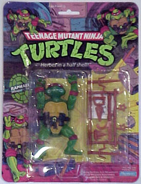
Teenage Mutant Ninja Turtles -- 1988 Raphael

Company: Playmates
Year: 2013
RRP: $15AUD

THE BACKGROUND
Back in the late 1980s and early 1990s, Teenage Mutant Ninja Turtles were just about the biggest kid’s phenomenon on the planet. They had a wildly successful TV show, which had spawned an obscene amount of merchandise in its wake. To provide a more contemporary reference, for those who weren’t born back then, just reflect on how big Gangnam Style was about two years ago – then triple it.

At the forefront of this Reagan-era excess was the action figure line, which generated more in sales than the economies of some small nations. Just about every kid had a plethora of TMNT stuff in and about their house. You’ll note that I said “just about every kid”, and the reason is not insignificant. As a child, I was not allowed much of anything to do with the Turtles, largely because of the violent content of the show. This will probably seem pretty silly to some, but the level of violence was actually quite controversial in its day. Some of you reading probably experienced this with your own parents.
Before I go on, I should add that my parents are great parents. They have bought me an absolute plethora of TMNT-related products in the years that have followed. And no I will no doubt have idiosyncratic rules for my kids one day too. So don’t make the mistake of thinking I was terribly deprived or treated poorly by my folks; nothing could be further from the truth.

However, I was obsessed with the Turtles and eyed the action figures of others with not inconsiderable envy. Some people, including myself, may even speculate that this lack of Turtles during my childhood has led to me spending an inordinate amount of money on various toys as an adult. I think there’s probably something to that – there definitely was when the ’03 TMNT series came out – but I think nowadays I also just appreciate a good action figure.
So today’s article is not just the simple purchase of a toy – this is the fulfilment of a childhood dream. Be warned, this is going to be much more of a gush than an objective review.

THE PACKAGING
I don’t often mention packaging these days. I am an opener, not an MOCer, and packaging often goes straight in the bin before I even bother to take a photograph of it.

Also, a lot of it just isn’t that interesting. I think that I can say without too much rose tinting on my glasses that toy packaging was often much better in the 1980s and 1990s. There were a lot of original illustrations and paintings, and seemingly more emphasis on grabbing a kid’s attention. Plenty of it was gaudy and horrible – just check out G.I. Joe’s Ninja Force subset for a great but dreadful example – but it has stuck with me over the years nonetheless. 

The TMNT boxes of the 1980s and 1990s are a prime example of great toy art. A lot of the illustrations on the box look positively amateurish, but they still have a very distinctive and awesome style nonetheless – particularly the comic on the back that relays their origins. .
This one appears to be an amalgamation of several different boxes. If you go and look at the original boxes, they are turtle-specific, with each character’s packaging directly related to them. However, this one features all four turtles. There are also a number of additional features to distinguish it from the original 1980s or 2009 re-release boxes, which is good. No doubt unscrupulous types would be trying to flog them off as the real deal if they could.

SCULPT AND ARTICULATION
If you owned one of these guys as a kid, you more or less know what you’re in for. These have apparently been made using the original moulds from the 1980s – and it is quite impressive that those moulds have lasted this long, I might add – so there’s no real surprises.
As for the design of the figure itself, the toy strikes a good balance between the comic and cartoon version of the character, but doesn’t look quite like either. I have read – though I’m not sure how true it is – that the turtle action figures were first prototyped before the cartoon had debuted. Getting the TV series signed off was part of getting the figures released and greater exposure for the initial comics. Of course, the show became a much bigger phenomenon than anyone could have predicted, and the 1980s cartoon and related merchandise are what most people tend to think of when they think of the Turtles.

Raph is slightly more articulated than I remember. He has the five points you’d expect from a toy of this era – neck, shoulders and hips – but his forearms are also cut joints. This allows him a little more motion than He-Man and co had, but not quite as much as G.I. Joe offered. Of course, these 7 points are not a great deal by today’s standards, but back in 1988 we didn’t have the same expectations.  
He seems to be cast out of two different plastics. His torso and shell are both quite hard, but are two hollow pieces. The head and limbs are much softer – almost rubbery, but not quite. Raph has also been stamped with a “2013” copyright on the back of his shell.

Like any toy, Raphael is not quite perfect, of course. His green is a little bit different to how it’s depicted on the packaging, and I’m not sure he’s been assembled with the greatest of care – moving his left shoulder seems to move the shoulder seam apart a little. Nonetheless, this is the Raphael I always wanted but never had.

ACCESSORIES
Raphael comes with a bunch of accessories, all of them weapons. Be warned that I’m not 100% on what all of them are; please feel free to give their correct names in the comments below.

*2 sais – his signature weapon
*2 shuriken
*a bladed knuckleduster
*an even bigger bladed knuckleduster

*something that looks like a bo staff, with a hook attached


All of them are cast in a caramel brown plastic, just like the old days. They’re attached to a sprue, which is somewhat styled to look like a weapons rack. I’d suggest using nail scissors to cut them out, rather than trying to twist them off. The weapons are cast in reasonably solid plastic, but you’re likely to leave white stress marks all over them if you go for the twisting option.

PAINT

I got this Raph via eBay, so I wasn’t able to examine him in person. Most of his paint is fine, but the tampoing on one side of his teeth is quite misaligned, riding up onto the underside of his snout. It’s more than a little annoying, so I may actually fix this with some paint in the future.

Also, as a side note: when the Ninja Turtles first debuted in 1984, they all wore red bandannas. However, when the comic was turned into a TV show, the turtles adopted their distinctive colours to better distinguish them for viewers. However, in the (now-sporadically published) modern Mirage comics, they seem to have retained the red bandannas to this day.
OVERALL
I've had numerous opportunities to buy vintage Raphael (and other TMNT) figures over the years, but I've always been a bit funny about it -- they were someone else's toys, not my own. Likewise, I didn't have the inclination or the money when these guys got a re-release in 2009 to coincide with the 25 anniversary of the comic.
I’ve had some regrets about that decision, so when I found out about these figures, I was thrilled. It’s taken some time, but I finally have an “original” Raphael of my very own. Taken as an action figure in comparison to more modern counterparts, he’s not so great. He’s a product of his time, quite primitive – if stylish – by the standards of today. But owning him is literally a childhood dream come true, and that’s not something many of us have happen very often. So in spite of his flaws, I consider this purchase a tremendous success – it’s extremely satisfying on an emotional level.
Will I go on to buy the other turtles? I don’t know. Purchasing all four would be a not-inconsiderable amount of money to sink into something like that at the moment. But a Shredder might be cool…   

Sunday, 24 August 2014

Funko POP! RoboCop

Company: Funko
Year: 2013
Series: Movies

BACKGROUND
Well, Funko Week comes to a close with RoboCop. I’ve spoken previously about my deep love of RoboCop, and what an amazing film it is. Really, if you’re a regular reader of this blog it probably doesn’t need a whole lot of introduction. So let’s just say that if you haven’t seen it yet, you should definitely do yourself a favour and go check it out ASAP. The second one, not so much. And I’ve not watched the entirety of the third one…but I certainly wasn’t sold on it based on what I’ve seen of it. Which is about 15 minutes.

This particular POP! was presumably released on the back of the hype around the 2014 remake, which was predictably okay, but not spectacular film. Funko doesn’t seem to have done a “new” RoboCop to match, but perhaps they only had the license for the original film.

THE POP
RoboCop’s condition is actually pretty horrible if you think too much about it. The original film is pretty vague about what’s left of his human body, but you get the strong impression there’s not much more than his face and part of his brain. And when he takes off that mask, it’s pretty horrifying. I’ve watched a huge amount of horror films, but one image that has stuck with me more than just about anything from those days is RoboCop’s unmasked face 

Of course, the Funko POP! version doesn’t really convey the horror of his existence so well – he’s just a cutesy cyborg, rendered in the distinctive POP! style. And I must say, it’s turned out pretty well. All of the main details are intact and present – his chestpiece, the screws on the side of his head and his separate big toe. Held in his left hand is his signature Auto-9, the ridiculously powerful handgun that deals out justice on numerous occasions during the film.   
Now for the paint. Oh Funko…you do so many fun sculpts and then do such an average job on paint!

RoboCop is painted primarily in silver, to match his appearance in the first movie – as opposed to the blue-tinged armour he’d later get. In theory, this shouldn’t be a problem, considering that they did a great job on the Silver Surfer, but in practice it’s little thicker and goopier than it should be.

This is forgivable – but the main thing that bugs me here is that RoboCop’s skin-tone paint is not properly aligned with where it should be on his face. It might be fixable, but it shouldn’t really have to be. Funko isn’t at the same level as Kidrobot when it comes to making this stuff, and to be fair I don’t think they’re trying to be, but it can be extremely frustrating nonetheless. So if you pick one of your own up, check it out closely.    
 

OVERALL
Like many of my Funko POP! figures, the paint is disappointing but the figure is overall great fun. As a big fan of RoboCop, I’m very pleased to have him as part of the collection. Though it seems unlikely, it would be great to see Funko produce figures of Clarence Boddicker, this guy and a variant based on this figure.  Now that would be a line to see!

Thursday, 21 August 2014

POP! Marvel – SILVER SURFER

Company: Funko

Series: Marvel
Year: 2013

RRP: $15.95AUD

THE BACKGROUND
Jack Kirby was a creative guy, and without his efforts the world of comics – and by extension, pop culture – would be substantially poorer. My favourite creation of his is the Silver Surfer. Originally appearing in the pages of Fantastic Four (who are probably my least favourite Jack Kirby creations), the Silver Surfer was originally the herald of Galactus, a cosmic entity who roams the (Marvel) universe in search of planets to devour. Also, before he became the Silver Surfer his name was Norrin Radd. Sounds weird? It is. But hey, it was the 1960s.   

THE POP
When this guy was released, he was one of the first Comic POP!s I’d seen that deviated from the “standard” POP body that was so commonplace – a lot of the early DC guys are essentially just repaints of the same base body, with new heads subbed in, and many of the Marvel guys weren’t miles away from it either.   

I think the results were a little mixed. If they had gone with the same body as Superman and just painted it silver, it probably would have looked a little too plain. But they’ve gone with a Michael Turner-style ultra-buff body, complete with buttocks. It works well in the comics, but looks a little too detailed in comparison to the other POPs. Though I’m not really a fan of his 1960s “trunks” look, I think it might have been the right approach on this occasion. Kudos to Funko for trying to mix it up a little though.
 
 
Still, taken purely on his own merits, Silver Surfer is definitely a success. His surfboard is included, attached permanently to his feet, to complement his surfing pose. They’ve even etched grooves into the surface, rather than leaving it blank, which would surely have been the easier option.    

Norrin Radd is entirely silver, so in theory it should be pretty easy to get it right. Yet the figure still had a couple of problems -- on removing him from the packet, some of the silver paint on his head tore a little, as it seemed to have stuck to the plastic tray. Not a lot you can do there, really.
However, aside from these minor flaws, he’s fine. The paint is nice and even, and the tears on his head aren’t super noticeable.

OVERALL
The Silver Surfer is a great addition to the collection. I’ve only bought a handful of Marvel POPs (though some of the Guardians of the Galaxy are tempting me) and I tend to have high expectations of them as I’ll only pick up characters I care about a lot. Paint tearing aside, the Surfer turned out very, very well and has been one of my most satisfying purchases.   

I don’t much care about getting a set of the Avengers in POP! form, but I would like to get some of the Infinity Gauntlet gang. Presumably Funko will bring out a Galactus sooner or later (and they already have in their Marvel blind-boxes), and hopefully also a Thanos, Adam Warlock, Dr Strange…the list goes on! Then the Surfer will be able to share the shelf with some worthy Marvel companions.    


Wednesday, 20 August 2014

POP! Movies – V

Company: Funko
Year: 2012/2013?
Series: POP! Movies
RRP: $15.95AUD

THE BACKGROUND
Released in early 2006, V for Vendetta made a huge impression on me. It may sound silly to some, but though I was historically and intellectually aware that some people treated others poorly on the basis of skin colour/sexuality/religious belief/political opinions etc, I hadn’t really had anything connect with me on a heart level that made it “real”. Being a white male, I’ve experienced very little discrimination in my own life, which probably accounts for this blind spot.

Watching it again some years on, I can appreciate that there are some valid criticisms of the film to be made. But watching V for Vendetta sparked a new awareness in me, something I hope I never forget – namely, discrimination against others is wrong and that we must always stand against totalitarianism. Simple sentiments to be sure, but ones that I think are well worth remembering.
(NB: I know the movie was based on a comic, but this guy was released as part of the Movies series rather than the Comics series)

THE POP  
The sculpt captures the character quite well, without moving outside of the Funko look. The most important part is, of course, the Guy Fawkes mask. It’s a stylised version of the film’s depiction, whose variations fit the Funko aesthetic nicely without deviating too far from the “real” look.

The body follows the same basic shape as most of the DC characters, though it’s been retooled for the details to match V’s outfit, and to feature a knife in each hand. The outfit looks a little under-detailed, but it still conveys the general impression of his costume. It's not exactly eyecatching, but its simplicity does mean that your eye isn't drawn away from the  intentional focal point of his mask. The cape is just the same as Superman and Martian Manhunter’s, though it’s cast in black. It’s inflexible, so don’t expect to pull off any windswept poses.   
V is quite a bit heavier than most other POP!s I’ve come across – largely because of his large Guy Fawkes, pilgrim-style hat, which seems to be solid, rather than hollow. It’s a separate piece to head itself, though it’s not removable. The hat is a big part of V’s look, but he does spend a considerable amount of time without it – it might have been good to see another version of him sans hat and cape.      

As for paint? Well, V is one of the better painted POP!s that I own, though I suspect this is because he is largely unpainted. Aside from his mask and head, only his belt buckle and knives are painted.
The details of the mask – the eyebrows, eyes, moustache and goatee – are all cleanly painted for the most part, though the left eye is slightly off. The cheeks also have a slightly rosy tinge. However, the bone-ish colour of the mask is rather dirty, as though a black wash has been put over it. This could be intentional – towards the end of the movie, V’s mask certainly does get very dinged up – but I’m not sure. Additionally, the unmasked underside of his head has been painted in a pale pink colour, a normal (if pale) skin colour – no sign of horrific burn marks here.   

The silver on his knives and belt buckle is quite sloppy, though it’s only really noticeable on close inspection, as it blends into the surrounding black.  

AVAILABILITY
V was in very short supply for a while there, and some retailers still seem to be charging an extortionate price for him online. However, over the last couple of months, he’s again been showing up in retailers and online again for RRP– maybe he’s been re-released? I’m not clear on how Funko structures its releases (e.g. whether certain runs are limited) and some cursory Googling hasn’t really resolved the matter. But suffice to say you shouldn’t be too hard-pressed to track him down.

OVERALL
V for Vendetta was one of my favourite movies for quite a while, so my expectations for this POP! were quite high, even more so after I had to spend quite some time tracking him down. I eventually came across him on Free Comic Book Day earlier this year. Did he live up to expectations? Yes, I think so, very minor paint issues aside. Though one must wonder if the manufacture of V for Vendetta merchandise is really keeping in the spirit of Alan Moore and David Lloyd’s creation, it’s nice to have him around the home nonetheless. The main disappointment is that there’s no Evey to accompany him – but perhaps in time.


Sunday, 8 June 2014

Playmobil Fi?ures Series 4: The Wizard

Company: Playmobil

Year: 2013

RRP: $AUD5 

BACKGROUND

If you’re reading this blog, you’re no doubt familiar with the Lego Minifigures range – blind-bagged minifigures, each sold individually. Lego has been releasing them to massive success since 2010, with no sign of slowing down anytime soon. Playmobil jumped on this bandwagon pretty quickly afterwards, launching its Fi?ures range in 2011. There have been four series so far, each split into two subsets – one aimed at boys and one aimed at girls.  

The Wizard I’m reviewing today comes from series 4, which seems to have been released in late 2013 (series 5 is likely to be on the way soon, I imagine). The Fi?ures range does not inspire me to collect in my usual obsessive fashion, but this is a particularly cool Klicky and I decided I had to have him.  

SCULPT AND ARTICULATION
Playmobil Klickies are built on one base figure (like a Lego minifigure), standing just under 3 inches tall. There seem to be a couple of variations (e.g. to allow for child Klickies), but most of the differentiation between figures appears to come from the accessories and paintwork. So if you’ve ever owned a Playmobil toy, you’ve got a pretty good idea of what you’re in for. However, there is an important difference with the Wizard – his robe is a solid piece, rather than simply being an accessory placed over normal legs.   
The face is cast in light skintone plastic, the body in black, the hands in white and his boots in black. Articulation is minimal – cut neck, cut shoulders and cut wrists. The hips are on a hinge, so the legs all move as one piece. Though minimal by action figure standards, it fits the aesthetic of the toy nicely.  However, the beard means that his neck movement is quite restricted, particularly once the cape is also added to the mix.

ACCESSORIES
The Wizard comes with quite a few accessories – most of which I suspect have previously seen release in other lines, but I am no expert on Playmobil, past or modern. Those with more knowledge than me should feel free to comment below.
He comes with:

*a green wizard’s hat

*an ornate silver hatband, which somewhat resembles the Assassin’s Creed logo

*a green cape, with pointed shoulders

*a green belt

*a grey hairpiece
*a grey beard

*silver wristbands

*a set of keys (?) which attaches to his belt

*a black wizard’s staff, with a (removable) translucent green mystical orb

PAINT
The “paint” on these guys seems to be largely the work of tampographs. In the Wizard’s case, it’s a little more ornate than we often see on a Klickie – a dark green pattern on the front of his lime green robe, with silver detailing further overlaid – but without hurting the simplicity of the overall design.
As he’s in a sealed bag, you won’t be able to check the paint prior to opening, but I had no dramas with mine.  

AVAILABILITY
The Playmobil Fi?ures series has been lurking around toy aisles for some time, but they don’t seem to be very readily available – the main place I’ve seen them is Toys R Us, a local Central Coast toystore and once in the Reject Shop (Series 1 & 2 only, though).
Though the figures are blind-bagged, you should be able to find the Wizard reasonably easily – his hat and staff are both quite distinct and easy to feel through the foil. 

OVERALL
As I said in my previous review, it’s probably been close to 20 years since I have played with Playmobil, but it was a really cool experience going back to it, particularly after my enjoyment of the Ghost Knight.

But though I was over the moon when I first saw the Playmobil Wizard, I wasn’t actually as blown away as I had expected once I got him in hand. Though he’s cool, he didn’t quite “pop” as much as I hoped. This should not dissuade you from purchase, as after the incredible high of a glow-in-the-dark Ghost Knight, I suppose it’s natural that other releases might not shine quite as brightly by comparison. The Wizard is a great little toy and I’m very glad to have added him to the collection. Epic photos of the battle between the two will hopefully follow soon!


Sunday, 20 April 2014

Lego Review -- Dragon Mountain (70403)


Set: 70403 Dragon Mountain

Theme: Castle

Pieces: 376
Build Time: 1 ½ hours

Year: 2013
RRP: $AUD69

The Background
The 2010-12 Kingdoms series was a little underwhelming. Ditching the more fantasy-oriented elements of Castle in favour of a more “realistic” approach was a mistake in my opinion, so when Castle returned in early 2013, I was initially quite pleased. However, the sets left me a little cold at first – I was pleased to see a dragon and an evil wizard, as well as good and evil knights – but I didn’t see myself buying any.

However, I ran across some sets instore recently and reassessed my position. Dragon Mountain particularly took my interest. An evil wizard, a princess to rescue -- and of course, a dragon. It hits on a lot of fantasy archetypes in one fell swoop. So I decided that I would like it, and my wife was kind enough to oblige a few weeks ago for our first wedding anniversary :)
Minifigures
There are 5 minifgures in this set – 2 Lion Knights, the princess (the good guys), the Dragon Wizard and a Dragon Knight (the bad guys). None of them seem to have names, but that’s okay – all you really need to know is that the Lion Knights (silver and blue) and the Dragon Knights (black and red) are battling against one another. The rest is up to you.

The Dragon Knight looks like most of the others – black armour with red and silver detailing. His head is goateed, with stubble around it. He does the job of generic henchman quite well.

The same goes for the first of the Lion Knights – nothing out of the ordinary, just a conical helmet with a noseguard, and a spear as a weapon. He gets to tend the catapult.  

One of the Lion Knights looks significantly more “heroic” than the other, though he’s still not given a specific name. He’s armed with a sword and shield. He’s also got a closing helmet, with two faces beneath, seen in the pics in the review – one confident-looking, and the other terrified.

The role of the Princess will be seen by some as sexist, as she is depicted on the box art as being locked up, waiting for a knight to come and rescue her. But this is Lego, so you can make your own story. She uses the standard dress piece, and has two faces – anxious and happy. Her hair is cast in soft rubber, rather than hard plastic, and her crown/tiara slots into the top.  

The Evil Wizard uses a black rubber beard piece, like Gandalf, and comes with a cloth cape and horned staff – a bit like Skeletor’s but without the skull. He’s a nice, standard Dungeons and Dragons-style evil villain.

Build

The set is relatively simple to construct, consisting of two main elements – the Lion Knight’s catapult and Dragon Mountain itself. The catapult is nicely detailed – and I would have enjoyed flinging the “rock” around immensely as a child – but it’s neither here nor there to me. I can’t help but think that the dragon’s flames would consume it quite rapidly. Still, it’s a nice generic piece to add to the medieval pile.
Dragon Mountain, on the other hand, is very cool. Split into two towers, connected by a bridge with a small catapult that shoots flaming projectiles, there’s a number of intriguing features packed into a relatively small set.

The most obvious is the jail cell on the taller of the two towers, where the Princess (or any figure of your choice, really) can be positioned. But turn the set around and you’ll see the bottom section of this tower is something of a break room or miniature mess hall. There’s a small table, complete with goblet and slice of cheese.  


A level up from the jail cell houses the a red crystal – one can only assume that it is some sort of nefarious object, perhaps the source of the Evil Wizard’s sinister powers. And at the top of the tower is the platform on which the wizard stands – though how he got there without a ladder is open to debate. Perhaps he can fly?
Over on the back of the other tower, you’ll see a large spiderweb, and a deadly spider lurking on it. But flip it down and you’ll see that concealed within is the Evil Wizard’s lair. Two keys (presumably for the jail cell), two mysterious flasks and a lit candle lie within.


It will sound silly to some, but one of the things I was most excited about was the inclusion of not just a treasure chest – but gold coins! I used to love these coins back in my childhood days, when they were included in Pirates sets. Now, as then, they have different denominations embossed on them -- and this time there’s an actual bar of gold included. It’s awesome!  


Last but not least, the mousehole – complete with mouse poking out – is a great touch. Presumably he was after the delicious cheese within.
The real centrepiece, though, is the titular dragon. Since 1993, Lego has produced several different dragons (and there are some amazing customs out there too!). This one was first released in 2007, and is classed as version 2.5, according to Brickipedia.  

Somewhere between an action figure and standard animal figure, his arms and legs are all swivels, and his neck is kind of swivel-hinged both where it connects to his head and body (albeit with somewhat limited range). His tail can be rotated to change its angle, but not moved much more. He’s also got a hole on the lower part of his mouth, where a flame piece can be inserted. This allows you to display him either neutral or breathing fire, whichever you prefer. His jaw is also articulated, so there’s a number of different looks you can go for here. Last but not least, his wings are ratcheted – which is very handy for keeping his wings in your preferred pose.

He looks pretty good on the whole, though in real life I was initially a little underwhelmed – I think due to the shape of his next being different to what I had expected. Nonetheless, he’s grown on me and is an impressively large piece – a terror for any minifigure to behold.


Overall
The set is a little small for its price, but it does come with a large amount of minifigs and obviously the dragon is where a lot of the cost is coming from. It’s not the best value-for-money set I’ve had from Lego, bbut as mentioned above, it was a gift from my wife for our first wedding anniversary a couple of weeks ago, so money wasn’t such an object J

After initially being ambivalent to iteration of Castle, I’ve come to quite enjoy it. My wife recently purchased me set 70402 (The Gatehouse Raid) -- but it’s similar enough to 70806 (Castle Cavalry) from The Lego Movie that I don’t think I’ll review it separately.
I owned a little bit of Castle Lego as a kid, but never a huge amount – it does not hold the same nostalgia for me as say, Pirates. As a boy King Arthur did not yet hold the same appeal as Robin Hood (granted, I did own some of the Forestmen), nor had I started reading fantasy novels and playing Dungeons and Dragons. Even though I’m quite late to this party, I’m glad that I decided to come. Now I’m eyeing off the King’s Castle – but at nearly $140 wherever I go, I’m having a hard time justifying it!