Showing posts with label 1980s. Show all posts

Friday, 2 February 2018

POP! 8-bit – Raphael

Picking your favourite Ninja Turtle is like picking your favourite child – that is, people will judge you for it, but you should definitely know who it is in case you’re ever in a Sophie’s Choice situation. Who's mine? Well, as you may have guessed by the title and picture, Raphael is my favourite of the TMNT.

As a kid, I spent many hours at my friend Rohan’s place playing the Teenage Mutant Ninja Turtles game for the NES. If you have never played it, rest assured that it is a thoroughly frustrating experience. While not of the same difficulty as Battletoads, the game is still routinely unfair to the player – a deadly combination of the developers thinking they were making a game to suck quarters and flat-out bad design.

That said, we did have a lot of fun with it; we were too young to realise that some games were simply poorly made and we were both Turtle-obsessed. It had a cool soundtrack too! So when Funko announced that they were making the Turtles as part of their 8-Bit line, I thought I’d pick up Raph here as a tribute to those more innocent days.

Raph has a nice chunky feel. Though made up of more individual pieces than the average regular POP, the 8-bit figures have a real heft to them, and don’t feel quite as delicate as some of the newer POPs doing the rounds. While not an exact match for the look of the game, the style is great, too – it feels like a callback to the vinyl art toys that Funko was aping when it first came out with the POP line. I could see a few people who aren’t necessarily fans of the POP look picking this figure up.  

There’s not a lot of paint; most of the figure is simply cast in the appropriate colours. The only real paint is around the mouth and on his sais. It’s a little sloppy, but taken as a whole I’m quite happy with it.
In a world where there are literally hundreds of Turtles figures available, this isn’t particularly essential, but it is an amusing novelty. In my case, it’s a purchase driven out of a misplaced sense of nostalgia. Now if only it also glowed in the dark...    

Monday, 24 July 2017

Madballs – Dust Brain (Kidrobot)

It might not come as a huge shock to discover that I am not a huge sports fan. Good Lord, who would have thought it? Please be careful while clutching at your pearls and fainting to the floor, I don’t have proper liability insurance on this place.

But I actually loved sport up until about the age of 11 or 12. Rugby league, baseball, basketball…I spent hours watching and playing them all, at school and with friends. There were always kids who were better than others at sport, but it was quite acceptable to play just for the pleasure of playing.
I feel like around year 6 this changed; as people hit puberty there’s suddenly far greater emphasis on playing to win, rather than enjoyment. Skill and co-ordination are suddenly required to be a serious contender. As a kid who lacked both but had recently discovered Star Wars, I realised that my time as a sports fan was drawing to an end.

But I might have hung in a little longer if I’d known about Madballs.

Y’see, Madballs are the perfect bridge between sports and weirdos. They’re such a simple concept, but genius – monster heads as balls. Put them on the shelf to impress your geek friends if you want, but you could actually toss them around like a real ball too. Perhaps the peak example was Oculus Orbus, a ball that is literally an eye! Whoever designed that deserves to be earning enough royalties to never have to work again.

Madballs had come and gone by the time I was old enough to pay much attention -- far too early to salvage my interests in sports. They didn’t have a supporting cartoon series to keep the line on life support in syndication, and the concept itself screams “fad”. This isn’t a criticism, but more of a reflection of the attention span of kids in the 1980s, an era where new franchises were debuting every other week. You can see how things got lost in the wash. The range was revived in 2007, but I don’t remember it at all (did it even make it to Australia?) and for a time it seemed that the world’s experience of Madballs would be limited to reading about them on nostalgia blogs or paying extortionate eBay prices for them.

But all that’s old is new again. Kidrobot has licensed the Madballs range, releasing a range of foam balls, and a bunch of blind-boxed stuff. More is apparently on the way too. So today, we take a look at Dust Brain!   

Mummies have been well-established horror tropes for more than a century now, and any horror-related toyline that doesn’t include at least one is simply getting it wrong. With my love of ancient Egypt, Dust Brain was the natural purchase for me. And boy, did Kidrobot do a nice job on this guy.

One thing I really like about these new versions is that they’re very faithful to the original designs. They’re subtly updated, but no less effective as a result. Often when 80s properties get revived, their character designs become a little more streamlined, toning down some of the weirdness in the process. Madballs is a property that is almost totally oriented around gross little details, so it’s to Kidrobot’s credit that they’ve opted for maximum grossness.  

He’s wrapped in horribly yellowed (browned?) bandages and you can see his teal mummified face peeking out from beneath. Orange eyes leer while rotting teeth often to form a horrible imitation of speech. It’s totally disgusting, while still being totally kid-friendly. Great work!

Dust Brain is cast in a soft but solid foam; these are clearly designed more as collector pieces, but you could do damage if you hit someone in the face with one*. Durability and paint will be rapidly tested if you start hurling it around though. Keep this guy on the shelf.  

My only real criticism is that the price seems just slightly high. I paid around $15AUD for this guy, and while I don’t think it’s outrageous I would feel much more comfortable if things came in around $12AUD. The sculpt and paintwork is very solid…but I do feel like there’s a slight Kidrobot tax on it too. Nonetheless, if you’re a fan of the old toys you won’t be disappointed. And if you just want something weird on your desk for work, you won’t be disappointed either.

*Don’t hit people in the face with Madballs  


Saturday, 3 June 2017

POP! Movies – Gizmo (Gremlins)


First of all, keep him out of the light, he hates bright light, especially sunlight, it'll kill him. Second, don't give him any water, not even to drink. But the most important rule, the rule you can never forget, no matter how much he cries, no matter how much he begs, never feed him after midnight.

A couple of months ago I took a look at Stripe, and you’ll notice that many of the things I say here are copied verbatim – despite their vastly different looks, they still apply equally.

Gremlins, hey? A movie that, along with Indiana Jones and the Temple of Doom, helped get the entire American movie ratings system adjusted. Why? Well, the movie’s initial marketing may have *cough* downplayed *cough* those horror elements in favour of the film’s cutesy mascot, Gizmo – a face that launched at least a thousand plush toys. And more than 30 years on, Gremlins merch still relies heavily on the little guy’s presence. So when Funko was in the early days of their POP! Movies line, it’s no surprise that they decided to make Gizmo along with Stripe.

Odd fact: Gizmo’s voice was provided by Howie Mandel. Not terribly well-known in Australia, he’s quite famous as an actor and as the host of Deal or No Deal in the USA – and also for his crippling mysophobia. The poor guy can’t shake hands with anyone, which must make day-today life a nightmare. 

This being a relatively early entry in the POP! Movies line, you’d be guessing that the paint is on the sloppy side. And you’d be right; it’s by no means their worst work and it’s better than Stripe, but they’ve come quite a way in the last 5-6 years. The sculpt is particularly cool; these days I would suspect it would be executed in quite a different fashion, and not necessarily as well. Before around 2013 or 2014, POPs were much more heavily stylised, and I don’t think that was a bad thing; not all of them are winners, but they definitely had their own feel. Though the overall standard of sculpting and paint has improved in the intervening years, the simplicity of the older figures definitely has its charms too. 

There is another version of Gizmo, though unlike most of his horror POP companions it’s not a glow one – rather, it’s flocked. It was released in 2011 as an SDCC exclusive, with an edition size of 480. Good luck tracking one of those down!

Even for a relative newbie to the franchise like myself, Gizmo here is a fun figure, and it’s a bit of a shame that we never got more characters beyond him and Stripe in POP form. The first film alone has so many cool character designs, to say nothing of the second. That said, Gremlins 3 is allegedly in development at the moment, so we may yet see more of them hit the shelves in the future.  

Thursday, 23 March 2017

POP! Movies -- Beetlejuice

I’m no big fan of Tim Burton. Or perhaps more accurately, I’m no big fan of the cult that’s been spawned centred around his works. But with that caveat, I do like several of his movies – Beetlejuice perhaps most of all.

I watched plenty of the Beetlejuice animated series as a kid – and of course, recall virtually nothing about it – but I had never actually seen the film until about four years ago. For whatever reason I was up late and it came onto TV as the late night movie, so then was as good a time as any.  

It’s a weird and dark film, though its heavy German Expressionist influences are mostly played for comedy rather than “true” horror. It contains many of the elements that have since become Burton clichés, though they feel remarkably fresh here; crude but effective Claymation-inspired designs, black and white stripes, weird gothy characters and a fascination with the morbid. I can’t imagine Alec Baldwin or Geena Davis starring in anything like it now, though of course for Winona Ryder it would help set the tone for her subsequent career.

Now, for convenience’s sake I’m going to refer to the film as Beetlejuice and the character as “Betelgeuse” – accurate to the movie, but not always how we tend to refer to him in the common parlance.  

Betelgeuse is quite well-sculpted, though I don’t think the expression on the face quite captures the signature smirk he displays through much of the movie. He’s recognisably the character, but definitely has shades of the Joker in the too – which is fitting in its own way, given Tim Burton’s role in launching the Batman film franchise in 1989. Paint is okay by Funko’s standards at the time, but would be better if he was released today. Check the stripes on his suit, the eyes, the teeth and the hairline. Some slop is forgivable around the hairline given that kind of fungus thing he has going on all over his face and suit, but in the other areas it looks much more overt.    

Like Spikewho got reviewed yesterday, there is a Glow Chase version of Betelgeuse. His eyes are also painted with the swirly pattern that appears on the box. It’s a good look, but as with most of his Glow Chase contemporaries, he sells for considerably more than I would care to pay.  

Betelgeuse is a solid if not quite spectacular POP. Sadly, we’ve never received any of the supporting characters from Beetlejuice in POP form*. There was a Hot Topic exclusive of Betelgeuse in a different outfit last year, I can’t imagine that we’re going to see anyone else in a hurry. It’s a shame really, because the whole film is filled with freakish and memorable designs that seem made for POP format – and if nothing else, you would have thought Funko would pump out a Lydia Deetz. I can only assume it has to do with licensing costs; Tim Burton is a huge director these days, but Beetlejuice remains something of a cult film; it’s never generated a fraction of the merchandise that accompanied A Nightmare Before Christmas. The cost-to-profit ratio may simply be too high.      

*Though there have been a few Mystery Minis

Sunday, 26 February 2017

Stranger Week Bonus Day – POP! Television: Demogorgon (Stranger Things)

The most visible threat of Stranger Things was the Monster, better known as the Demogorgon. A number of Lovecraftian elements are present in the show, but the Demogorgon’s design is where we probably see the most influence shining through. H.R. Giger and Silent Hill's hands are also evident, though there’s far less bio-mechanoid/Freudian sexuality than either of those influences typically showcases. Stalking through both the real world and the Upside Down, numerous characters fell victim to its claws and teeth-lined face.  

At present, we don’t actually know a great deal about the creature; there’s been a wide array of fan theories, but for me the jury remains out until such time as future season/s of the show provide more information. The Duffer Brothers themselves have likened it to the shark from Jaws, rather than being a sentient being, but I guess we’ll just have to wait and see what…unfolds…

The POP depicts the Demogorgon with its “face” fully flared out, ready to attack. It somewhat resembles a carnivorous flower, and it’s also pentacle-shaped – this is likely a reference to the demonic origins of Demogorgon in Dungeons & Dragons, which in turn drew its name from a rather vague (and unrelated) figure in Christian demonology*. Modern research seems to suggest that the whole concept was likely based on a misinterpretation of the word “Demiurge”, a figure in Gnostic belief. But here we start to move into occult waters that are well out of my depth.

The scale is not quite right. Looking at screencaps, the Demogorgon is substantially larger than a human, but nowhere near big enough to warrant a 6” POP. They’ve gone bigger in the past with figures like Cthulhu, but on this occasion I think the reduced scale still works fine. He’s wildly different in style to the other figures in the series – which would ordinarily be a criticism but makes sense in light of the way the character is depicted on the show.   


There’s also a chase version of the Demogorgon, and it’s a good example of an ideal chase figure i.e. it adds something cool to the collection, but it’s not essential to own in order to consider the collection complete (Eleven’s chase POP is a bad one for this very reason). The chase version depicts the Demogorgon with a closed face, somewhat resembling a clenched fist, a nurse from Silent Hill or a butt. It’s okay…but the regular version is definitely the cooler one.   

If you enjoyed Stranger Things but don’t want to go all-in on the line, Demogorgon and Eleven are the obvious figures to pick up. The sculpt is good, the paint is fine (the teeth on the "petals" is a bit sloppy) – and while I wouldn’t go so far to say the Demogorgon has quite reached iconic status yet, it’s a very cool creature design and will look great on the shelf alongside other movie monsters. I can't wait to see what Season 2 throws at the protagonists!  


*Though they got it a little off if they wanted to convey this; the upright pentacle that we see on the Demogorgon's head has typically been seen as a symbol of good. It's the inverted one that's meant to convey darkness or evil. Hence why neo-pagans tend to wear upright ones and metal bands tend to use inverted ones. The upright one has even been used as a Christian symbol at various times, though your local church is unlikely to have one on prominent display.  

Friday, 24 February 2017

Stranger Week Day 7 -- POP! Television: Eleven (Stranger Things)

Weird girl with magical powers who can’t communicate properly with those around her. This is a well-worn trope across all genres of weird fiction, and it’s one that tends to drive me up the wall. I’ve never been totally clear on why it bugs me so much, either; perhaps because it tends to be played for crappy comic relief and/or heavy-handed social commentary on how sometimes what we see as cultural norms are actually a bit strange AND HAD YOU EVER THOUGHT ABOUT THAT??!?!?*

But I didn’t dislike Eleven at all. Millie Bobby Brown had quite a central role as part of Stranger Things, and she pulled it off admirably. Eleven was rather different from some of her cinematic forbears in that the producers opted to play her in a relatively understated fashion – and for the most part, convincing – as opposed to exaggerating everything into an opportunity for “hilarity”. There are some funny moments, but they’re never break the wider tone of the show.

As might be expected, Eleven is depicted with a shaved head, dirty face, bloody nose and a pack of Eggo Waffles. She’s also wearing the clothes that she gets from Mike’s house (was it meant to be Nancy’s old clothes, or just from a dress-up box? I don’t remember), even down to the calculator watch. So this POP isn’t based on any specific scene; it’s more of an aggregation of several elements of the character, though you could argue that it’s from right near the end when she fights the Demogorgon.

Eleven was actually the first Stranger Things POP teased, back before they even had the license. What we got here is much the same as that initial prototype, which is impressive – it’s one of Funko’s more detailed POPs, both in terms of sculpt and paintwork. Obviously Netflix and the various other licensors were quite happy…but the cynic who used to work in advertising makes me think that Funko had the license for a lot longer than they let on, and the whole “these are prototypes” thing was just to build hype. Never mind either way; the final product is a good one.   


There is also a Chase version of Eleven, packed at a 1/6 ratio. It uses the same body sculpt, but has a different head sculpt – it’s Eleven after she gets her blonde wig and has her face cleaned up. And this brings me to a complaint. I don’t mind that Funko does Chases; but in four years of collecting, I have only ever encountered four or five in the wild. Traditionally, they’ve also tended to be paint variants – metallic, glow-in-the-dark, that kind of thing.

But in 2017, Funko is now bringing in sculpt-based chases, and that irritates me no end. Once upon a time, Funko would have simply released these two versions of the character separately, and people could simply pick and choose which one they wanted (probably both, in most cases) – now we don’t have that option. Though they’re ostensibly being packed at higher ratios than before, I can virtually guarantee that they are still going to be a huge pain in the ass to find. Given that I’m expecting (as I have noted numerous times on here) Season 2 versions of the characters to eventually be released, I’m probably not going to make much more of an effort to search out the Chase version. But Funko’s doing similar things across a number of their lines, and I don’t think it sets a very good precedent. Their Twin Peaks range has done something similar, in even more disappointing fashion -- an entire major character has been relegated to a Chase figure.       

Not counting the Chase, there are two other versions of Eleven at this stage and I suspect we’ll see more not too far down the track. There’s an Underwater version, with her “swimsuit” and helmet. Next month there’s an Emerald City Comicon exclusive – Upside Down Eleven, who’s in a two-pack with Upside Down Barb. It looks to be the Underwater sculpt without the helmet, so I’m sure customisers won’t have any issues creating their own.

Eleven is must-buy for fans of the series, and she seems to be the best-selling so far. Funko have done a bang-up job with this one, and here’s hoping we see this level of care and attention applied to some of their other ranges in future.


*One of my other pet peeve is when characters are described as “quirky” by their actors, screenwriters or directors. In our day-to-day lives, we do meet quirky people, and they’re often highly engaging and entertaining. But on film, “quirky” tends to be code for “the character has one or two oddball interests but is mostly just extremely irritating and will make you resent the time they spend onscreen”. 

Stranger Week Day 6 – POP! Television: Mike (Stranger Things)

Like many of its inspirations, Stranger Things is ostensibly for adults but is also eminently watchable by a younger audience. Sure, at a few points it’s violent or scary, but it’s hardly The Evil Dead.

While Mike’s not exactly the main character, he’s probably the closest thing the show has to an audience surrogate for its younger viewers. Fortunately, he’s got substantially more depth than most audience surrogates. The Duffer Brothers have obviously heeded their own childhood viewing as a warning about how terrible audience surrogates can be, as the ratio tends to skew about 10,000 Orkos to 1 Mike.

Mike’s POP shares quite  a good likeness to Finn Wolfhard, though Will’s is probably still the best overall. He’s equipped with his walkie-talkie (which would have made a good accessory for Lucas, too), which seems omnipresent throughout the series, and as with all of the Stranger Things POPs so far, the sculpting is well-executed and painted well. The only (possible) detail missing is a cut on the chin, though you could always add this yourself if you wanted.   

I’m in the middle of watching the series through again, partially in preparation for series 2, but also just to refresh my memory as I write these reviews. And on second viewing, I strongly suspect that Mike is at least partially based on Sam, John Francis Daley’s character from Freaks and Geeks. Though not identical, they look somewhat alike, dress similarly and are definitely on the same wavelength of interests, though Mike is considerably less dorky*. In an interesting example of things coming full circle, Finn Wolfhard has since been cast in the new version of Stephen King’s IT – which has also had its setting updated to the 1980s. I'm hoping he doesn't get too typecast in the long run!


As with Joyce, Mike is not the most fascinating design that we’ve ever seen Funko come up with, but he’s an essential part of the show; one of my favourite characters from it too. Eleven and the Demogorgon are the obvious pickups from the range for more casual fans, but Mike is a very close third.


*If you’ve never watched Freaks and Geeks you should definitely check it out – it was one of my favourite shows as a teen, and pushes a lot of those 80s nostalgia buttons in the same way that Stranger Things does.   

Tuesday, 11 October 2016

POP! Heroes (NYCC 2016 Exclusive) – Classic Batgirl

Batgirl occupies a strange place in the DC canon. Though she’s extremely high profile from a merchandising perspective, the classic character that you tend to think of when the word “Batgirl”is said didn’t really exist for 20+ years. Instead, Barbara Gordon was occupying the role of Oracle after the events of The Killing Joke, back in the late 1980s.

Nonetheless, merchandise is a power driver…so waaaaay back in 2010 when POPs were first debuting, Batgirl was one of the first DC girls produced. Which is very cool, but she’s no longer in production (though the mould is still being used) and now sells for an obscene amount of money on the aftermarket. So good luck getting hold of one! More recently there’s been a “Batgirl of Burnside” POP produced, which is a great look – but I haven’t read the comics it’s based on, and it’s not really the classic look that I tend to prefer for my POP shelf.  

This costume is based on her original costume, apparently, it’s also quite similar to one of her New 52 costumes, sans armour plating. It’s not really a familiar look to me – by the time I was really old enough to be reading comics, Barbara had been turned into Oracle, so that’s how I’ve kind of always known her. And when I did come across the odd reprint or compilation that featured Batgirl, it was almost inevitably the gray/blue suit. That said, it’s a really stylish look, and makes sense in light of the whole…well, Bat thing.

The paint is adequate, but not perfect. It's reminiscent of Funko's mid-period work -- not totally sloppy, but definitely not amazing, either. Still, it looks decent at a distance. Also, she doesn't stand all that well on her own -- but she does come with a stand, so that's good. In my case, she'll be staying in the box so it becomes a bit of a moot point anyway.   

This POP is an NYCC exclusive, but I had a lot less trouble getting hold of Batgirl than I did any of last year’s SDCC (stupid rare flocked Wolfman!) or NYCC exclusives. Popcultcha’s website didn’t seem to crash, and my local bookstore had plenty of these available. How long they’ll last is anyone’s guess – but in Sydney at least, certain POPs seem to hang round for months afterwards.   


That said, if you miss out – don’t panic. Given that the original’s no longer around, I will be very surprised if we don’t get this mould in grey and blue in the near future as a regular release. Which I may also have to pick up…  

Sunday, 25 September 2016

POP! Movies -- Freddy Krueger

Series: POP! Movies
Company: Funko
Year: 2011

Freddy Krueger – in a world of mute murderers like Michael Myers, Jason Voorhees and Leatherface, he stands out as one of the most distinctive villains from the slasher era. I mean, Pinhead has a bit to say for himself, but he's distinctly less...amusing...in the process. 

More than 30 years after his cinematic debut in A Nightmare on Elm Street, he’s still incredibly popular. He may not have had a film in the cinemas for a while, but the plethora of Freddy merch littering the shelves suggests that there’s still a substantial fanbase out there. Will we see Robert Englund play him again? Probably not, but the character lives on nonetheless.   

Though this figure was released under the Nightmare on Elm Street banner, this is not Freddy from the first film. His appearance has remained pretty consistent over the years, but has undergone a few subtle adjustments over the years. I would guess that this is based on the third or fourth film, based on reference images online. Maybe Freddy Vs Jason? Others more familiar with the character will have to make that call.

Considering how early this figure came in Funko’s run of POPs, it’s surprising how excellent it looks. The fedora also appears to be a solid piece, which gives the whole thing a nice weight. The paint could definitely be better, but the main area you’ll notice an issue is the left hand, which is a totally different colour to his scarred face. Perhaps it’s a more realistic take on burns damage, but it looks weird and incongruous in this format.

As a side note, the box depicts Freddy with painted eyebrows, but while the sculpt includes them, they’ve been left unpainted. I think was a better decision, as the “real” Freddy doesn’t have any. Also, pick your figure carefully in-store – the claws on his right hand are frequently a bit warped. It’s probably fixable with the hot water and ice trick, but I haven’t tried it myself.   

Freddy isn't the only horror villain with large claws.
There is a variant available too – a glow-in-dark one. Though I was fortunate enough to stumble on the Jason Voorhees variant in the wild, I suspect you’ll have a tougher time tracking down the Freddy one, unless of course you’re willing to pay crazy eBay prices. There's also been a syringe-fingers version of the character to -- this is apparently from a scene the third film. It's an interesting take, but not really as iconic as some of his other looks. 


Of all of the big horror villains, I’m probably the least familiar with Freddy Krueger. I’ve seen the first and second Nightmare on Elm Street films, Freddy Vs Jason and the 2010 remake – but with the possible exception of Freddy vs Jason, none of them are really representative of the popular image of the character as the sinister wise-cracking sadist. Nonetheless, the first film is a slasher classic, and indeed much better than some of its peers and predecessors. I’m sure I’ll get to the other films eventually, but in the interim still Freddy deserves his spot on my horror shelf. 

Saturday, 28 March 2015

Sunday Afternoon Reader: Each Sold Separately/Action Figures Not Included

Each Sold Separately

and

Action Figures Not Included

by Phil Reed

Phil Reed is the CEO of Steve Jackson Games and the driving force behind Battlegrip.com, one of my favourite toy-related sites. In his spare time (and honestly, I don’t know where he finds it – with his day job and the sheer number of posts he puts up on Battlegrip the man must only sleep about 2 hours a night) he finds time to publish books centred around his interests.  

Today, we look at two of those books – Each Sold Separately and Action Figures Not Included. I’ve chosen to review them together, as they really should be read in conjunction with one another. During the initial Kickstarter for Each Sold Separately, Phil announced that he had put together some extra pages beyond the original book – and suddenly, one book became two. I contributed to the initial campaign, and Phil was kind enough to also send me a .pdf of Action Figures Not Included when the two books were finalised earlier this year.      

Ostensibly based around the 1980s but self-admittedly touching on plenty of the 1970s and 1990s too, these books are great reading for anyone who remembers the childhood toys of this era fondly. Rather than being a comprehensive assessment of the toys of the era, it’s more of a look at the unusual and creative ways they were marketed. The usual suspects, such as TV shows and comics, are encompassed, while light is also shed on more obscure promotions such as cereal and “Book & Record” sets.

While the two books may not delve terribly deeply into most of the toy lines covered, that’s not really their purpose – we tend to remember the toys fondly, while often forgetting the huge amount of ephemera that were used to promote them in the first place. It’s great to see some of them rescued from total obscurity, as many of them had a great deal of time and creativity put into them, belying their blatant cash-in origins. As someone who works as an advertising copywriter by day, it’s an interesting insight into the way marketing has evolved – and also how much modern-day marketers could learn from these early-80s mavericks!

My big find was that there used to be G.I. Joe-based Find your Fate books – at least one of which was written by R.L. Stine of Goosebumps fame! How I missed this as a kid is something I may never understand. I may have to investigate further on eBay...  

Transformers and Star Wars get a lot of coverage, which is appropriate given both the enormous marketing success of the two properties at the time, Phil’s personal fandom and the sheer fact that both brands are still going strong today. However, plenty of others get a look-in too. Famous names like He-Man and The Masters of the Universe and G.I. Joe: A Real American Hero sit comfortably alongside comparatively obscure names like Power Lords, Crystar and ROM. A few names pop up that I’d never even heard of, which is always exciting for an 80s buff like myself. The main name which stands out as curiously absent is Thundercats.       

These books serve as a great jumping-off point for people who are interested in learning more about toys or marketing, and a bibliography is provided for those who are looking to broaden their own reading on either subject. Overall, it’s a fun coffee table book for toy and broader 1980s fans.  

You can also purchase the books reviewed here today on Amazon, as well as Phil’s other currently available books, which look at the world of third-party Transformers. Phil is currently working on a book based on the late-1990s Star Wars Expanded Universe action figure series. It’s being funded via Kickstarter, and looks like it will be another great read – I’d strongly suggest backing it if you get the chance.  

Wednesday, 5 November 2014

Book Review: Just Can't Get Enough -- Toys, Games and Other Things from the '80s that Rocked

Elements of this article originally appeared on the (now defunct) CastleCo-Op.com. This one's for you, Phil!

Pic from Amazon.com


Just Can’t Get Enough: Toys, Games and Other Things from the ‘80s that Rocked

Authors: Matthew Robinson and Jensen Karp

Year: 2007

Publisher: Abrams Image

The Background

When my now-wife and I started dating back in 2009, one of the first things we bonded over was our mutual love of the 1980s. Sensing my fondness for kid's toys and pop culture, she loaned me the subject of today's review, which I instantly loved and have never really returned -- now that we're married, the point seems kind of moot, too.

The Book

Toy-wise, the 1980s and 1990s were an interesting time to be a child in the Western world. Cartoons and action figures had been around for several decades previously, but it was in the 1980s that the combination of the two really came into bloom. Cartoons like He-Man, Thundercats and Transformers dominated not only the TV screens but the toy shop as well. Care Bears sold by the truckload. Kids all around the world were lapping this stuff up, and the companies involved were presumably all sleeping on mattresses filled with gold bullion.
 
In hindsight, all these kid's fads seem to be a typical example of the “Greed is Good” attitude that many believe defined the 1980s. Yet it is a model that has never truly gone away…just grown more subtle over the years. As adults, we're a little more aware that our favourite childhood toys were often more the products of cynical marketing meetings, rather than inspired creativity -- and yet it does not usually affect our previous enjoyment of them.

Styled to look like a Trapper Keeper, Just Can’t Get Enough is awash with brightly coloured pictures, amusing anecdotes, disturbing personal revelations and historical trivia. It’s somewhat comparable in concept to The A-Zof Cool Computer Games, though perhaps a little more cynical and (although I dislike using the term as a descriptor) American.

Many of the biggest children’s fads of the decade get a look-in. He-Man, Voltron, World Wrestling Federation, Hungry Hungry Hippos….the list goes on. Most you’ll be familiar with, even if only in passing. But there were a few I’d genuinely never heard of before -- the Lite-Brite? Did any of you ever own one of these? Maybe it was a U.S. thing, or maybe I was just too young, being an '85 baby.

Each chapter takes a look at the history of the toy/game/book in question, its current availability status and a brief overview of any related spin-offs. For example, the section on He-Man features an assessment of the live-action movie starring Dolph Lundgren and Frank Langella (oh, it happened).

I was particularly pleased to see that Choose Your Own Adventure books were also featured within. Anyone who knows me well is probably aware of my childhood obsession with these marvellous pieces of children’s literature. They’ve long since come and gone in their popularity, but as a young child I was absolutely hooked.
 
Importantly, it’s not just boy’s stuff that gets a look in -- there’s plenty of coverage for more traditionally female items like Rainbow Brite and Strawberry Shortcake. The Cabbage Patch Kids chapter in particular is one of the funniest in the book.

How do all of these retro relics hold up after so many years? As might be expected, it’s a little bit mixed. There are plenty of toys within that still look cool as an adult. Other items have not fared so well, or were simply terrible at time of release, but people were sucked in by hype. Take Pogo Balls -- much like the authors, I remember just about everyone owning one of the things, but I would be hard pressed to remember seeing anyone actually use one. I suppose it’s a powerful example of how well marketing can work on young impressionable minds.

There were a few omissions from the volume that were disappointing. Perhaps the most shocking was the Teenage Mutant Ninja Turtles, posterboys for the 1980s if ever there were some. Still, things are always going to get left out, I suppose.
 
Not long after the original version of this article was published online, I actually interviewed Jensen Karp via email. My document of this seems to have been lost (though I am looking), but I recall him mentioning there were a number of other chapters planned, but for space and other considerations, they just didn't happen (possibly accounting for the lack of TMNT?). He also mentioned the prospect of a 1990s-based sequel, which didn't seem like it was getting off the ground through no fault of their own -- one was released in 2013, but it seems that it was entirely separate from their involvement. I own that volume too, though, so I may have to look at it on here soon.
 
Just Can't Get Enough is primarily a hilarious experience and highly recommended. But it's also slightly tinged with sadness; the 1980s are gone and they'll never be back. Similarly depressing is that  the reminder (or in some cases, revelation) that many of your favourite childhood moments were facilitated by cynical companies who were simply looking to squeeze money from your parents. Still, that’s all part of growing up; you can’t live in a rosy childhood forever.

Though it seems increasingly unlikely, I’d love to see a companion volume, covering some other '80s fads. With their reverential yet irreverent tone, Jensen Karp and Matthew Robinson did a thoroughly entertaining job of bringing some of these near-forgotten things to life again.


Wednesday, 10 September 2014

Minifigure Week! Day 3: Fitness Instructor (series 5, 2011)


Minifigures are one of my favourite things about Lego – and series 12 is on the way (possibly even out in your country by the time you read this). So to celebrate this upcoming release, every day this week, we’ll be looking at a different minifigure from the series that have come before. This is by no means a comprehensive overview – nor even necessarily a look at my favourites – but it’s an example of some of the unusual figures the line has produced since it debuted back in 2010.  Today we look at the Fitness Instructor from Series 5, all the way back in 2011.
Don’t fall down now! We’re just getting warmed up!

The Fitness Instructor has devoted herself to one thing and one thing only: getting people in great shape! With the help of a boom-box full of energetic workout tunes and a wall full of degrees in aerobics, yoga and more, she leads fitness sessions and promotes good health wherever she goes.
With her endless energy and enthusiasm, the Fitness Instructor makes exercise look like so much fun that you just can’t resist joining in. But if you do, be prepared for the workout of a lifetime, because she’ll keep going and going long after everybody else is ready to drop from exhaustion!
 
-- LEGO.com biography

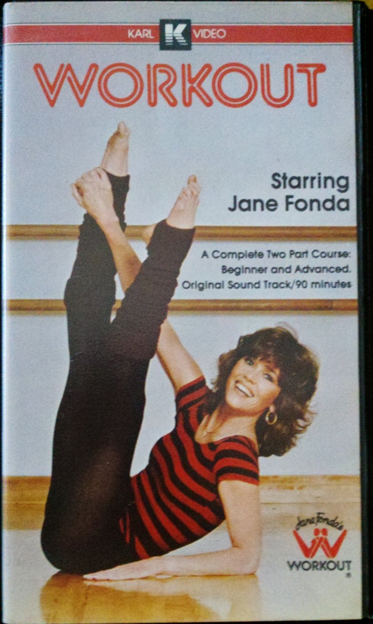
The 1980s. An era that gave us Reaganomics, some of the best music the world has ever seen, the Teenage Mutant Ninja Turtles, RoboCop – and Jane Fonda’s workout tapes.
 
Pic from Amazon.com
I’m sure I’m generalising a bit here, but it seems that in the late 1970s and early 1980s gyms were largely for Arnie-esque muscle men, and women didn’t really have anywhere they could go to work out. But the release of Jane Fonda’s workout tapes changed all that, helping innovate the “home exercise” movement, alongside other pioneers like Richard Simmons. As far as I can tell, this isn't such a big thing these days, but it was HUGE in the 1980s and 1990s. You couldn't turn on the TV without seeing an ad for some new piece of exercise equipment or VHS that would "strip the fat away", "get those abs toned" or "give you magical powers" (advertising laws weren't as strict back then, and we didn't have the internet to fact check). There was even a TV show called Aerobics Oz Style that ran for YEARS on Channel Ten over here, and I'm sure most readers had their own local equivalents too.   
How does this relate to today’s review? Well, any of the more 1980s-savvy you will probably have clicked by now -- though the Gym Instructor isn’t specifically Jane Fonda, I think it’s a fairly safe bet to say she was the central inspiration. And of course, one can only assume that Olivia Newton-John’s Physical music video (hilarious but borderline NSFW) had a role to play too.
Released in 2011 as part of series 5, the Gym Instructor is a bit of an oddity in a Lego theme that has produced a lot of unusual figures. She doesn’t really fit with any of the other characters – maybe the Weightlifter from series 2 – or any other Lego sets that I’ve ever seen. Maybe you could slot her in with some of the really pink and girly sets from the 1990s, but I think she'd look like an anachronism there too.  
The slightly bouffant hair, pink patterned leotard, lime headband, lime belt, lime legwarmers and bright blue tights are all 1980s gold. It doesn't seem to be specifically based on a particular costume, but this one looks about right. 
She comes with one accessory – a lavender boom box – which boosts the whole thing from “pretty cool” to absolute winner.  The main thing that could really improve the whole ensemble is a Richard Simmons analogue to make a truly 80s-tastic display. Or at least an out-of-shape student or two. 
 
I’m a big fan of this minifigure. She’s very 1980s and very tacky, which tends to be a winning combo in my book. I've been watching The Goldbergs a lot lately, which has only increased my appreciation, and which I highly recommend to any fellow 80s-philes out there.  
Also, I decided to include her because I remember how disappointed my friend Boon (of TheBoonArmies fame) was when he bought something like four Minifigure blind bags and got her in about three of them. I wouldn’t have been thrilled myself, but I do remember it annoying him a whole lot, and I hoped to rekindle some of that irritation :)

Sunday, 24 August 2014

Funko POP! RoboCop

Company: Funko
Year: 2013
Series: Movies

BACKGROUND
Well, Funko Week comes to a close with RoboCop. I’ve spoken previously about my deep love of RoboCop, and what an amazing film it is. Really, if you’re a regular reader of this blog it probably doesn’t need a whole lot of introduction. So let’s just say that if you haven’t seen it yet, you should definitely do yourself a favour and go check it out ASAP. The second one, not so much. And I’ve not watched the entirety of the third one…but I certainly wasn’t sold on it based on what I’ve seen of it. Which is about 15 minutes.

This particular POP! was presumably released on the back of the hype around the 2014 remake, which was predictably okay, but not spectacular film. Funko doesn’t seem to have done a “new” RoboCop to match, but perhaps they only had the license for the original film.

THE POP
RoboCop’s condition is actually pretty horrible if you think too much about it. The original film is pretty vague about what’s left of his human body, but you get the strong impression there’s not much more than his face and part of his brain. And when he takes off that mask, it’s pretty horrifying. I’ve watched a huge amount of horror films, but one image that has stuck with me more than just about anything from those days is RoboCop’s unmasked face 

Of course, the Funko POP! version doesn’t really convey the horror of his existence so well – he’s just a cutesy cyborg, rendered in the distinctive POP! style. And I must say, it’s turned out pretty well. All of the main details are intact and present – his chestpiece, the screws on the side of his head and his separate big toe. Held in his left hand is his signature Auto-9, the ridiculously powerful handgun that deals out justice on numerous occasions during the film.   
Now for the paint. Oh Funko…you do so many fun sculpts and then do such an average job on paint!

RoboCop is painted primarily in silver, to match his appearance in the first movie – as opposed to the blue-tinged armour he’d later get. In theory, this shouldn’t be a problem, considering that they did a great job on the Silver Surfer, but in practice it’s little thicker and goopier than it should be.

This is forgivable – but the main thing that bugs me here is that RoboCop’s skin-tone paint is not properly aligned with where it should be on his face. It might be fixable, but it shouldn’t really have to be. Funko isn’t at the same level as Kidrobot when it comes to making this stuff, and to be fair I don’t think they’re trying to be, but it can be extremely frustrating nonetheless. So if you pick one of your own up, check it out closely.    
 

OVERALL
Like many of my Funko POP! figures, the paint is disappointing but the figure is overall great fun. As a big fan of RoboCop, I’m very pleased to have him as part of the collection. Though it seems unlikely, it would be great to see Funko produce figures of Clarence Boddicker, this guy and a variant based on this figure.  Now that would be a line to see!

Tuesday, 29 July 2014

Kidrobot TMNT Ooze Action (Glow in the Dark) Raphael

Company: Kidrobot

Year: 2014

Price: $15AUD

THE BACKGROUND
Kidrobot have been producing vinyl toys since 2002, and are well-known within the art/designer toy community, a scene which I know very little about myself. I’ve never bought any of their stuff previously, as it’s an aesthetic I have mixed feelings about, and I could never quite justify the price even when I did see something I liked.

 
However, I have noticed that in the last few years – and it’s quite possible it’s been going on even longer overseas – they seem to have developed a number of products at a lower price point and with greater availability, presumably to appeal to the more casual collector. I suspect this has something to do with the growing popularity of Funko, a brand that has traded on the designer vinyl aesthetic very effectively, managing to snag a huge number of licenses and bring the whole scene a little more mainstream in the process, all while doing it at a very affordable pricepoint. 
Your own thoughts on this will vary of course – as with any underground scene there are always those loath to see things become “mainstream” or to have things “ruined” by “casual fans”. I’ve had many a moan about things over the years myself! But as someone who enjoys Funko’s work, I’m pretty happy to see the style gaining wider acceptance.   

Anyway, Kidrobot recently picked up the TMNT license, and have produced a number of products based on the 1980s TV series. The shop I picked this up from also had keyrings (approx. 1”), these “Ooze Action” figures (3”) and blind-boxed figures (also 3”), which cover all of the same characters in the Ooze Action set, plus a few more. Online I've also discovered that there are 7" Bebop and Rocksteady figures, and I suspect there may be more in future. Time will tell.  
Today’s figure, Raphael, comes from the Ooze Action subset. These guys are in the same scale as the blind-boxed figures, but have slightly different paint apps – including ooze splattered on their weapons or bodies, which is depicted via glow in the dark paint. Additionally, they’re not blind-boxed, which makes it much easier to get the character/s you want. Being a huge sucker for anything glow in the dark or TMNT related, I decided that I was going to make the investment. How did that pay off for me? Well, read on to find out!

PACKAGING

I don’t often talk about the packaging much these days, but I thought this one was worth a mention. It fits with the 1980s TMNT blister packs, modernising the “green on brick” aesthetic, all printed on nice thick card with a j-hook. It’s printed with an open sewer pipe, over which the figure in its blister is positioned, as though he’s bursting out of a pipe to say hello, or attack. For a brief period I did consider keeping him MOC, but that brief period lasted only a few minutes. A second one to keep MOC would be good though…

The back of the card depicts the other characters available in this line – Leonardo, Donatello, Michelangelo, Splinter and Shredder – while also including a few lines of flavour text about the ooze, which mutated the turtles and Splinter into their current form.
However, in spite of all the character designs being clearly based on the 1980s cartoon, it uses the logo from the 2012 TV series. Not wanting to create confusion among the (presumably) younger audience that this release is targeting, perhaps?

More strangely, the text on the back of the pack specifically states “this is not a toy”. This seems a little strange – if it’s not a toy, what is it?  But perhaps this is as a legal protection against some of the safety requirements that toys need to adhere to – types of paint, sharp edges, etc.

But these curiosities aside, the packaging really enhances the overall product. It’s not essential to enjoying it, but it’s a great bonus for those who want to keep it mint.

SCULPT AND ARTICULATION
Kidrobot seem to use a base body for most of their creations, which can be seen on their rabbit-like “Dunny” and monkey-like “Munny”. Their products do cover a broader range, of course, but for the purposes of this review that’s all you need to know about.  

(Incidentally, “dunny” is Australian slang for “toilet”, so it gives me a childish little giggle every time I see Kidrobot stuff being sold around the place.)
For this range, that means all four turtles use the same body and head, with the differences coming in paint app form. Likewise, Shredder and Splinter use the same body, but have different heads. Splinter…did not turn out so well. The sculpt is not poorly done, but it just doesn’t look like Splinter – he looks more like a dog than a rat.  

Raph (and all of them) is articulated at 3 points – his neck and at both shoulders. All are cut joints, and the articulation on the arms is a little restricted due to the shell on his back. But this isn’t necessarily a minus; these figures are bought for their overall aesthetic as opposed to their Marvel Legends-esque contorting ability.
It’s a very basic, kiddie-looking thing, somewhat like a bath toy. Once upon a time, I really disliked the vinyl toy look, particularly during my prime comic buying days of 2006-2007. It seemed so pretentious – who would pay insane amounts of money for a toyish, under-articulated piece of crap?  Why not get a real action figure?

With the benefit of a little bit of exposure to stuff that was more to my taste – and a bit of general growing up on my part – I’ve come to appreciate it more. And of course, in this case the license definitely does a lot of the heavy lifting. Being inherently cartoony, the 1980s TMNT lend themselves to the aesthetic much better than say, Cthulhu does. But of course there’s a market for that too.

ACCESSORIES
Raph comes with his two sais, which are spattered with “ooze”, which is actually glow in the dark paint.  Both of these fit neatly in his hands and will stay in place, though you’ll want to consider arm and head position before clicking them in – otherwise they’ll just poke straight into his face.

PAINT
There isn’t a great deal of straight paintwork on Raphael – as far as I can see it’s restricted to his bandanna, the belt across his shell and possibly his sais. Everything else is tampographed, and they’ve done an exceptional job. Just about everything looks neat and clean, and doesn’t look likely to rub off anytime soon. However, the glow in the dark paint scratches quite easily, so be careful with it. I scraped a little bit off just by my thumbnail banging against it accidentally.

My only real disappointment is that Raph himself doesn’t glow. Given that the turtles are all primarily green, it seems like they could have done it reasonably easy – but perhaps a future series or variant/ComicCon/online only exclusive release will do this. And it’s certainly a viable project for any keen customisers out there.
OVERALL

I’m really happy to have picked Raphael up from this range. I have no real quibbles about the execution or the price, and as my perennial favourite turtle, Raph will make a fine addition to the existing TMNT collection. Nonetheless, I don’t plan on picking up any more Kidrobot TMNT anytime soon. Not because the figures are bad quality, but I collect enough stuff already and don’t want to funnel hundreds of dollars into completing a set of the blind-boxed figures – which I can definitely see myself doing, if I don’t nip it in the bud now!

But for TMNT and designer toy fans alike, these toys come highly recommended.   

Sunday, 16 March 2014

Eighty Pop Classics from the 1980s


The 1980s are one of my favourite eras of pop culture, having birthed many of the pop culture icons I hold so dear today, such as the Teenage Mutant Ninja Turtles, G.I. Joe: A Real American Hero, Predator, RoboCop and The Transformers.

As a result, I’m quite a fan of a lot of pop music from the era too. Not in an ironic way either – I genuinely love the songs listed here. Some of you will be familiar with, some you won’t. Some you’ll like, some you’ll think are utter garbage. Such is the nature of compiling these lists. Feel free to leave comments below, with your own preferences.

And now, in no particular order, I present 80 of my favourite pop songs from the 1980s!

1. Dan Hartmann – I Can Dream About You

2. Hall and Oates – You Make My Dreams Come True

3. Stan Bush – The Touch

4. Stan Bush – Fight to Survive

5. Billy Ocean – Caribbean Queen

6. Toto – Rosanna

7. Toto – Africa

8. Kajagoogoo – Too Shy

9. The Psychedelic Furs – Love My Way

10. Midnight Star – Midas Touch

11. Ollie & Jerry – Breakin’… (Ain’t No Stoppin’ Us)

12. Spandau Ballet – Gold

13. Duran Duran – Hungry like the Wolf

14. Billy Ocean – When the Going Gets Tough

15. KC & The Sunshine Band – Give it Up

16. Rick Astley – Never Gonna Give You Up

17. Tears for Fears – Head Over Heels

18. Giorgio Moroder & Phil Oakey – Together in Electric Dreams

19. Simple Minds – Promised You a Miracle

20. Kim Carnes – Bette Davis Eyes

21. Gary Wright – Really Want to Know You

22. Time Bandits – I’m Only Shooting Love

23. Pat Benatar – Love is a Battlefield

24. The Cars – Drive

25. Pseudo Echo – Funky Town

26. Jefferson Starship – We Built this City on Rock and Roll

27. Prince – Little Red Corvette

28. The Breakfast Club – Right on Track

29. A Flock of Seagulls – I Ran

30. Billy Idol – Dancing with Myself

31. Billy Idol – Rebel Yell

32. Simple Minds – Don’t You Forget About Me

33. Hall and Oates – Private Eyes

34. Huey Lewis and the News – Do You Believe in Love

35. Pointer Sisters – He’s So Shy

36. America – You Can Do Magic

37. Go West – Call Me

38. Go West – We Close Our Eyes

39. Corey Hart – Sunglasses at Night

40. Haircut 100 – Love Plus One

41. The Cure – Inbetween Days

42. The Police – Every Little Thing She Does is Magic

43. Bruce Springsteen – Dancing in the Dark

44. New Kids on the Block – Step by Step

45. Dire Straits – Walk of Life

46. Don Henley – The Boys of Summer

47. Glen Frey – The Heat is On


48. Steve Winwood – Higher Love

49. Steve Winwood – Valerie

50. Paul Simon – You can call me Al

51. ABC – The Look of Love

52. Belinda Carlisle – Summer Rain

53. Wa Wa Nee – Stimulation

54. Eddie Money – Take Me Home Tonight

55. Sade – Smooth Operator

56. Sade – Sweetest Taboo

57. Billy Ocean – Mystery Lady

58. Pet Shop Boys – West End Girls

59. Scandal – The Warrior

60. George Harrison – I Got My Mind Set on You

61. Phil Collins – In the Air Tonight

62. Simple Minds – Glittering Prize

63. Earth, Wind and Fire – Let’s Groove

64. Melissa Manchester – You Should Hear How She Talks About You

65. Icehouse – Electric Blue

66. Icehouse – Can’t Help Myself

67. The Stranglers – Skin Deep

68. The Jets – Crush on You

69. INXS – Don’t Change

70. John Farnham – Two Strong Hearts

71. Lionel Richie – All Night Long

72. Bananarama – Cruel Summer

73. The Go-Go’s – Our Lips Are Sealed

74. Devo – Whip It

75. Men Without Hats – The Safety Dance

76. The Church – Under the Milky Way

77. Nik Kershaw – Wouldn’t it be Good?

78. Orchestral Manoeuvres in the Dark – If You Leave

79. Frank Stallone – Far From Over

80. Fischer Z – So Long