Monday, 24 February 2014

Soundwave (Transformers Generations: Fall of Cybertron)


Possible Autobot lair?


Series: Transformers Generations
Year: 2012

Company: Hasbro
RRP: $50AUD

BACKGROUND
I don’t remember Soundwave from my childhood. But over recent years he’s become one of my favourite Transformers. His robotic monotone, bizarre tape deck alt mode, navy and purple colour scheme and ability to shoot out smaller robots are all awesome. But I don’t care for his more modern iterations from series like Prime – and I wasn’t about to fork out big bucks for a G1 or Masterpiece version. But the Fall of Cybertron toy? Yeah…I could get behind that one.  

SCULPT AND ARTICULATION
Soundwave’s bot mode is a reasonably good approximation of his classic G1 bot form, but it’s been updated enough that it doesn’t look super blocky and outdated. It will annoy some of the diehards, but I think that’s been the case with most stuff released since 1990 anyway. 

His eyes (eye?) are light-piped. This doesn’t work as well as it did for Starscream, but if you hold him at the right angle you can give him some cool laser-eye effects. (Pew! Pew pew pew!)
Articulation-wise, he’s got:

*double-hinged shoulders
*swivel-hinged biceps (though it’s split into two separate pieces on the arm)

*hinged elbows (ratcheted)
*hinged forearms (mostly important to transformation)

*cut wrists

*swivel-hinge hips
*cut thighs

*hinged knees (ratcheted)
*hinged ankles

As much as I loved the few Transformers I had as a child and teen, no-one could ever accuse them of being over-articulated.  Soundwave is very well articulated – his large feet mean he’s very stable, and you can get him into some good, deep poses. The only drama is that his shoulders are massive, so sometimes they get in the way a little. Still, a little manoeuvring of the various joints should short it will let you work around it on most occasions.


I would have liked his head to be able to move (though with the gun there it would have been tricky), a cut waist and his hands to open and close, but I’ll live. On the whole, Soundwave is an excellent bot figure.  


His alt mode…well, it was was always going to be a little controversial. Given that this is based on the Fall of Cybertron game – which in turn is set millions of years before tape decks were even conceived – it works from a story perspective. Rather than the much-loved tape deck, Soundwave has become a more conventional “Communications Truck.” Personally, I think the design is okay – and I prefer it to the jet mode that he often gets in other media – but what lets it down is its relatively plain colour scheme. It works on the bot, but not so much as a vehicle.  As a result, mine will mainly go into vehicle mode to reduce space size for storage.
 
The instructions aren’t in colour, and I found these a little difficult – to the point where I initially thought that he hadn’t been put together properly and I wouldn’t be able to transform him. I think Hasbro needs to go back to using words on their instructions too, or possibly colour images rather than the grey and purple ones currently in use.  

As a side note, there was another Soundwave released for War for Cybertron. It was considerably smaller and still changed into the communications truck – but it also had an undocumented feature which turned him into a very boom-box looking shape. This one doesn’t seem to have that ability, which is a little disappointing.
On the vibrant streets of Columbia

ACCESSORIES
Soundwave comes with two accessories – his shoulder-mounted gun and Laserbeak. Lasberbeak is pretty cool as accessories go – rather than a cassette, he’s now become a “data disc” to better fit with the FoC aesthetic. He transforms into bird mode by pressing a button on his base.

The box and instructions also depict Soundwave with a second gun, which is hand-held. However, mine didn’t come with this – I spoke to a friend who also has this figure, and I think the gun was cut from the final release.
Personally, I think it would have been better if a couple more of the data-discs had been included in the set to sweeten the deal. Soundwave isn’t a small guy, granted, but $50AUD is still a lot.

PAINT
Soundwave is a not a badly painted figure by any means, but he has the same issues that I mentioned in my previous review of FoC Starscream. There’s a bit of slop at some edges, some missed details and some odd choices in terms of casting colour vs paint. The job looks consistent overall and you won’t notice issues unless you’re looking closely – but as with Starscream, I think that a figure retailing for this amount should have a little more attention paid to it. 

Laserbeak has some splotches of red paint around his face and neck, but his paint is otherwise pretty good. The silver details are all picked out without any slop (though the Decepticon logo has a bit of wear already), which is particularly impressive considering how small they are.  

ISSUES
The main issue I had with Soundwave is that Laserbeak doesn’t fit particularly well into his chest, and the eject function doesn’t work very well either. I’ve only been able to fit him in once, it was a chore getting him out and I’m loath to try it again in case I break either of them. This doesn’t bother me as an adult, but as a kid it would have annoyed me immensely.

OVERALL
As I mentioned in my Starscream review, Hasbro is on to a good thing with the Generations line – they’re toy-ish enough for kids, but nice enough for collectors. Hasbro has just recently annoyed more Generations stuff for 2014, and I’m very keen—Acid Storm is definitely on my to-buy list.  

By these standards, Soundwave is a cool, albeit overpriced, toy. I found him eBay brand new and paid notably less than retail for him, and I would suggest you do the same if possible. While we’re hardly getting gouged on these figures, I still think they’re stretching the level of price acceptability.
Still, pricing aside, Soundwave is a great figure and comes highly recommended. If Hasbro keeps doing this line right, I suspect I’ll keep buying them! 


Soundwave was always sensitive if anyone found out that he liked to collect action figures -- it just wasn't considered fitting for a grown Decepticon.

Sunday, 23 February 2014

Lego Ghost (30201) polybag


Theme: Monster Fighters
Pieces: 31

Build time: 5-10 minutes
Year: 2012

RRP: See below

The Background
In spite of my initial scepticism about the Monster Fighters theme when I first encountered it in 2012, I have become quite a fan. Christmas 2013 saw my parents (very) generously purchase for me Lord Vampyre’s Castle, which now occupies pride of place on my bedroom floor. But I was lacking a ghost to haunt said castle, and that had to be rectified.

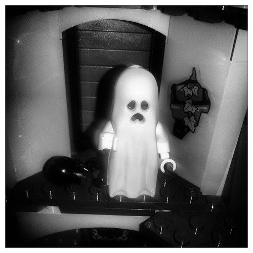
So I bought this set -- a polybag that containing a ghost, complete with Marley-esque chain, and a grandfather clock.

The Minifigure
When I was but a youth, I had a friend that I'm pretty sure owned this set, from Lego’s long-running Castle theme. The included ghost minifigure was unlike any other I had ever seen. There were ghosts in the world of Lego? Perhaps most amazingly, IT GLOWED IN THE DARK!

I was, of course, rather jealous. But though I owned a handful of Castle stuff, my Lego interests were more focused around the Pirates and variations of Space. So I never ended up getting one of these bad boys.
Flash forward more than 20 years, and I finally have my own ghost minifigure. On the whole, I think he lives up to expectations. This one is a little different to most modern versions – he doesn’t have any legs, but instead a small brick. A ball and chain plugs into the bottom of this to provide him with a “foot”, and he’s balanced by attaching a single stud to the other empty slot. It’s a neat little system, and the addition of the ball and chain separates him from the ghosts that are included in the other Monster Fighter sets.

And does he glow in the dark? You bet he does!

The Build
As might be expected, it didn’t take long to put this bad boy together. I think it was around 5 minutes, while watching an episode of The Middle 
The clock works well for the ominous Monster Fighters theme, but could be easily transplanted into your average Creator house. I’ve never really seen Lego do a set like this, and I thought it was really cool. It’s a bit of a shame that it seems to be restricted to this fairly limited release. For the time being, it sits in a tower of Lord Vampyre’s castle, chiming every hour and irritating the bat-creatures that hang from  the building.


Overall
This set isn’t particularly hard to find, but it’s now discontinued and getting expensive. I paid $18AUD, which seems about standard, and was fortunate enough to find an Australian seller who didn’t charge me for postage. International sellers may have it cheaper, but you’ll probably pay a bomb for postage.

Still, it’s a fun little set and one of the cooler ways to get hold of an individual Lego Ghost – on that basis it comes recommended. If you can find it cheaper than I did, grab it!


  "Dammit, ghost! I'm trying to sleep -- go and clank somewhere else!"

Saturday, 22 February 2014

DVD Review: Arthur C. Clarke's Mysterious World


DVD Release Date: 2011 (original screening date 1980)

Extras: None

BACKGROUND
I was reading through the archives of The Surfing Pizza a few months ago, and came across an old article where he spoke about compiling a shelf full of “Sunday reading” books. I knew almost exactly what he was talking about too -- I often found Sunday afternoons a bit of a downer as a child, and well into my teenage years. It was too late to start any new major projects, and though the evening would likely bring something watchable on TV, the hours between 12 and 6 were likely to be spent doing nothing better than clock-watching if you weren’t careful.

So to fill these Sunday afternoons, I often spent a lot of time at the local library. And I spent a lot of time reading about the paranormal, the unexplained and the mysterious. UFOs and aliens were of particular interest, though in a pinch I’d read about more general mysteries.  
So when I first heard about this show a few years ago, it sounded right up my alley, though the chances of getting hold of a legitimate copy seemed a little unlikely. I just assumed that it would be one of those things that wouldn’t be available at JB Hi-Fi – or if it was, it would be for an extortionate price – so I never really chased it up.

Flash forward to 2013 and I found this in a pile of old DVDs for sale at my work. I believe I paid around $3, which I was more than happy to part with. Those of you who want to view after reading will probably have more luck with Amazon or eBay, though.  

The Show Itself
Though the program bears Arthur C. Clarke’s name, he is more of a facilitator, rather than the focal point of the show. He bookends the program, showing up to introduce the week’s topic, and adding some pertinent points at the end of proceedings. From time to time he’ll pop in midway through the show, sometimes to segue and other times just to make a remark.

Many of the subjects you’d expect to be covered in this sort of program make an appearance – UFOs, aliens, cryptozoology, crystal skulls and of course, Stonehenge. For anyone who’s picked up a book on the paranormal, it will be pretty familiar stuff. But Clarke is a reasonably charismatic presenter, Gordon Honeycomb’s narration is solid and it’s nice to see interviews with some of those involved, rather than simply reading about these individuals.  
Image quality is around VHS level. I’m not sure whether it’s been remastered or not, but this show was obviously filmed in the days before digital video and Blu-ray. But although it’s a bit crude by today’s visual standards, it certainly doesn’t look ugly. In fact, I think this relative crudeness adds to the overall mysterious vibe of the program. And some of the footage is undeniably beautiful, such as the sunrise as viewed from Newgrange.

The rest of the show is a mix of footage from around the world, presumably shot by the production staff. There’s a mix of interviews, on-location shooting and archive footage, all tied together by narration from Gordon Honeycomb (who Wikipedia tells me now lives in Perth).

The soundtrack is particularly good. It’s very dated, but I do enjoy that distinctly 1980s “mysterious” synth sound, so it doesn’t bother me in the slightest. Composer Alan Hawkshaw is still alive these days, and still producing soundtracks.

The DVD has no extras, unfortunately. It would have been nice to get a director’s commentary or two, and perhaps a “now vs. then” retrospective on some of the featured mysteries. But this series did come as part of a boxset which compiles all three of Arthur C. Clarke’s TV series about the unexplained – Mysterious World, World of Strange Powers and Mysterious Universe, so I can’t really complain.  

The Verdict
As might be expected, the show is never explicit about whether the mysteries it showcases have any strong basis in fact. Doubtless a number of the people interviewed have seen or experienced something – but what is that something? A genuine paranormal phenomenon, or just something ordinary that was taken out of context and misinterpreted?
Probably the closest the show to drawing a definite conclusion is in the episode featuring the Rude Man of Cerne, which – based on reconstructions carried out over the course of the episode – they suggest probably depicts Hercules, rather than a Celtic fertility deity, as has been commonplace to assume. In other cases, interviewees and experts explain their viewpoint, but for the most part, it’s difficult to draw a solid conclusion based solely on what you see on screen.

It is partially this reticence that makes reviewing a show like this somewhat difficult. Many people of a more sceptical bent will sneer and ridicule the program for looking at many of these “mysteries” with any level of seriousness at all. To the dedicated believer, the show will not have drawn enough conclusions from the “evidence” it presents. As for myself? As much as these subjects interest and entertain me, the more I have looked into them, the more sceptical I am inclined to be. Yet I don’t think the whole thing can be written off as easily as some people would like -- and it certainly made for entertaining viewing. 

I did quite a bit of Googling while watching to see if any of the cases depicted had been solved, shown to be fraud, etc. However, most of the time there didn’t appear to be a whole lot of additional information -- save, perhaps for the Crystal Skulls.

As the program was filmed more than 30 years ago, quite a number of people mentioned have died – including Mr Clarke himself. But it was interesting to see that more than 30 years after first screening, many of these mysteries still remain just that – mysteries.

Friday, 21 February 2014

Kre-O Transformers Microchangers – Collection 4

Company: Hasbro

Year: 2013

RRP: $5AUD

BACKGROUND

Blind bags. They’re a great way to get collectors interested in your product, and an equally great way to drive them up the wall. Even though we’ve typically got more cash to spend than the average kid, that doesn’t mean that we’re made of money, and very few of us are interested in investing time, money and effort into completing a set that may yield us dozens of unwanted figurines.

Still, I’m a sucker for blind bags, and have been since I was a kid. I’d read about them online (probably at OAFE) and I recognised a photo opportunity – Transformers that were small enough for the TMNT to use as toys!
Epic Autobot vs Decepticon battles in the lounge room

As far as I can tell, they’ve only just started turning up in Australia, though they’re already up to series (“collection”) 4. Looking online at previous iterations, the characters appear to be drawn from a bunch of different sources: G1, Beast Wars, Armada, and even a few “new” characters (they’re not exactly the same as their G1 counterpart, but they’re pretty similar e.g. Acid Wing/Acid Storm in collection 3). Though I’m not an especially dedicated Transformers fan, I was surprised at how few of the characters I recognised – only Kup and Rodimus were familiar names. This isn’t just because we’re on collection 4, either. Looking over the older collections seemed to suggest that there’s been a deliberate focus on more obscure characters.

There are 12 characters in each collection. A few of the major characters like Optimus, Megatron, Bumblebee and Starscream have seen released individually. A couple of the gestalts – Menasor and Computron – have also been released too. How many make it to Australia remains to be seen – so far I’ve only seen the blind bags in Big W and my local comic store. 
So, how do they stack up to your average regular Transformer?


"Change to da choppa!"

SCULPT AND ARTICULATION
The most obvious point of reference is a Lego Minifigure – they’re around the same size, and the Kre-O range as a whole definitely owes Lego a debt of gratitude. However, Hasbro refers to their figures as a “Kreons”.


Brawn


Kup


Brake-Neck


Iceberg

So far, I’ve got five characters from the line – Sandstorm, Kup, Iceberg, Brawn and Brake-Neck. Four Autobots and one Decepticon. They’re all built on the same basic body, with the variation coming in colouration and accessories. Their shoulders and hips are balljointed, which gives them a wider range of motion than a Minifigure. Heads are attached via a neck peg, so they can swivel from side to side, but can’t look up or down.
I like that the Kreons are more articulated than Lego Minifigures, but the articulation also makes them feel much more fragile. This isn’t a major issue for adults playing with collectibles, but it certainly could be for kids who tend to be rougher with their toys.

Kup is probably the one who resembles his animated counterpart the most – though Brawn looks really cool, he does look quite different to his animated form. Brake-Neck is hard to tell…TFWiki tells me that this character has gone through a few name and appearance changes, presumably for legal reasons. Apparently he was once one of the Stunticons that made up Menasor, but he doesn’t seem to be included in the Menasor set that’s advertised in the accompanying booklet. So your guess is as good as mine here. Iceberg was originally a Mini-con from Armada – he looks nothing like his original counterpart, but does looks considerably better as a bot. Sandstorm kind of gives the same vibe as his original form, but he was also originally a triple-changer. Still, they’re all quite endearing and cutesy, “accurate” or not.
Accessories vary slightly across the series, but in the case of my guys, all of them came with a gun. There seem to be a few basic gun shapes across the range – pistol, blaster and rifle – which are then moulded in different colours as necessary (or in Sandstorm’s case, combined with parts of his vehicle mode). I like Brawn’s the best – it’s translucent blue, which gives it an interesting dimension, as opposed to basic black or blue.

These figures don’t actually transform, as such. Rather, they can be reassembled into an alternate form with extra blocks that are included in the bag. It’s a cool idea, but one that’s better on paper than in execution, particularly with the cars. Why the cars? Well, the arms are supports for the front wheels. However, the ball-jointed arms mean that they tend to be a little wonky, and the whole thing looks a little weird once it’s complete. In Brawn’s case, the front of his car just won’t attach to his neck properly.
Iceberg's vehicle mode
Brake-Neck's vehicle mode


Brawn's vehicle mode
Kup's vehicle mode
Sandstorm (helicopter) doesn’t have the same problems, and looking at the diagrams in the instruction booklet seems to suggest that the airborne vehicles generally don’t have the same wonkiness. However, I’m yet to see any of the planes in person to confirm. All of mine are currently on display in bot form – they won’t be getting changed back and forth too often.


"This choppa won't be able to take us anywhere!"

PAINT
Paint is not bad, but definitely not up to Lego standards. Kup had some wear on his legs straight out of the bag and Sandstorm’s shoulders have been painted orange in a very sub-par fashion. Each character has a chest tampo, most of which seem to be slightly misaligned. Still, I’ll give them a passing grade – the tampos are still impressively detailed for such a small scale – but there’s definite room for improvement.
OVERALL

Transformers Microchangers are pretty cute and endearing in bot mode, and the inclusion of obscure characters who rarely get a look-in is nice. However, I’m less keen on their alt modes. I’d like to get Slipstrike – his bot mode looks great and I think his alt mode will work well – but I’m not sure that I want to invest a ton of money into different bags to find him. I may just try and track him down on eBay.

Still, these are a fun sidenote to “real” Transformers toys. Vehicle fans need not apply, but bot modes definitely come recommended.  

Friday, 31 January 2014

Book review: The Gosford Files

It has occurred to me that in spite of this site being called the Lupine Book Club, I’ve yet to post a book review on here. So without further ado, here is the inaugural book review for the Lupine Book Club – The Gosford Files!

Update March 2015: Moira McGhee herself commented on this review and noted that the book is NOT out of print and can still be purchased by visiting www.independentnetuforesearchers.com.au

Authors: Moira McGhee and Bryan Dickeson
Published: 1996

Publisher: INUFOR
Availability: In print

BACKGROUND
Most people are familiar with the NSW Central Coast as a retirement spot, or as a beach holiday area, where you might spend a few days visiting for a family vacation. But this relatively quiet part of NSW, only an hour and a half north of Sydney, is also something of a UFO hotspot. For those of you not familiar with ufology jargon, this basically means it’s a good place to go if you’re interested in seeing UFOs. Hotspots for UFOs are dotted in various locations all over the planet, though the exact reasons why certain spots become hotspots are unknown.

The Central Coast, while home to a number of small urban centres, is quite geographically diverse – there’s plenty of bush, mountains, large bodies of water and farmland throughout the area, all located relatively close to one another. Whether or not this geographic diversity contributes to its hotspot status is entirely speculation, of course.  But still, it’s a potential tourism outlet that someone should look into more closely, I think.  
I lived on the Central Coast between 1989 and 2010, spending my early childhood through to my early twenties there. I still visit regularly to see friends and family, and I’m very attached to the place. But in spite of its reputation, I will say that you probably won’t see a UFO on a casual weekend visit there – in my years living there, I saw two, or perhaps three (I may post on that another time).

But in late 1996, Sydney-based UFO researchers Moira McGhee and Bryan Dickeson published The Gosford Files, in the wake of a large number of UFO sightings that had taken place earlier in the year. I first encountered the book not long after publication. I was in late primary school and someone had brought a copy in to school. I was already somewhat familiar with UFOs and the idea of alien abduction at the time – in fact, I had even seen a UFO in 1994, while at a family friend’s party. The whole thing intrigued me immensely, and I ploughed through it as soon as I could lay my hands on a copy (probably from the local library).
Since then, I have read scores, if not hundreds of books on UFOs, the unexplained, the paranormal etc. Few have made the same sort of impression on me as The Gosford Files, probably due to my personal attachment to the area.  

CONTENT
As might be suspected by the title, The Gosford Files covers UFO sightings that took place on and around the NSW Central Coast. Most are from the early- to mid-1990s, but there are a number that span previous decades, with the earliest from the 1950s. McGhee and Dickeson are good writers, and while the relatively short nature of each entry can leave you curious to know more at times, it does mean that you’re unlikely to get bored. 

Other, more general “unexplained” phenomena is covered as well, such as the famed “Kariong Hieroglyphics” (though the book describes them as located in Woy Woy). These rock carvings have attracted national attention at various times, and periodically get wheeled out as examples of questionable theories such as ancient aliens, unrecorded contact between the Egyptians and the Aborigines etc. *
Reading about all of this was particularly exciting as a child, when the book was first released. “Whoa! Someone saw a UFO there?”  All of a sudden, the Central Coast seemed like a place where things could happen, as opposed to the relatively quiet place that I had previously known it to be.
This book was published just on the cusp of internet access becoming mainstream, so there’s plenty of stuff I’d like to follow up on now – of course, the passing years and heavy use of pseudonyms for witness names makes this increasingly difficult.

OVERALL
As it’s rapidly approaching 20 years since the original book was published, I would love to see some kind of follow-up on the cases featured, whether online or as a Gosford Files 2-style publication. A short time after I first moved to Sydney, I began a bit of research into UFO sightings that had occurred post-publication of The Gosford Files. The project never really got off the ground, though I would like to return to it one day. 

As with any book like this, a lot of your final opinion is going to rest on whether or not you ascribe any reality to the UFO phenomenon at all. While I once would have considered myself a thorough believer in alien visitation, these days I am much more agnostic on the issue. It may sound a little wishy-washy to the more hardened UFO sceptic, I suppose – but I have definitely seen UFOs. But only in the sense that I have seen unidentified objects in the sky; I cannot claim anything at all along the lines of them being the result of aliens travelling across space/dimensions/time to visit the earth.
Taken as a book on the UFO phenomenon, The Gosford Files is an interesting read, and a good catalogue of a diverse variety of sightings and experiences within a fairly small geographical area. However, even for the non-believer, it’s still an interesting curio of Central Coast history. If you come across a copy (see note below) I’d definitely recommend picking it up. Even if you have no personal interest, odds are strong that you will know someone who is keen for a copy.

*I have never visited them myself, as their exact location is deliberately kept secret, to discourage visitors and vandals. But I have seen photos and I will happily throw my hat into the ring and say that these are 100% fake. Anyone who has ever looked through a children’s book on ancient Egypt can see that they are ridiculously crude (though whoever did them has gone to a lot of effort), and are hardly the work of highly trained scribes.

 Postscript: The Extraordinary
For those who are interested, one of the cases featured in the book was also featured in a segment on The Extraordinary ­­– which, for my overseas readers, was an Australian equivalent of Unsolved Mysteries in the early to mid-90s, covering subjects like UFOs, ghosts and other paranormal phenomena. You can view the segment  here on YouTube.

Post-postscript: A word on availability and pricing
This is a slightly edited version of the original section of the review, retained only for archival purposes now that I have been made aware of the book's availability. 

Though I have read the book numerous times since it was first published, I didn’t actually own my own copy until 2012! On and off, I spent a few years trying to find one, without much luck. Though I had numerous friends interested in similar subject matter, it’s quite sought-after in certain circles and it’s now been out of print for some years. I don’t know what sort of print run it had on initial release, but I suspect it was no more than a few thousand.  

Eventually, though, my father came across a copy in a Gosford book exchange for $5.50, which he snapped up for me. I have seen it selling online for more than $100! As might be imagined, I guard my copy quite dearly.

For Central Coast locals, Gosford Library has a copy, but it was moved to the reference section years ago – so no borrowing! It may also be worthwhile checking with the Wyong Shire libraries too.

Thursday, 30 January 2014

Arkham Origins Batman


Series: Arkham Origins
Company: DC Collectibles

Scale: 7”

Year: 2013

The Background
Batman: Arkham Origins was probably my most anticipated game of 2013. When it finally landed, I had a lot of fun playing it, but I was very disappointed with the storyline, and I traded it in right after I finished the main game.

Still, in anticipation of the game – and having admired, but never picked up any of the Arkham Asylum or Arkham City figures – I requested this figure several months ago as a Christmas present. After my disappointment with the game, I was a little more concerned. This was heightened after I ran across all of the figures except Batman in London’s Forbidden Planet store. They had good sculpts, but their articulation didn’t look great. That’s not such an issue with characters like Black Mask, but it’s a big problem for Batman. Combined with my disappointment with DC Unlimited Hawkman, I had some real reservations about going ahead with this figure. But he was already in the mail, so it was too late to cancel. Were my concerns justified?  

PACKAGING
The new packaging for Arkham Origins deviates significantly from the cowl-shaped clamshell that marked Asylum and City.  Now it’s more like a rectangular NECA clamshell, but with the Arkham Origins logo flaring out at the top. But clamshell haters need not panic – some of the back has been pre-perforated, allowing you to tear it open with relative ease (just keep a pair of scissors handy).  

The fairly plain insert unfolds into a flyer for both the Arkham Origins and City ranges, both of which seem to have been reappearing at retail lately – a clever touch.
Overall, I don’t dislike the packaging, but I think it’s a little bland in colouring and will probably present storage problems for MOCers, just because of the unusual shape.  

SCULPLT AND ARTICULATION


I was never quite satisfied with the sculpts on the Asylum or City figures of Batman. Though mostly great, his head always looked just slightly too small for his body, giving a weird effect. In fact, the whole series was a real mix of fantastic (Harley Quinn) and ordinary (Poison Ivy), which I think may be why I never actually pulled the trigger on buying any of them.

This Batman resolves those issues, and presents us with one of the best Batman toys I think I have yet come across. The sculpting is by Gentle Giant studios, who I understand generally base their work from digital scans of the character model.
I couldn’t say for certain whether it’s 100% screen accurate, but it definitely looks right – the armour plating is all there, the belt’s present and the head is the correct size. The biggest issue that I noticed was that his left bat-ear was slightly larger than his right one, and some of the spikes on his glove are slightly warped. Fussier folk than I may choose to break out the customising tools, but I’m happy to leave him be – I don’t really notice unless I’m looking for it.    

The cape is really cool. It’s made out a soft rubber which manages the delicate balancing act of being neither too stiff nor too soft. It restricts his shoulder movement slightly, but not massively. My only real concern is that it feels quite oily, and I’m hoping it doesn’t fall to pieces quickly.
As for his articulation, he features:

*ball-jointed neck
*swivel-hinge shoulders

*swivel-hinge forearms

*ball-jointed wrists
*ab crunch

*swivel waist
*hinged hips

*swivel thighs
*double-hinged knees

*ball-jointed ankles


"This isn't what I had in mind when I was thinking about 'Predator Encounters'."
One of his ankles was at a bit of a funny angle in the box, but I was able to twist it back into its correct shape easily enough – no boiling required.
All of the joints work well and move smoothly – of all of my “collector” figures, Batman is far and away the most mobile, particularly compared to say, my NECA Predators. There are no complaints here, which is possibly a first for one of my reviews!

PAINT
In the comics Batman typically has a very plain colour scheme – black (or blue) and grey. Accordingly, the figure reflects this, and the accompanying paint job is pretty basic, though it doesn’t need to be any more complex. The exposed half of his face is painted a flesh tone (slightly darker for the lip) then given a black wash for stubble. Up close he just looks kind of dirty, but it’s pretty effective from a distance – and it still works either way.

I could see DC Collectibles giving us a “Battle-damage” repaint at some point – those of you who have played any of the Arkham games know that the Batsuit takes quite a beating over the course of the game, and a banged-up version could look pretty good. If it doesn’t get a release, of course, all it would take is a steady hand and some Citadel paints… 
The only real issue I have is that the paint is already showing some wear marks at a couple of points. Both the cape and cowl appear to have been cast in grey, and then painted black. As a result, there’s already a wear mark on his cape (possibly from the packaging) and the tips of his ears are starting to wear too.

ACCESSORIES
Batman comes with no accessories. I was hoping he’d come with a batarang, but no such luck. Considering his hands are balled into fists, ideally I think the best way to go would have been to would have liked some interchangeable hands, a batarang and/or a weapon – along the lines of the old SOTA Street Fighter II toys.  

If the range goes for more than two waves, I won’t be surprised if we end up with a variety of different Batmans – perhaps unmasked as Bruce Wayne, Batman in a slightly different costume, or Batman incorporating more accessories. But I hope that they avoid this, as there have already been far too many Batman lines already that simply consist of variants of Batman.
Instead, I think it would be better to incorporate more accessories into a base figure – interchangeable hands, maybe a head and some accessories. It might cost a little more at retail, but I suspect that you’d probably sell more figures too – rather than annoying fans by releasing a bunch of largely unwanted variants. 

OVERALL


"Rookie mistake, Jason."
Despite Batman being my favourite superhero from a very young age, I’ve never really owned a good figure of him. I had an Animated Series Bruce Wayne-to-Batman figure in the 1990s – which was okay – and a Batman Begins basic Batman when the movie was out – which was also okay. But I’ve never really seen one that grabbed me and was within my budget (I’m looking at you, Hot Toys DX 12 Dark Knight Rises Batman). 
The lack of accessories is disappointing, but Arkham Origins Batman is definitely one of my favourite figures that I’ve bought this year, despite my disappointment with the game. The sculpt looks good, the articulation is great and he looks good fighting Lava Planet Predator – I would recommend him thoroughly to any Batman fan. He’s a great addition to the collection. 

Side note: At this stage, the only other figure I’m planning to pick up is Deathstroke, assuming he has similar articulation and a good paint job – he’s scheduled for release in April. However, future waves beyond wave 2 may well hold more characters that I’m interested in. The other figures look fine, but they’re just not up my alley.

 
"I don't use guns," said Batman, loudly and pointedly.
"Well, how about you shut up let the real cops do their job?" said RoboCop.
The bust that followed was a success, but it was awkward for everyone.


Wednesday, 29 January 2014

Marvel Select Silver Surfer

Series: Marvel Select

Scale: 7”

Company: Diamond Toys

Year: 2013

BACKGROUND
The Silver Surfer is one of my favourite Marvel characters. He is quite well known in comic fandom, but has never been able to break through to A-list status, and his presence is usually confined to guest appearances or infrequent miniseries – though word around the campfire is that he will be returning to a monthly series in April this year.

But I digress – I found myself with a gift voucher for my local comics store after Christmas (thatnks to my brother-in-law), and the Marvel Select line has been intriguing me for a while now. It’s slightly larger in scale than Marvel Legends – if not as heavily articulated – and the diorama bases it includes can be quite impressive.  So after eyeing this figure off for some time, I decided it was time to get the purchase happening.

PACKAGING


The Marvel Select packaging is definitely designed with collectors in mind. It’s ridiculously large compared to the average retail figure, it’s covered in cool graphics and the figure is clearly displayed, for those who like to keep things MoC.
Unfortunately for MoCers, they’re also somewhat easy to ding – the Silver Surfer I picked up was the last one in the store, and it was in “good” rather than “mint” condition. Not a problem for me, since I’m a chucker anyway, but something to watch out for if you are a little fussier about your packaging.

SCULPT AND ARTICULATION
The Surfer looks to be something of a hybrid of his 1960s and 1990s versions. He still seems to be wearing trunks as in his early appearances, but he also has the ludicrously ripped physique of a post-MacFarlane comic character, before things went back to being a little more restrained in the noughties.  


I purchased the DC Unlimited Hawkman a couple of months ago, and found very quickly that his legs – seemingly cast in metallic plastic – had a very disappointing range of movement. I had concerns that the Surfer would be similar, and that most of him would be rendered immobile.
Articulation-wise, this is what he offers:

*ball-jointed neck
*ball-jointed shoulders

*swivel biceps
*hinged elbows

*pegged wrists
*cut waist

*peg and swivel hips
*double-hinged knees
*swivel ankles

His posture is somewhat slouched – good for when he’s in surfing poses, but it might have been nice to have an adjustable neck for when he’s standing up straight.
The combination of swivel hips with hinged knees meant it was initially kind of difficult to get him into a good-looking surfing pose – which is a bit of a bummer for the Silver Surfer. I think a better approach would have been cuts on the thigh for a greater range of motion and/or ball-jointed ankles – though cut thighs may have left me complaining about a spoiled look on the figure.

However, these issues are more to do with the style of articulation chosen, rather than plastic QC issues. His range of motion is actually really good! All of the joints move smoothly, and he’s easy to set up for a good looking photo. His wrists were initially quite stiff, but I didn’t have any worries about breaking any of his other joints – something that I sadly can’t say about many other collector’s figures that I’ve bought.
Combatting evil wherever in the galaxy...or Detroit...they may go.
 
The other thing I did like is that while the range is on the exaggerated side of 7”, Silver Surfer still fits in quite well next to Arkham Origins Batman. Though his proportions are slightly larger, this can easily be explained by the fact that he’s an alien, not a human. Additionally, he’s not so “realistic” that he looks silly placed next to my TMNT. Those who follow me on Instagram (lupinefunclub) will have seen a few photos already – more should follow soon.                                      

ACCESSORIES
Surfer comes with eight accessories – a staggering amount in this day and age, particularly when you consider that other figures costing only a few dollars less (or more) often come with one or none.

*diorama base
*Silver Surfboard

*two energy blasts
*three alternate hands

*the Infinity Gauntlet

Two of the alternate hands look virtually identical to one another – just the hand held flat, presumably for surfing poses. The other is in a kind of grasping position – probably for holding the board when it’s standing upright. The energy blasts are cool, but they can be a little tricky to fit over the hands. However, I can see it being put to use for a number of other effects, too -- gunshot explosions, bullet wounds, etc.
The Infinity Gauntlet can fit over the Surfer’s left arm once his hand has been removed. You’ll need to wedge it on a little to make it stay, but it does look great once it’s on. I’m curious to know how many other Marvel Select characters it will fit onto, as well…Deadpool, perhaps? 

Sadly not many of my other figures have easily removable hands – otherwise I could definitely see potential for a few zany crossovers (Lava Planet Predator gets hold of the Infinity Gauntlet – sounds pretty 90s to me!).
The diorama base is quite simple. It’s some kind of lunar-looking landscape with an energy “swoosh” attached for the surfboard. There have been more complex bases in this series, but this one is nice because it’s relatively understated – I can’t stand the ones that come with big unarticulated figures. They almost invariably look terrible. The only real downside is that the Surfer’s feet don’t quite fit in the footprints. I think there should definitely have been a flat area with a peg for the foot on the base, but I don’t like the footprints themselves being embedded permanently in the sculpt. Still, I have paid similar amounts for figures that came with far, far less, so it seems churlish to complain about such minor quibbles. 

PAINT
As might be expected, there’s not actually a lot to say about paint for the Surfer (and his board). He seems to be primarily moulded in a silver colour, with his joints apparently cast in clear plastic and then painted silver. You’ll see the unpainted areas show in certain poses, but it’s no biggie – after Hawkman, I’m just happy that he can move!

The only real detail area is his eyes – these have been cleanly done, with no trace of slop.
Accessories-wise, the Infinity Gauntlet is okay, but unspectacular. It colours all of the gems, and gives it a wash to add a bit of depth to the glove itself, but it just feels a little flat for such an important artefact. Perhaps a slightly glossier finish might have been the right approach? 

The energy blasts are unpainted, but I think they should have been given a drybrush highlight so they don’t look so obviously plastic-y. This is something I may fix myself in future.
The diorama base is simply painted too. The energy swoosh is moulded in the appropriate colour, and the landscape is seemingly just a basecoat and some drybrushing. Still, that’s all that’s needed to provide the appropriate effect.

In spite of the Silver Surfer being one of the more visually striking characters in comics, this has not traditionally translated into paint jobs that stand out as particularly striking. Metal is hard to make look good at this scale, and very few companies succeed. I’d rate the paintwork on the figure as “pretty good”. There’s nothing obviously wrong with it, but it doesn’t quite go that extra mile in the same way as the NECA RoboCop’s multi-toned silver did. The accessories are also perfectly acceptable.  

OVERALL
Though the current range of Marvel Select characters at my local store aren’t my cup of tea, I could definitely see myself picking up a couple more in future. I particularly like the look of Deadpool, though I suspect I’ll have a mission tracking him down. Or perhaps Thanos, to continue the spacefaring, cosmic theme of this toy – and to provide a worthy adversary for Norrin Radd. 
Silver Surfer was not my favourite figure of 2013, but he hit all of the right notes – good sculpting, good paint and lots of accessories (particularly for a character who’s mainly noted for having one). All of these things should be standard for a figure of this cost, and Marvel Select definitely gets props from me for doing it. Other companies should take note!
 
"Dammit MIkey! Bring it back - NOW!"